Adding Items with BoldGrid’s Post and Page Builder
WordPress Page Builder
When you activate the BoldGrid Post and Page Builder plugin, it expands the default WordPress editor into our bigger, better version. This feature makes adding content like images and text to your website fast and easy. It organizes your pages and posts into sections, provides simple on-screen cues for adding and editing content, and allows for drag-and-drop manipulation of various elements in your layout.
 Once installed, the Post and Page Builder automatically appears when you begin editing a portion of content within a page or post.
Depending on the section you edit, the Post and Page Builder adjusts to display a few commonly used actions appropriate for that type of content. If you need even more options, click on a section with an image and you will see the full Post and Page Builder menu.
 For this article, we will focus on using the “Add Item” option of the Post and Page Builder menu. When you click on the plus sign or “Add Item,” it allows you to add a new piece of media (i.e., a photo or video), a button, an icon, a Block, or a section.
 Clone creates a duplicate of the existing section, while Delete removes the entire section, including its contents. Using Section Width, you can expand or shorten the width of the section. To move this section higher or lower on the page, click Move Up or Move Down. You can also add a new, empty section from this menu with Add Empty Section.
Lastly, this menu provides a means to change the background. To add a background, choose whether you want to use an image, color, or pattern. You can use your own, or choose from our bank of images, suggested color palettes, or pre-designed patterns.
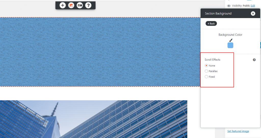
 To use scroll effects, first select a background. Then, click on “Settings.” You will see the options: “None,” “Parallax,” or “Fixed.” If you skip this step, BoldGrid will automatically select “None” for you, and the background will act in the customary fashion.
With a Fixed background, the image or pattern will remain in place while the content moves over it, as the user scrolls.
With a Parallax background, both the image and the text will move as the user scrolls, but at different rates. This creates a visually compelling, three-dimensional effect.

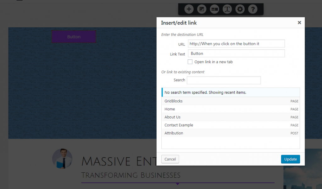
 If you click on the button itself in your Post and Page Builder design layout, a pencil and link symbol appear. These allow you to further edit the design or text on the button, and to remove or change the page that the button links to.
Pro tip: Be sure to use labels on your buttons that clearly identify what they do and why a viewer should click them. For example, use “Learn More” when linking to another article or “Sign Up” when asking website visitors to join your mailing list.


Getting Started
 Once installed, the Post and Page Builder automatically appears when you begin editing a portion of content within a page or post.
Depending on the section you edit, the Post and Page Builder adjusts to display a few commonly used actions appropriate for that type of content. If you need even more options, click on a section with an image and you will see the full Post and Page Builder menu.
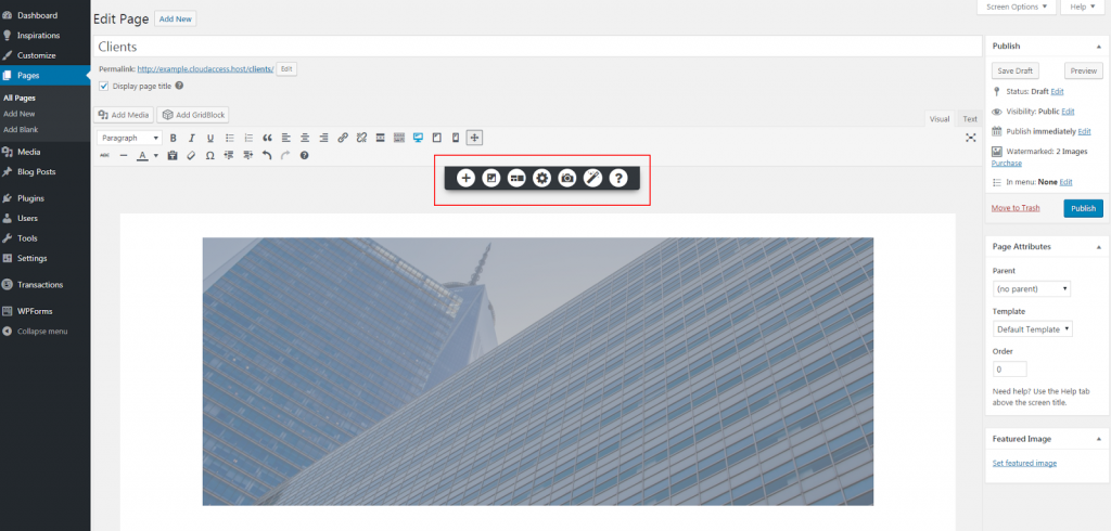 For this article, we will focus on using the “Add Item” option of the Post and Page Builder menu. When you click on the plus sign or “Add Item,” it allows you to add a new piece of media (i.e., a photo or video), a button, an icon, a Block, or a section.
Adding and Working with Sections
Say you want to add a new section. A section encompasses all of the various content that could be added to your page or post—such as rows, columns, and elements like text, images, buttons, and more. When you add a new section, you will see arrows at the top and bottom that allow you to expand or collapse the section to the desired size. A second toolbar will show at the bottom or right side with the following options: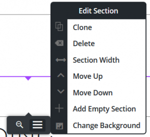 Clone creates a duplicate of the existing section, while Delete removes the entire section, including its contents. Using Section Width, you can expand or shorten the width of the section. To move this section higher or lower on the page, click Move Up or Move Down. You can also add a new, empty section from this menu with Add Empty Section.
Lastly, this menu provides a means to change the background. To add a background, choose whether you want to use an image, color, or pattern. You can use your own, or choose from our bank of images, suggested color palettes, or pre-designed patterns.
Scroll Effects
Take your section customization even further with our new addition: scroll effects. These will add effects to your background images which occur when a visitor scrolls up and down. Scroll effects bring a page to life and dramatically improve viewer interest and engagement.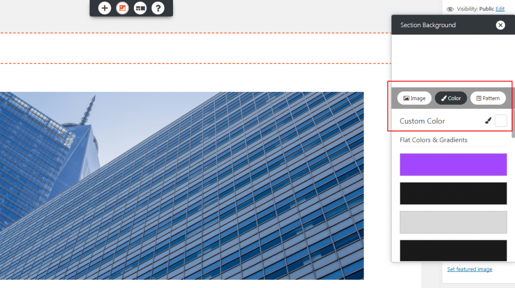 To use scroll effects, first select a background. Then, click on “Settings.” You will see the options: “None,” “Parallax,” or “Fixed.” If you skip this step, BoldGrid will automatically select “None” for you, and the background will act in the customary fashion.
With a Fixed background, the image or pattern will remain in place while the content moves over it, as the user scrolls.
With a Parallax background, both the image and the text will move as the user scrolls, but at different rates. This creates a visually compelling, three-dimensional effect.
Adding Buttons
Jumping back to the Post and Page Builder’s “Add New” menu, you can add elements that nest within page sections. Among these are buttons. Buttons are important features which encourage your website visitors to take a specific action, like signing up for your newsletter or downloading a form. With BoldGrid, you can choose from options we provide based on themes, your own buttons, or sample designs based on shape or depth. You can also customize the color appropriately or build your own buttons from scratch.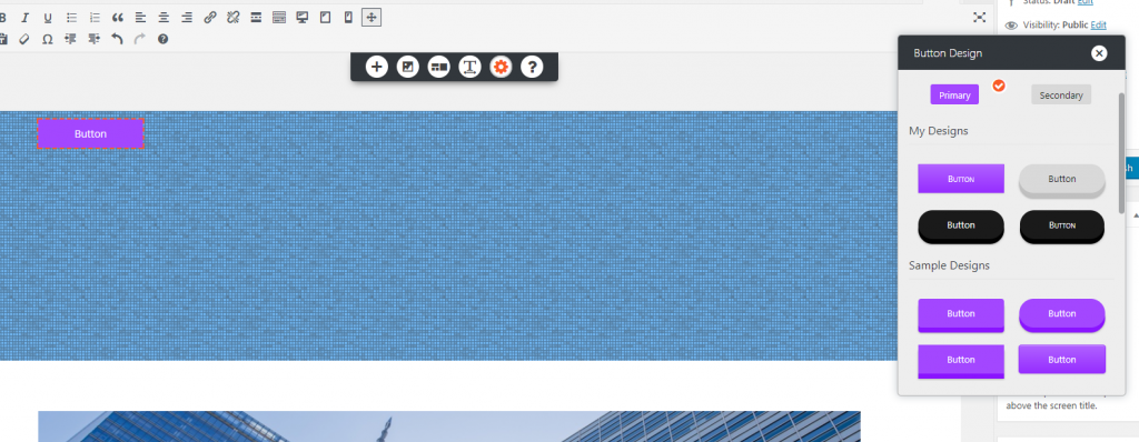 If you click on the button itself in your Post and Page Builder design layout, a pencil and link symbol appear. These allow you to further edit the design or text on the button, and to remove or change the page that the button links to.
Pro tip: Be sure to use labels on your buttons that clearly identify what they do and why a viewer should click them. For example, use “Learn More” when linking to another article or “Sign Up” when asking website visitors to join your mailing list.
