- AuthorPosts
- September 25, 2019 at 7:15 am #30472
David A Mulholland
GuestHi Guys, it seems I am forever on here with problems LOL
My homepage seems to have widened and is now way too big with the main pics that are supposed to cover end to end showing instead with huge gaps at each end?
Can you please help? https://businessmoneymatters.co.uk
September 25, 2019 at 12:08 pm #30473support
GuestHi David,
Thank you for contacting us and I am sorry to hear about the problems with the main image on your homepage.
Currently this is how the page looks for me when navigating there:

It appears to meet your criteria for having the image stretch the full width of the page and it looks like you were able the get that fixed. If that is not the image that should span the entire width or the website is displaying differently for you please let us know and we will continue investigating this problem.
- This reply was modified 1 year, 10 months ago by
BoldGrid Support.
September 26, 2019 at 2:16 am #30474David A Mulholland
GuestI wasn’t referring to the one image but the page as a whole.
The page has widened for some reason leaving huge gaps on either side of the text and the larger pictures which are actually your own blocks that are supposed to cover the page from end to end like the main picture does
If you look at the first red block you have shown here as an example that shows you what has happened..e.g. it should be right across the page (no black gaps on either end) as should all the other blocks and large background pictures on the page.
If you look at the Logo above the picture and the Menu, both of these should actually be at the extreme left and extreme right as you will know from your templates.
So why has this happened?
September 26, 2019 at 1:00 pm #30475support
GuestHi David,
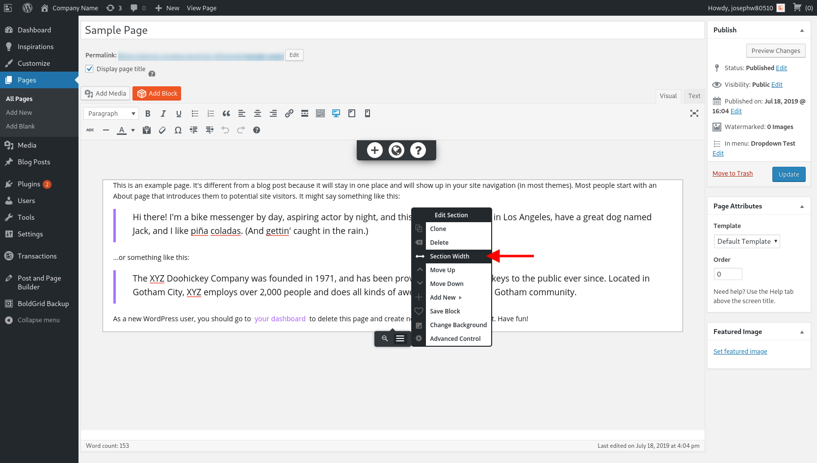
It looks like those sections on your website have a maximum width associated with them, and this is likely due to the Section Width setting for each of those sections.

The Section Width tool allows you to toggle the class assignment for each section between ‘container’ and ‘container-fluid’. Sections that have the ‘container’ class will display with those gutters on either side while ‘container-fluid’ ones will span the width of the page.
I hope that is the solution you need to get this display issue fixed and please let us know if there is anything else that we can do to help!
- This reply was modified 1 year, 10 months ago by
BoldGrid Support.
September 26, 2019 at 1:11 pm #30476David A Mulholland
Guestthanks Guys will try that, but they were ok 2 days ago and I havent touched any of those section width options so this shouldnt be happening?
September 27, 2019 at 4:03 am #30482David A Mulholland
GuestGuys I tried that and although it made the pictures wider it has also made everything else in the page including all the text much wider than it was before.
Examples below. first one is the size they should be and 2 is the size they are on live site.. right out to the end of page on each side.. Why has this happened?
You really need to see this on full screen on computer to see the difference


- This reply was modified 1 year, 10 months ago by
BoldGrid Support.
September 27, 2019 at 4:06 am #30483David A Mulholland
GuestI think my only option is to revert back to a previous save meaning I will have to re edit.
October 1, 2019 at 1:34 pm #30488Jesse Owens
GuestHello David,
Thanks for providing those screenshots. From what I understand, your goal is to contain the “Our Partners” blocks without having them take up the full width of your website.
When I’m taking a look at your website now, I do see that the blocks appear like your first screenshot, contained within the content row, 1170 pixels wide on a full-width screen

Out of curiosity, I noticed that this page also has the form you had previously mentioned in your other question thread, and that your form had been modifying the HTML markup for the page below the form. Is it possible the issues are related to each other? If, for example, your form was leaving an open <div> element, or had an extra closing </div>, that would explain the behavior you’re seeing.I hope you’ve got this resolved, please let us know if you’re still experiencing issues and we’ll be happy to help.
- This reply was modified 1 year, 10 months ago by
BoldGrid Support.
- This reply was modified 1 year, 10 months ago by
- AuthorPosts
- The topic ‘My page has gone way too wide?’ is closed to new replies.


