- AuthorPosts
- January 28, 2020 at 10:58 am #30744
kathleen
GuestWhen I am creating a page and choosing to align my words to the left or to the center, it does not look the same when I go to my public website. Instead, my website looks unaligned, messy, and unprofessional. This is very frustrating. I should not have to spend som much time spacing on Boldgrid, trying to get the correct alignment or spacing. PLEASE HELP
January 30, 2020 at 2:25 pm #30751support
GuestHi Kathleen, thank you for your question!
Our team is happy to answer any questions you have about working with your website.
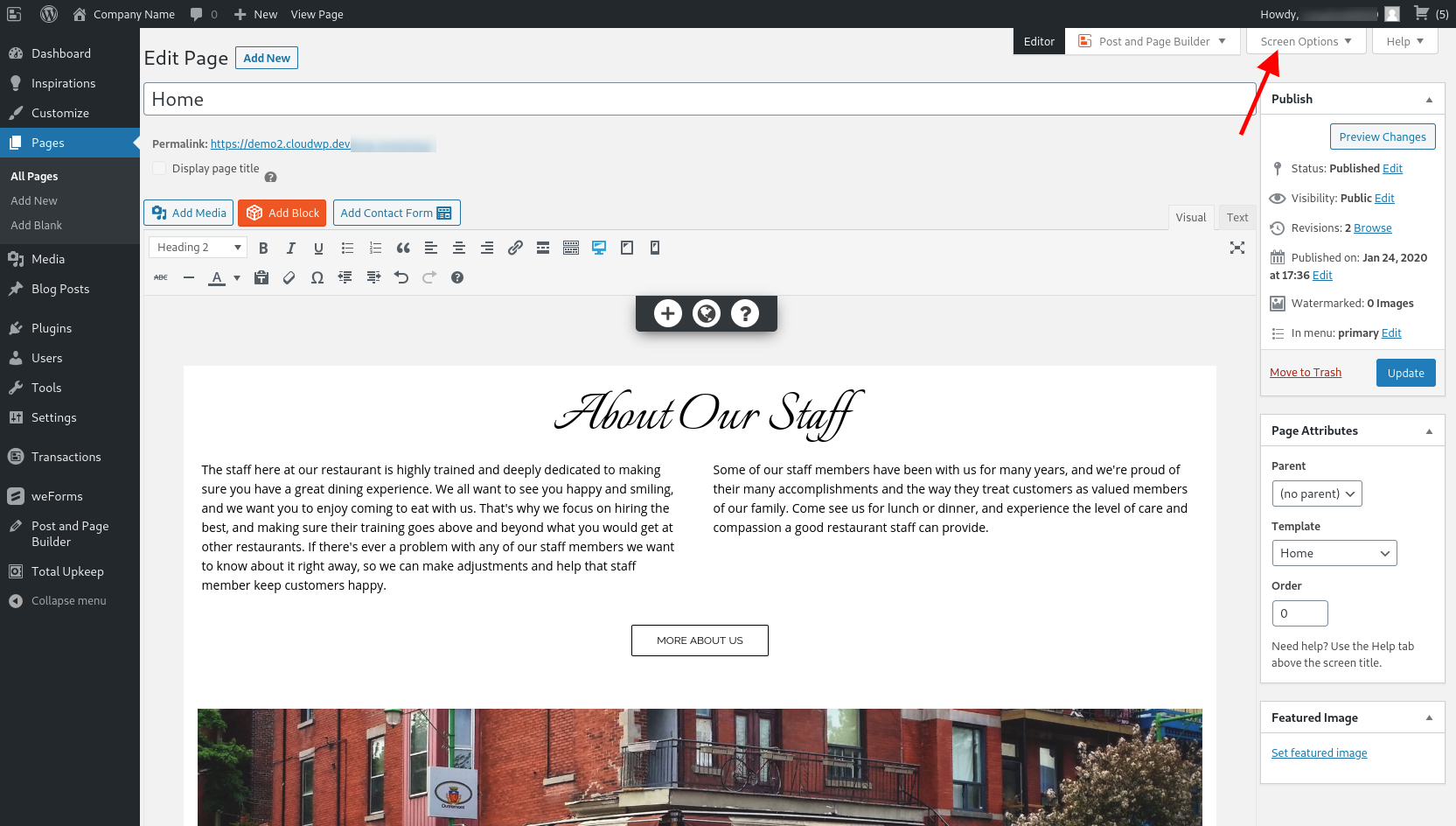
The reason that you are seeing a display difference between the editing interface and the front end of your website is because of the available space that your page content has to stretch across. While editing a page there are a lot of other items on the screen that reduce the available area and there are some configurations that you can make to help make the displays more similar.
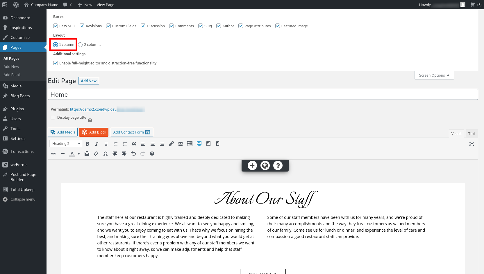
The first step is to use the Screen Options to change the editing panel to the one column display.


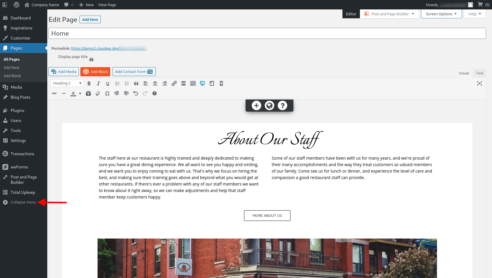
The next step is to collapse the dashboard menu.


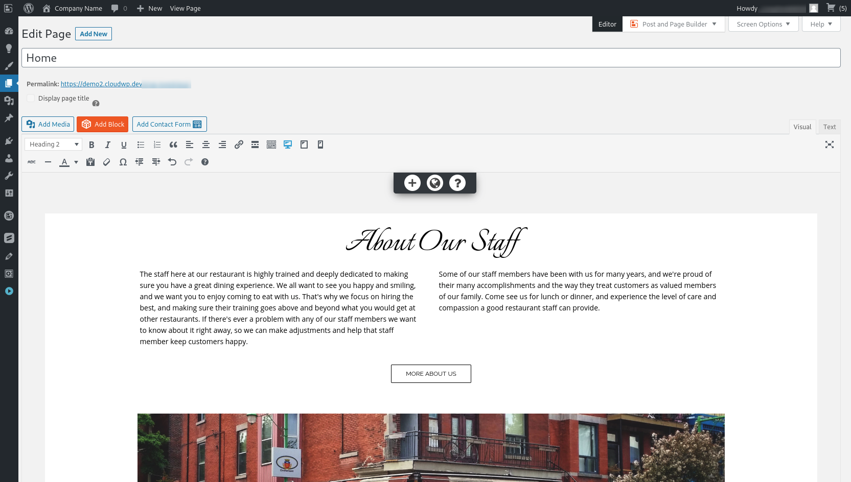
Doing this will expand your editing interface and should help you create a consistent design across the two different displays. Please let us know if there is anything else that we can do to assist you, we are always happy to help! - AuthorPosts
- The topic ‘Why does my words not line up on my website the way I lined them up on Boldgrid?’ is closed to new replies.


