BoldGrid is a series of plugins to help you quickly build a website. They include pre-built sets of pages called Inspirations. In essence, a BoldGrid Inspiration is a pre-built website populated with filler content. The quickest way to make a website with an Inspiration is to simply replace the filler content in the pre-built pages with your own. To aid you in making a decision on the Inspiration to use, I am highlighting the twenty different Inspirations.
These Inspirations were developed using responsive design, meaning that you can view these Inspirations on a computer screen, a tablet or a phone and the design will properly size itself to match the screen where it is being viewed. There are twelve categories specific to common industries used for websites. These categories determine the images that are being used on the site. For example, the Music category uses music related images. The images that are on the site are stock photo images, and some may require that you purchase a license. However, the expectation is that you will replace the text and images in the Inspirations to meet your needs. All of the Inspirations include three different page sets and this spotlight concentrates on the base page set (3 pages).
The BoldGrid Inspiration that we are viewing in this article is Vacation.
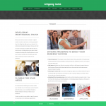
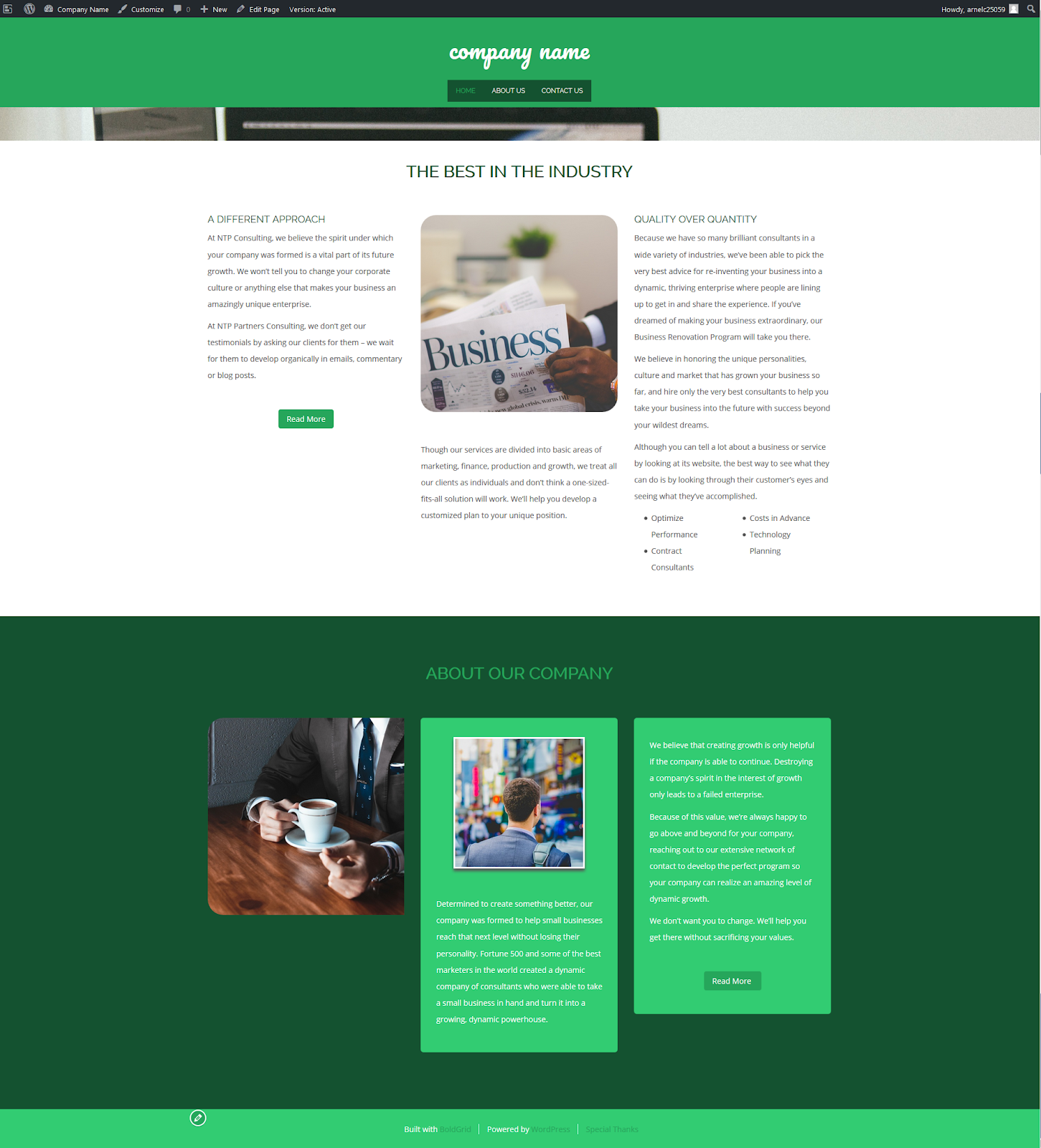
The Vacation home page focuses more on content as you add pages. This means that if use the pre-built 5-page set or kitchen sink (11 pages), you will see less of the background and more of the page content. The background image is set to 1920×1080 pixels and the site title is in a dedicated header bar with a font size of 42 pixels. The main menu is centered directly under the site title. To see how the home page looks as it is resized you can either resize a browser window or simply use the different preview options when you select an Inspiration in the BoldGrid Dashboard Inspirations section.
Vacation Home page with main navigation menus
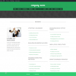
About Us Page
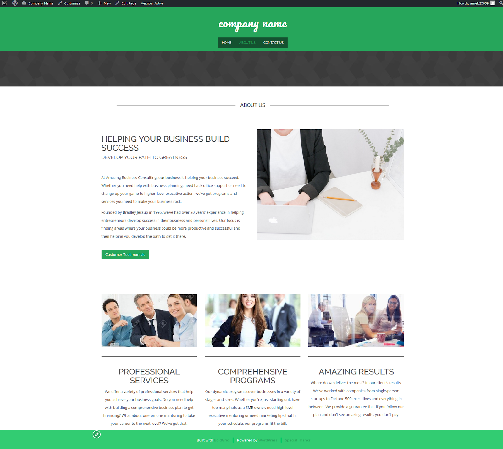
The About Us page includes a column of text on the left that includes a title and subtitle to describe your business, your cause or yourself/organization. Adjacent to the text on the right is an image that parallels the left column text. At the bottom of the About Us text is a link that can jump to a testimonials page. In the base set, this page does not exist as a separate page. You can add a different link, create a page, or remove the button as needed.
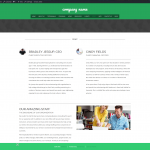
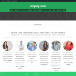
At the bottom of the page, you will see page formatted in 3 columns for customer testimonials. Each column is headed with an image and then has a title text underneath it.
Contact Us Page
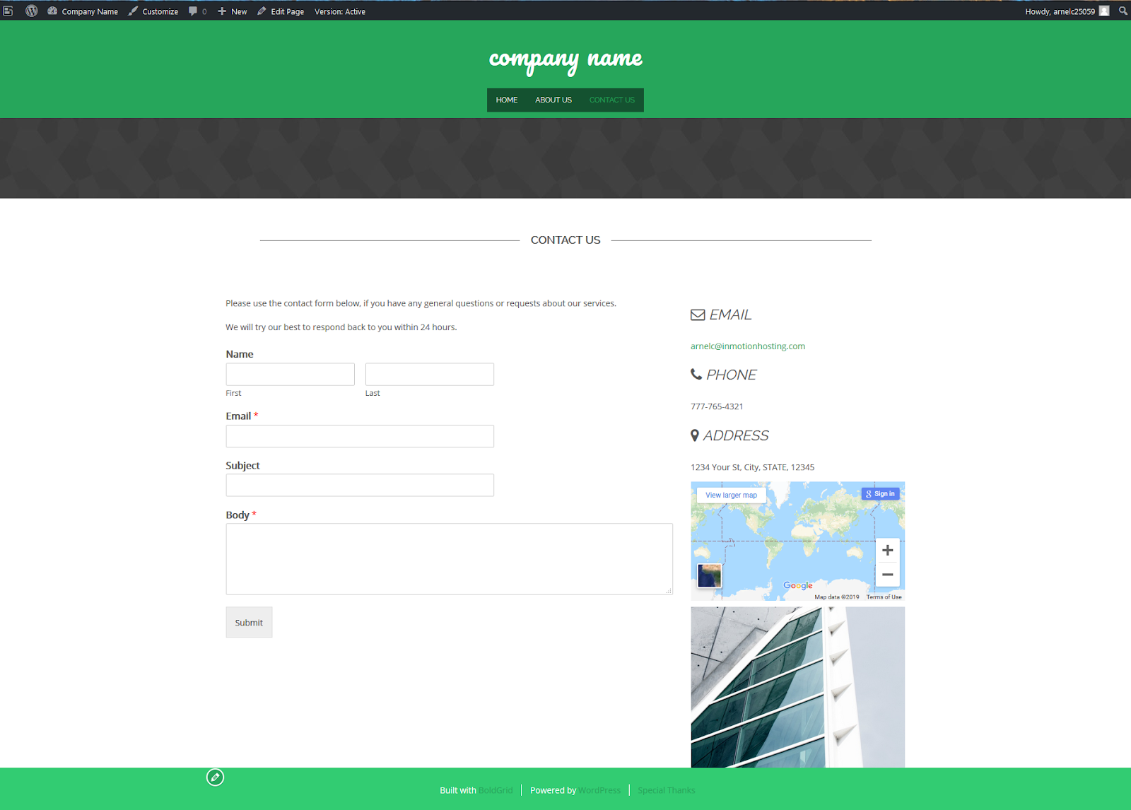
This page uses a form created with the WPForms so that your viewers can contact you. All of the BoldGrid Inspirations contact forms are standard. They show a form, contact information on the right-hand side, a map for your location, and an image. The form and the page can be changed within the BoldGrid Dashboard.
Inspiration Pages
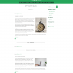
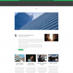
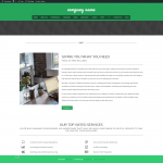
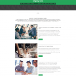
As previously mentioned there are 3-page sets. Each one builds upon the other. You also have the option to add a dedicated blog page. The gallery below shows a sample of each page:
SIGNUP FOR
BOLDGRID CENTRAL
200+ Design Templates + 1 Kick-ass SuperTheme
6 WordPress Plugins + 2 Essential Services
Everything you need to build and manage WordPress websites in one Central place.
