- AuthorPosts
- October 15, 2018 at 3:44 pm #29190
Nathaniel Muñoz
GuestHow can I make it so that my background photo on home-screen doesn’t get extremely zoomed -in when viewing on a mobile ?
October 16, 2018 at 6:01 pm #29191christopherm
GuestHello Nathaniel,
Thanks for submitting a question about background images. There are options in the Customizer that can prevent this. Which options have you tried so far?
Best,
Christopher M.
October 24, 2018 at 11:49 am #29192RonThomasDesigns
GuestI am having this same issue as well. I couldn’t find any of the options in the Customizer. I tried a different CSS that I saw but that didn’t work either. Could you point us to the right part of the Customizer?
October 24, 2018 at 2:55 pm #29193arnelc
GuestHello Ron,
I believe that the confusion lies in where you go to look at the background image. You will need to go to the Page Editor (using the Classic Editor) and then use the controls in the menu to select the different sizes. You can then go to the graphic and edit the size per the screen type (there’s a desktop, tablet, and phone view). If you continue to have problems with the issue, please try making changes there first.
October 29, 2018 at 3:13 pm #29194RonThomasDesigns
GuestI guess I am kind of confused as to your direction. I’ve looked through multiple menus, and can’t find anything that changes the background picture to the size of the mobile screen. Is there a specific menu or setting that you can direct me to?
October 29, 2018 at 5:00 pm #29195carlosd
GuestHi Ron.
I believe that the menu Arnel was mentioning is described here. However, the Settings for the Background Image only allow you to hide the image on the selected devices. The responsiveness of BoldGrid Inspirations should be automatic.
If you can reply back with the name of the Inspiration and the size/dimensions of the image you are using in your section’s background image, this will help to replicate and diagnose the issue.
Thanks.
October 30, 2018 at 10:12 am #29196RonThomasDesigns
GuestWe are using Swifty, and the picture is 1640 x 624.
October 30, 2018 at 11:14 am #29197christopherm
GuestDid you crop the image when selecting it as your background image, or did you select the “Skip cropping” option? I tested this in Swifty with an image that matched your dimensions exactly, and I selected to have it cropped. It responds perfectly in mobile view. However, I also tried it with “Skip cropping” selected and it still works. So I was not able to replicate this behavior even though I’ve seen it before.
October 30, 2018 at 12:12 pm #29198RonThomasDesigns
GuestI don’t remember exactly. But that shouldn’t make a difference right? It should still optimize the picture in mobile shouldn’t it? Are there other settings that may affect this?
October 30, 2018 at 3:40 pm #29199christopherm
GuestThe image dimensions will have an effect on the resizing behavior. The reason that’s there is to ensure that the image matches the the other elements on the page, which also resize in the mobile view. However, with some images this can have a jarring effect like the one you’re noticing. There are a few things you can try.
- Customizer: in the admin area of your site, (or in the toolbar) click Customize and then Background. This is where you can choose different display options.
- Try different images/sizes
- Consider using a solid color or pattern instead of an image
October 30, 2018 at 3:42 pm #29200christopherm
GuestThe part of the Customizer you’re looking for is Background.
October 30, 2018 at 4:26 pm #29201RonThomasDesigns
GuestWell, here is another issue that I just noticed pertaining to this as well. This happens even with the stock picture that came on the Inspiration. Nothing was changed with that picture either. There’s a picture of a skateboard and when in mobile view it shows just the very middle of the board and not all of it. Maybe there is something wrong with our version of it?
October 30, 2018 at 5:18 pm #29202christopherm
GuestIt doesn’t sound like there’s anything wrong with your version. You’re seeing a built-in feature in BoldGrid. Images will adjust slightly to align nicely with other elements in the layout. (You may also notice this effect on other popular websites.) The suggestions I provided above for the background image are still applicable. Were any of those helpful?
October 30, 2018 at 5:39 pm #29203RonThomasDesigns
GuestOK, so first I want to apologize for being dumb and not realizing my mistake and making it clear. This isn’t for the background of the site itself. This is for the background on a section/row. I am so sorry for making you guys do all this work only to realize I was giving you wrong info. So, a background to a row is not sizing correctly when on mobile.
October 31, 2018 at 9:32 am #29204arnelc
GuestHi Ron,
No worries, Ron. We understand that working on these things can be tedious and at times frustrating. Can you please provide us a URL to the page/post where you’re having the problem? It would help us to investigate the issue in more depth.
October 31, 2018 at 10:10 am #29205RonThomasDesigns
Guestlegionoftheleprechaun.com
October 31, 2018 at 3:02 pm #29206arnelc
GuestHello,
That URL is showing a maintenance page/coming
soon page that doesn’t let us see the page with the issue. Can you
please provide access to the page, or provide us the graphic and the
steps to how you’re applying it on the page so that we can duplicate the
issue and work to resolve the problem?October 31, 2018 at 3:47 pm #29207RonThomasDesigns
GuestThat is the page. The main image below the header and right above the coming soon message. We’re having the same issue on all the pages. It’s just a background for the section.
November 1, 2018 at 8:26 am #29208Nathaniel Muñoz
GuestI have attempted all customizing options, including image resizing. Furthermore, I have found out that this issue only happens on iOS devices. The problem still persists.
November 1, 2018 at 10:28 am #29209arnelc
GuestThanks Ron! The problem is that the image you’re using has all of it mainly elements focused on the right side of the image. The responsive coding for this image automatically resizes the image without regard to the placement of image content. The easiest way to handle this is to change the image so that the content will be positioned to account for the change in size. Otherwise, it will require custom coding in the CSS to use a different image when the size of the screen changes down to the phone size. You can also see an example why this is a tricky issue to resolve by looking at the answer to this question. The problem is that the required code will often be unique to the image. You may need to speak with an experienced web developer to help with the code if you intend to keep the same image. This is a common responsive design issue and is often resolved by an image change because of the custom coding requirements to accommodate specific image placements.
Apologies again for the frustration. Please let us know if you have any further questions.
November 1, 2018 at 11:23 am #29210RonThomasDesigns
GuestIf I change the image will it display the whole image or still cut it off? I’m confused as to why it would matter where the content in the image is. The page should adjust the picture for mobile no matter what right? It’s stated that Boldgrid is optimized for mobile.
November 2, 2018 at 3:42 pm #29215arnelc
GuestHi Ron,
I hope I can try to explain this so that it’s a bit clearer. This is a very common responsive design issue. There are three sizes that the theme responds too (based on bootstrap code and the standard they used for all of these themes). Basically, the 3 sizes can be considered the desktop, tablet and phone size. Each time screen reaches the smaller threshold, the media uses an automatically generated size of the image. When it reduces the size of the image, it is set to keep the scale of the image the same so that image is not warped. In layman’s terms, if you have a picture of people, the image of the people doesn’t squash them smaller or make them skinnier. I’ll give you an example of what happens in a screenshots below with the default background to the Swifty theme. So let’s look at the three sizes and see what happens to the image, text and menus on the screen.
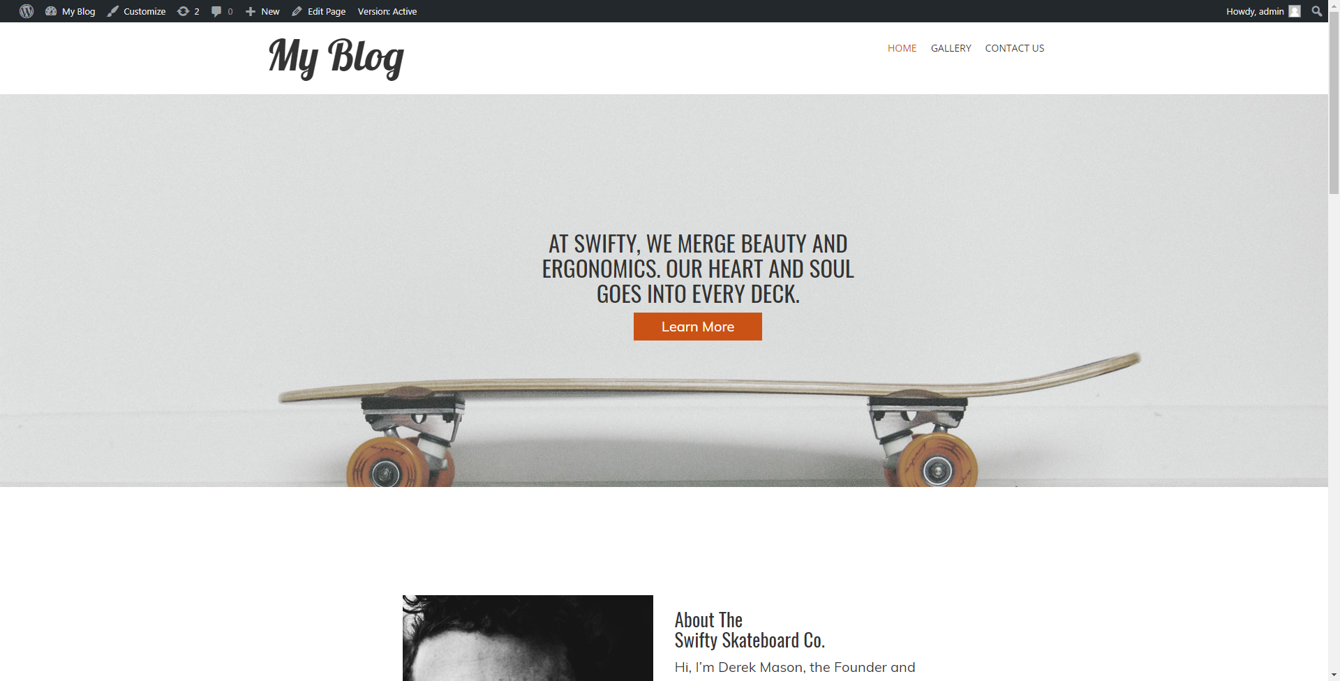
Desktop:

So in the Desktop,you have the image in its full size – the menu is showing, but there’s no issue affecting the image other than possible width of the section that I didn’t adjust in the BoldGrid editor.
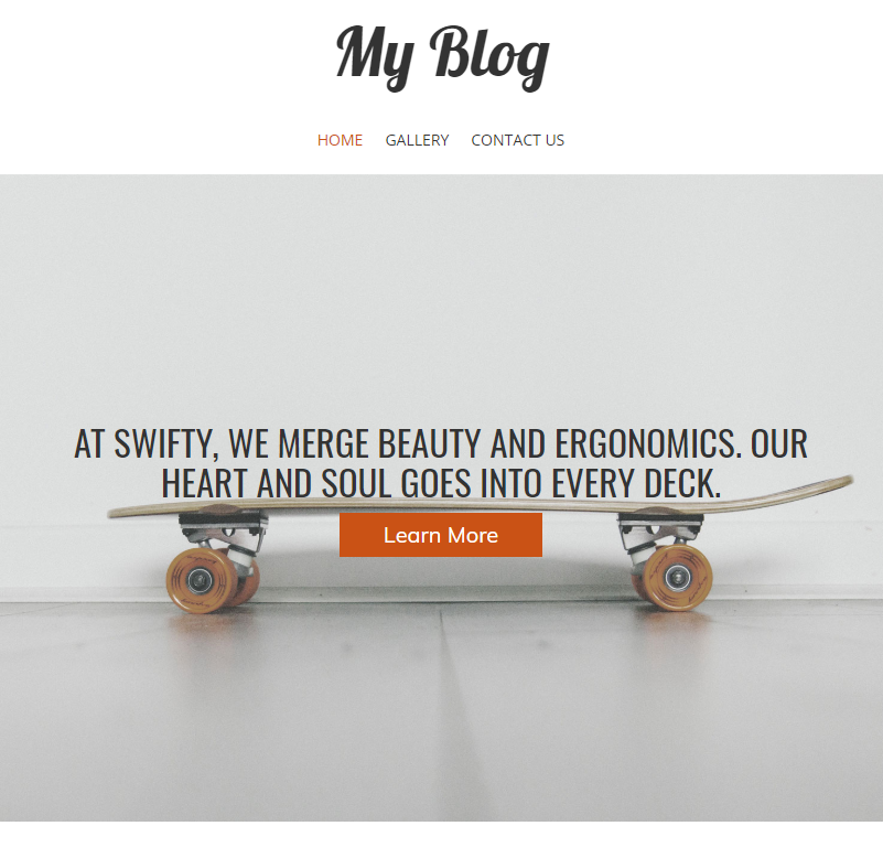
Tablet:

In the Tablet size the image width is reduced. This affected the title so that text is in the middle of the screen. The menu is only 3 items, so it is centered with no issue. As you noticed in your image, there is still little effect to the elements of the image because they still show the majority of the image while retaining the appropriate size of the image.
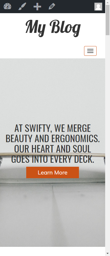
Phone:

So, here you can see the most dramatic effect of the responsive code on the image in the phone size. The menu has changed to a hamburger menu – which will show the menu items when you hover over/touch that button. The text in the menu (the call to action) has been set to 4 lines and is now centered over the graphic. The graphic however is no longer recognizable because it has been cropped and centered automatically. The code cannot sense where the elements in the image are located and therefore cannot properly size the image so that it remains visible for the phone size.
This is a common design problem because the intent of responsive design is to deliver ONE design solution that will automatically resize to the media being used to hold the image (media = screen). So, the programmatic solution will be to change the code so that it accommodates the image. The image would need to be manipulated by the code when it reaches the phone size so that you properly see what the designer wants you to see. This is typically custom coding because the image will always be different depending on the website being created and/or it depends on what the site owner wants to appear in this state.
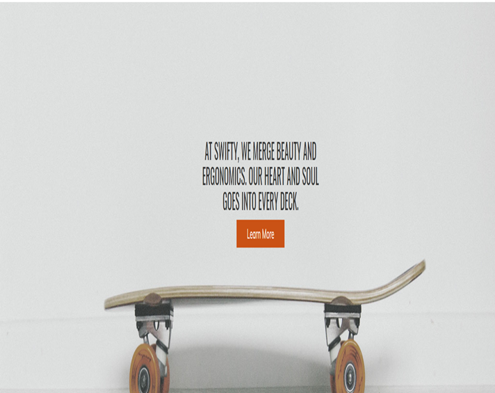
The image ratio is kept constant in order to keep the image scaled as per its original size. If the image were to be changed without regard to the ratio, then it would become warped. For example:

I didn’t take this all the way down to phone size, but you can see what’s happening. The image can be warped to the point that will be unrecognizable.
The code that I provided in the link above (the question and answer from Tim E.) has code that you are welcome to try to use for your image. You can also change the image so that whatever appears at the phone size will be appropriate to the site.
Changes to the existing code are considered custom code which is outside of the scope of support. This is because a change for one site may not apply to another resulting in unending variations based on custom images. Changing the image would probably be easiest. An experienced Web developer can also help to change code so that the image properly appears based on the phone size. This can be done using Custom CSS code.
I sincerely hope this helps to explain the issue. I do apologize again that we can’t provide a more direct answer. I hope the solutions I’ve offered can help you resolve the issue. If you have any further questions or comments, please let us know.
Kindest regards,
Arnel C.
- This reply was modified 2 years, 9 months ago by
BoldGrid Support.
- This reply was modified 2 years, 9 months ago by
BoldGrid Support.
November 5, 2018 at 2:49 pm #29216RonThomasDesigns
Guestwould that be the same code if the picture in question isn’t technically the background for the site? or would it have to be changed to deal with images themselves?
November 6, 2018 at 8:09 am #29217christopherm
GuestThat code targets the CSS selectors and not the images themselves, so that code would be applicable for potentially any image.
November 6, 2018 at 12:40 pm #29218RonThomasDesigns
GuestOK, unfortunately I’ve put it in and nothing changes, at least when not viewing the mobile option. And due to our site being pretty graphics based, I think I’m going to try a different theme. Thank you all for all of your help, you have been amazing.
November 6, 2018 at 1:06 pm #29219christopherm
GuestNo worries, Ron. Thanks for your patience!
- AuthorPosts
- The topic ‘How can I make it so that my background photo on home-screen doesn’t get extremely zoomed -in when viewing on a mobile ?’ is closed to new replies.


