- AuthorPosts
- December 16, 2020 at 11:15 am #32262
Emily Stoll
GuestHi there,
I designed a website using BOLDGRID for our business and it has never seemed to be very mobile friendly. I finally got frustrated and sorta just let it go, but I am back working on it and am hoping ya’ll can offer some advice as to how to fix it? I’m not all that tech savvy, but am hoping it is something I can fix. We are fairly happy with how it displays on a desktop, but it doesn’t seem to scale it’s self down for mobile viewing. Thanks, EmilyDecember 16, 2020 at 11:36 am #32290Jesse Owens
KeymasterHi Emily-
I’m seeing a couple of things you’ll probably want to do to improve the mobile resposiveness.
First, it looks like you’re on a pretty old version of the Diced Theme, 1.22.1, which was released in Nov. 2017. We’ve made a lot of improvements to the theme in the last three years, so I’d highly recommend making a backup of your website and then updating your theme, plugins, and WordPress Core.
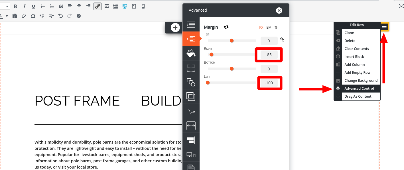
Next, I’m seeing some of your pages with strange negative margins, like the Post Frame Buildings page. These would have had to be manually configured to be that way in the Advanced Controls section of your builder:

For pages like this one, I’d recommend re-writing them using the pre-designed blocks available from the Add Block interface, so that you don’t have to worry about making custom margins and designs.
- AuthorPosts
- The topic ‘Doesn’t seem to be mobile friendly’ is closed to new replies.
