- AuthorPosts
- January 4, 2021 at 6:07 pm #32650
kraus.ric
GuestHello
There appears to be an issue which I believe originates from something going on, on the Home screen and extends itself into the other pages.
It behaves a little differently on the Home Screen than it does the other pages. I’ve inspected the html element, and I thought I could write a Custom Theme JS & CSS statement and edit the CSS/HTML Editor, but it didn’t work out the way I thought it would, and I can’t figure anything else out for it.Visually, the thing I’m looking at is, near the bottom of the Home screen, a black bar about the height of your sideways thumb that extends the width of the page. On the other pages, it seems like it’s the same exact thing only it appears more in the middle of the page.
I am asking for your help reducing this wide black line to being nonexistent, if at all possible, so that the spacing of all the different design objects around it can benefit from it’s absence.
My attempts to modify this on my own are logged below the signature line of this message, I didn’t really log my non-code attempts.
Thanks very much.
Sincerely
Ric KrausI couldn’t really successfully isolate the html element on the pages.
On the Home screen, however, the html element seems to be the following because it highlights the entire selection of the thing I’m looking at:
<div class=”entry-content”>
<div class=”bgtfw “>
<div class=”boldgrid-section”>
<div class=”container”>
<div class=”row”>
<div class=”col-md-12 col-xs-12 col-sm-12″>
</div></div></div></div></div></div>CSS/HTML Editor snippet in style.css, ln 61;
.page-template-page_home .entry-content .bgtfw > .container-fluid {
padding: 100px 0;}So I changed it to padding: 0px 0; and just padding: 0; both in the CSS/HTML Editor and the Custom JS & CSS section of the Customize view pane, and refreshed the website, etc.;
But no dice. Nothing changed.
And I saw one other item that seemed promising, but ultimately changing this also seemed to do nothing.January 4, 2021 at 6:19 pm #32691Jesse Owens
KeymasterHi Ric-
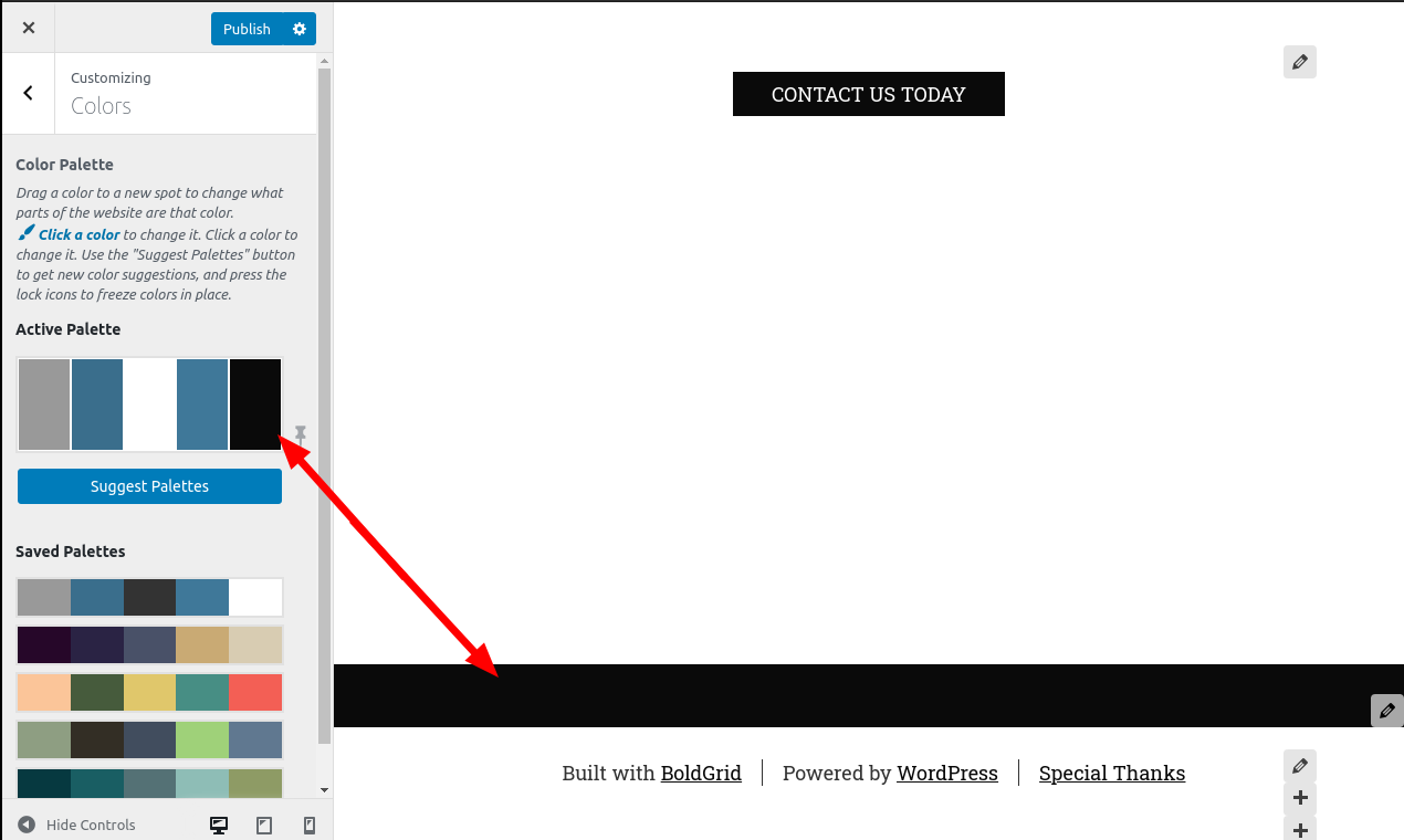
This black color is actually coming from the entry-content’s background color. The reason that it’s lower on your home page compared to other pages is that by default, your home page has a larger header than others.
There’s two ways you can fix this. Probably the best way is to change your Color Palette. This background color is coming from the 5th color of your palette. Navigate to Customize > Colors and check the last color in your palette.

You can also accomplish this with Custom CSS if that affects other parts of your website that you still want to have the black color. Use this rule:
.palette-primary .site-content { background: #fff; }You should take caution to make sure you set your text color if you do that, as the default text color will be meant to contrast with the background color.
- AuthorPosts
- The topic ‘Visual Element Issue’ is closed to new replies.
