Tagged: Swifty
- AuthorPosts
- October 8, 2021 at 6:07 pm #43542
Pia
GuestHelping friend with his website and previously the background image of a vineyard appeared but today it has disappeared. Have gone to that section and reloaded the pic, but only blue sky appears. Checked the code and it is in there. Thinking the image in the media library needs to be resized. It is 1920 x 1080. Or, is there some other issue?
October 8, 2021 at 6:24 pm #43546Jesse Owens
KeymasterHi Pia-
Thanks for reaching out! The exact scale and view of that image is going to be heavily dependent on the size of the device viewing it, so there isn’t an “ideal” size for it exactly.
You’ve already got the settings for the background set to show at the maximum vertical value, so changing a setting in the Post and Page Builder won’t really do the trick either.
There are two things you could do to show more of the landscape. I’d recommend cropping some of the sky from the top of the image. That will be the most reliable way to make sure the landscape is visible on different screen sizes.
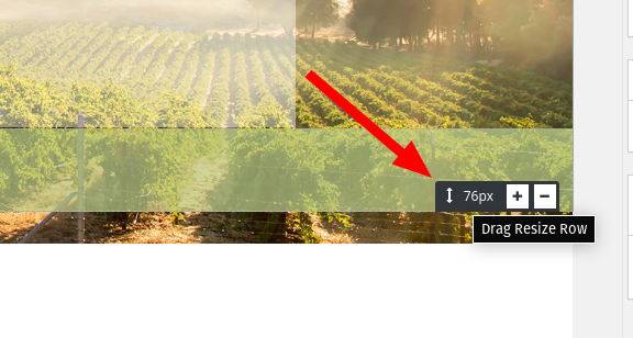
You could also increase the height of the block by dragging the bottom row size slider down:

This will expand the size of the block to show more of the image, but it may look better on some devices than others.October 11, 2021 at 11:38 am #43549Pia
GuestHey, Jesse, thanks for the great guidance! Much appreciated.?
- AuthorPosts
- The topic ‘Swifty header image ideal size’ is closed to new replies.
