Tagged: Crio, Menus, Post and Page Builder, Responsive Design
- AuthorPosts
- May 16, 2022 at 12:23 pm #52931
Karen Lewis
GuestHi there,
I have two different questions. The first one has to do with menus. Is there a way to show only certain menu items on certain pages but not others? For example, if I want to send someone to only one section of my site, without links to the rest of it. Also is there a way to have menu items appear under top menu items? For example, let’s say you have a main menu item of “Portfolio” and then you want to have “graphic design” and “surface design” as links as well, but just want them to show when you roll over “Portfolio”I also have a question about controlling how the content looks on different devices. It seems that if I alter something in one layout that it changes in the other layouts. Is there a way to control them independently? Am I just not seeing the controls?
My last question is about editing pages. Is there a way to see all the fields as you build a layout. Currently I can only see the columns and rows when I roll over them and then they disappear.I would like to be able to see a whole grid set up before dropping things in.
Thanks for the help,
A beginner,
KarenMay 16, 2022 at 3:08 pm #53110Brandon C
ParticipantHi Karen,
Thanks so much for reaching out and thank you for using Crio Pro WordPress theme!
You can definitely incorporate different page header menu displays for individual pages and post by using a the Custom Page Headers tool that is native to Crio. You would first need to create the custom menus that you would like to display on each page by navigating from your WordPress Dashboard to Appearance < Menus.
After creating your menus navigate to Crio < Page Headers and create a custom page header for each of your menus. Now you can use your newly created custom page headers on any page or post with BoldGrid Post and Page Builder. You simply need to set the Page Header attribute to whichever one you would like to display.
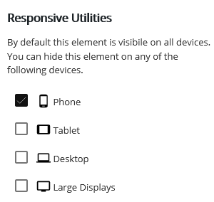
Now lets address you second question. The responsiveness of many website areas in Crio, like the header and footer sections, are automatically designed to shift their content to create a readable mobile display. There are also some Responsive Utilities provided by the Post and Page Builder that allow you to select the device type and change how your content looks for difference screen sizes.
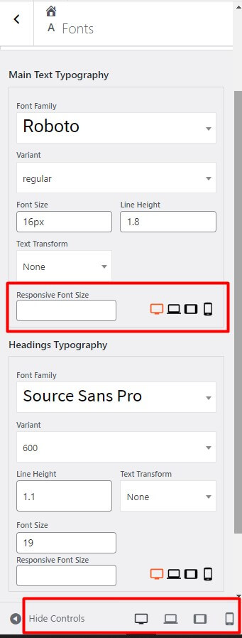
The responsive utilities icons on each page allow you to adjust block elements according to screen size without effecting the other device sizes. When you select a specific device size you the Post and Page builder will adjust and show you preview of your page in whichever size you choose.

You can control global typography from the WordPress customizer inside of the Appearance < Customize < Fonts section.

To take it a step further if you would like to remove the auto-hyphens for Headings and Sub-Headings in your content you can add this “CSS” snippet to the CSS/JS editor section of your customizer:
.palette-primary .h1, .palette-primary .h2, .palette-primary .h3, .palette-primary .h4, .palette-primary .h5, .palette-primary .h6, .palette-primary h1, .palette-primary h2, .palette-primary h3, .palette-primary h4, .palette-primary h5, .palette-primary h6 {
    word-wrap: normal;
    hyphens: manual;
    -webkit-hyphens: manual;
}
I hope this helps! Please let us know if you have any other questions for us!
- AuthorPosts
- The topic ‘Is there a way to show only certain menu items on certain pages in Crio WordPress theme?’ is closed to new replies.

