Tagged: Crio, Page Headers
- AuthorPosts
- September 13, 2022 at 9:43 am #57226
Frank Saia
GuestSeptember 13, 2022 at 10:10 am #57364Brandon C
ParticipantHi Frank,
Thanks you for reaching out and thanks for using Crio Pro WordPress theme!
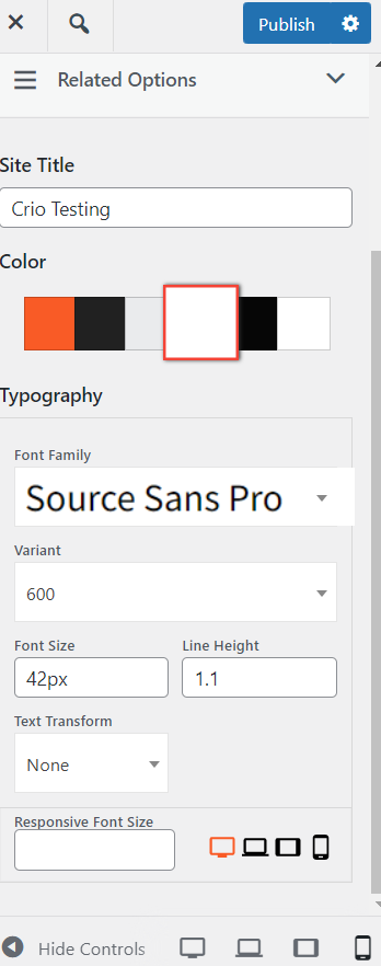
You can control the responsive font size of your Header Text in the Crio Customizer by navigating from your WordPress dashboard to Customize > Appearance > Design > Site Title and you can set a Responsive Font Size which will only display on smaller devices.
I hope this helps. Please let us know if you have any other questions for us.
September 13, 2022 at 10:22 am #57366Frank Saia
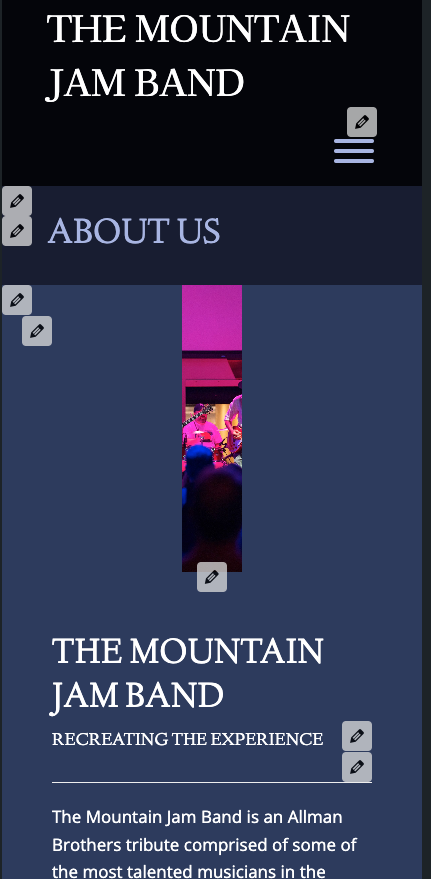
GuestThe font is not the problem it is the image as shown in the pics I attached. There is an issue sizing the image when the responsive page shifts to mobile sizing. Please help with the image issue.
September 13, 2022 at 10:29 am #57369Brandon C
ParticipantMy apologies Frank,
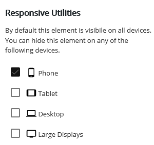
I wasn’t able to see your first screenshot until actually publishing the page so I was thinking the problem area was the actual page header itself. This is a similar issue but you can use the Post and Page Builder responsive controls to set the same image to display on mobile with less padding.
Edit your page and select the image element, click the hamburger menu and then Advanced Control and you’ll see the responsive options there as well.

We have a guide that explains how to do this in detail.
I hope this helps Frank!
- AuthorPosts
- The topic ‘Mobile header text not sizing correctly in Crio WordPress theme’ is closed to new replies.


