With BoldGrid Crio, our WordPress theme for business, you can use a color, video, or image for the background of your website header design. The header background options are found in the Customizer:
- In the Dashboard navigate to Appearance → Customize
- In the Customizer menu navigate to Design → Header → Background
- Here you will see 3 design options – Background Color, Header Video, and Header Image
How to Change the Header Background Color
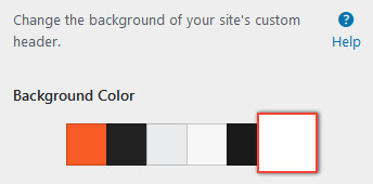
You can select a header background color from the theme’s color palette. If you want to use a different color than what is shown, you will need to first add that color to your palette from Customizer > Colors.
This color will be shown globally across the site unless an image background is added lower in this panel, and conditionally with video backgrounds, as discussed below.
Add a Header Background Video
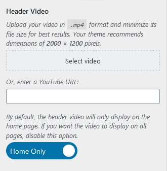
The second option is for a header video background. The recommended resolution of the video is HD (2000 x 1200 pixels).
Note: By default, the video background only displays on the home page. If you want it enabled for all pages, click the blue toggle on Home Only and then the video will show across the site on desktop and tablet. On mobile, the home page uses the background color selected at the top of this panel to prevent long load times the video would cause on mobile networks. The color can be seen in the live preview by clicking the phone icon at the bottom of the Customizer.
If you are hosting the video locally in your WordPress installation, click the gray Select Video button to upload it to your media library. Be careful with this option! Adding the video from here could cause slower load times, as it would depend on your personal web hosting server. And depending on the size of the video and the terms of your web hosting account, you could go over the data limits.
The option we recommend is the YouTube URL. Creating a YouTube account is free so you can easily upload the video there and then copy and paste the link into the Customizer.
Once a video has been added, a new header background option appears at the bottom of the panel – Header Overlay, which is discussed later in this article. Since the video is only shown on the homepage, you can use a header image background in conjunction with a header video background, which we will go over next.
Add a Header Background Image
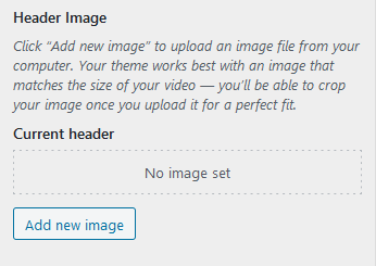
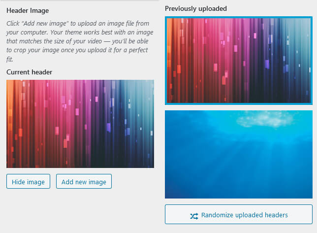
To add a header background image click the gray Add new image button to open the media library. You can choose an existing image or upload a new one. The recommended size for the header image background is 2000 x 1200 pixels.
Uploading more than one image allows you to click the gray Randomize uploaded headers button. This option displays a different image each time a page is loaded, even if you refresh the current page.
After an image is added, clicking the gray Hide image button will keep the image as an option in the Customizer but not show it from the live site. If the Randomize uploaded headers option is being used, this button will disable it.
Once an image has been added, a new option appears below – Header Overlay.
Add a Color Overlay to the Header
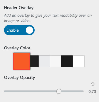
Using an overlay on your header background image or video can help your design be more accessible to your users by improving the contrast between the image and text. Keep in mind this overlay will be used for the video and image backgrounds if you are using both.
To enable the Header Overlay options click the gray Disable toggle, this will change the toggle to be blue and say Enabled. Now you can select your overlay color from the theme’s color palette, and change the opacity of that color if needed.
Once you have the header background designed, don’t forget to hit the blue Publish button at the top of the Customizer to save your changes.
Troubleshooting
Remove the “Venetian” Triangles
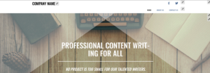
One of the theme sets in BoldGrid Inspirations includes a decorative, triangular semi-transparent background at the top of the page. If you’d like to remove these, you can do so with a little bit of Custom CSS. Navigate to Customize > CSS/JS Editor and paste this line into your CSS Code:
body:after, body:before { border: none !important; }
Congratulations!
If you have any questions about the background options for your WordPress website header, please let us know below. Next, you may want to learn how to work with menus in BoldGrid Crio.
SIGNUP FOR
BOLDGRID CENTRAL
200+ Design Templates + 1 Kick-ass SuperTheme
6 WordPress Plugins + 2 Essential Services
Everything you need to build and manage WordPress websites in one Central place.
Sharicita says:
I have two questions please..
1) I would like to add a gradient to the header masthead background. I do not see any options or ways to do this except by perhaps adding some custom CSS.
2) I also would like to be able to have the header span the full width of the viewport, but have not found a good, simple way to do this this in settings. The container always keeps it constrained. I would like the logo to be able to go as far left as possible in the header, with a search to the far top right, and the main site navigation below the search, also aligned to the far right. I’ve accomplished all of this except for it being constrained within the boundaries of the smaller container.
Thank you for your time.
Brandon says:
Hi Sharicita,
We appreciate you reaching out. Could you reach out with this same question to our Support Forum and include the URL to your website? We would be happy to take a closer look for you.
Sharicita says:
Thank you, I have responded using the URL you provided.
Brandon says:
Thank you Sharicita! We’ve received your inquiry in the forum and will address it there.
Peter says:
In customiser, my header is my logo on a white background. It looks correct in the customiser, but when I go to my actual page the header is totally black and does not show my logo but instead has my business name written in white font.
How do I fix this?
Brandon says:
Hi Peter, this type of issue is most commonly due to caching. Trying purging all cache associated with your website including browser cache. Then refresh your live page, or open it in an incognito browser. Hope this helps.
Pedram says:
Thanks for the suggestion, I cleared all caches but unfortunately that did not solve the issue….any other suggestions?
Brandon says:
There could be a conflict in the theme itself that is preventing it from updating. If you would like us to take a look at your website and give you our suggestions you’re more than welcome to start a new Support Forum thread. Be sure to include a link to your site.
Peter says:
Thanks Brandon, I have started a new thread.
Gabe says:
Hello. I would like to remove the kinda translucid triangles that show on the homepage and cover both the header and part of the body. I don’t find a way to do so. Could you help me out?
Jesse says:
Hi Gabe-
Thanks for the great question. I’ve updated the article above with instructions to get rid of those.
Gabe says:
Thank you! Thank you! Thank you! 😀
webworx says:
Well, it’s good to know that there is a solution and I would be happy to move to a Pro version of the theme, but the client does not want a subscription-based theme. We are more apt to find another theme despite the work it will take to put everything back in place. Is there a Pro version that is a one-time fee? That would please me and my client greatly! Thanks for your response and your work to date.
Jesse says:
Hello-
Since your client is using one of our Platinum WordPress Hosting partners, DreamHost, Crio Pro is included with the hosting package, no additional purchase is needed. Here’s some more info about using Custom Page headers.
webworx says:
The proportions for the mobile device and the desktop are different. As I shrink the screen on the desktop, it does indeed take on the look responsively of the phone, but the Desktop view in full screen is proportionately only a quarter of the height of the mobile device. If there were a way of using a different image for desktops, tablets and phones, that would be acceptable, but otherwise, I’d prefer for the desktop view not to use up as much real estate as the phone. If you would like to see it in action, you can go to https://karenbleiferltd.com
Joseph says:
Thank you for sending us that information!
The best way to use two different background images for your mobile and desktop headers is to take advantage of the Custom Page Headers feature included in Crio Pro.
Our Community Manager Jesse even created a video tutorial on how to create this exact configuration using the Custom Page Headers feature and I hope that the video will help you create that design on your website!
https://youtu.be/2wBzC9BVZos
Please let us know if you have any other questions for us, we are always happy to help!
webworx says:
I am using the BoldGrid Crio theme and have uploaded an image for my background header. The recommended size is 2000×1200. This looks great on for mobile phones, but does not resize nicely for desktops. Is it possible to have a single image work responsively in a better way (even if it is to upload a small, medium and large image to accommodate this)? Thanks!
Joseph says:
Thank you for contacting us! Sorry to hear that your background image isn’t resizing as desired for desktop displays and we will do everything we can to help!
What kinds of issues are you seeing with the desktop resizing? Is the image position incorrect? Is the background image area not tall enough when viewed on a desktop? If possible, could you also include a link to your website so our team can witness the background image problems firsthand? Any additional information you can send us about the problems with the image is greatly appreciated and will help us get a better understanding of the situation so we can find the best solution!
Thank you for your patience while we get this sorted out!