This tutorial covers creating a custom WordPress Block with the Post and Page Builder.
After mastering the basic structure of a Block, the next step is to add content to your Block within the columns you have laid out. The following guide will walk you through adding content that uses the responsive breakpoints set up within the Boldgrid Theme Framework. We will be using the following example Block that will show 4 full width columns on your phone, 2 rows with 2 columns in each on your tablet, and 1 row with 4 columns on your desktop.
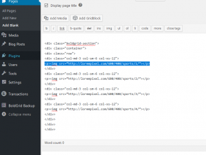
This is the example code we used in the first guide which explains the Block Structure, and we will be adding images to it.
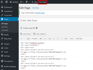
Adding content
Congratulations! You now know how to add content to your Block.
Checking the Breakpoints
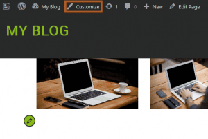
To check the different screen sizes, and ensure that your Block is set up correctly for them, you can use the viewport preview tool that is built into the Customizer. The following guide will explain how to use the preview tool to check all 3 screen sizes.
Congratulations! You now know how to add content to your custom Block, and preview it across multiple device types. The next step is to style your custom Block content.
SIGNUP FOR
BOLDGRID CENTRAL
200+ Design Templates + 1 Kick-ass SuperTheme
6 WordPress Plugins + 2 Essential Services
Everything you need to build and manage WordPress websites in one Central place.

