
The parallax effect is an effect used within websites to create the illusion of depth. It is created when a foreground image moves a little faster than a background image. It can involve a few images or several. The following tutorial will show you how to create the parallax effect using the section editor of the BoldGrid WordPress Page Builder.
How to Create the Parallax Effect
Here you will be creating a page with a blank background in order to start the process.
 Log into BoldGrid.
  Under Pages click Add Blank
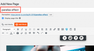
  Click Blank Page
  Provide the page with a title
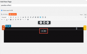
  Hover over the body of the page until you find the section menu.
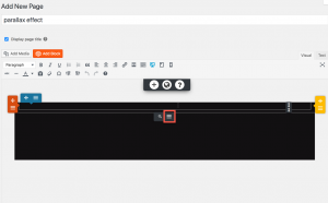
  Click the three horizontal bars
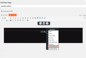
  Click Change Background
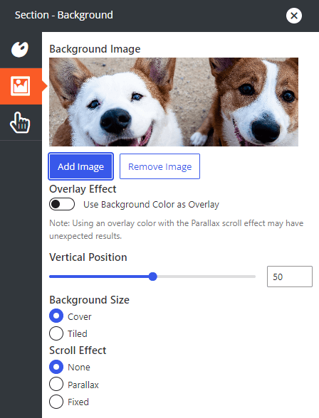
  Select Image on the left side of the panel
 - Click the blue Add Image button to choose your image
- Under Scroll Effect choose Parallax
- Click the X to close the window
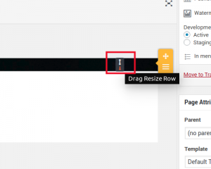
 Hover over the newly added image and use the arrows to adjust the size as needed
You can add as many images as you want. When ready, you can add content beneath or above these images. Scrolling through the page now in Preview or after publishing will perfectly demonstrate the parallax effect in action.
Be sure to update or Publish your page when ready in order to save the changes you made.
SIGNUP FOR
BOLDGRID CENTRAL
200+ Design Templates + 1 Kick-ass SuperTheme
6 WordPress Plugins + 2 Essential Services
Everything you need to build and manage WordPress websites in one Central place.



TC says:
I added background through the customize option, my problem is how to get the parallax effect between sections. When I add a new section, it attaches itself to the previous section with no background in-between.
Joseph says:
Hi TC!
If you want the background your configured in the Customizer to show through the Sections in your page content then you can do by setting a transparent background on each of your page Sections. Click on the Edit Section tools for the Section that you want to change to use a transparent background and select the Change Background option from that menu.
Next, click the Color option to open up the background color controls for your Section and select the Custom Color option. Move the Transparency slider on the right all the way to the bottom to make the background of your Section transparent and show the background you configured in the Customizer.
One thing to keep in mind is that you probably won’t see the background show up in the Visual editor, but when you save your changes and view the page you should see your image come through as expected. Please let us know if you have any other questions for us!
Fadil says:
How to add image mentioned above?
Jesse says:
Hi Fadil-
The images described in this article are backgrounds, which is what gives them the ability to have the Parallax effect. In steps 5 and 6 above, you’ll see how to add a background image to a section element, but you can also add a background to a row or column element and use this process to add the Parallax effect.