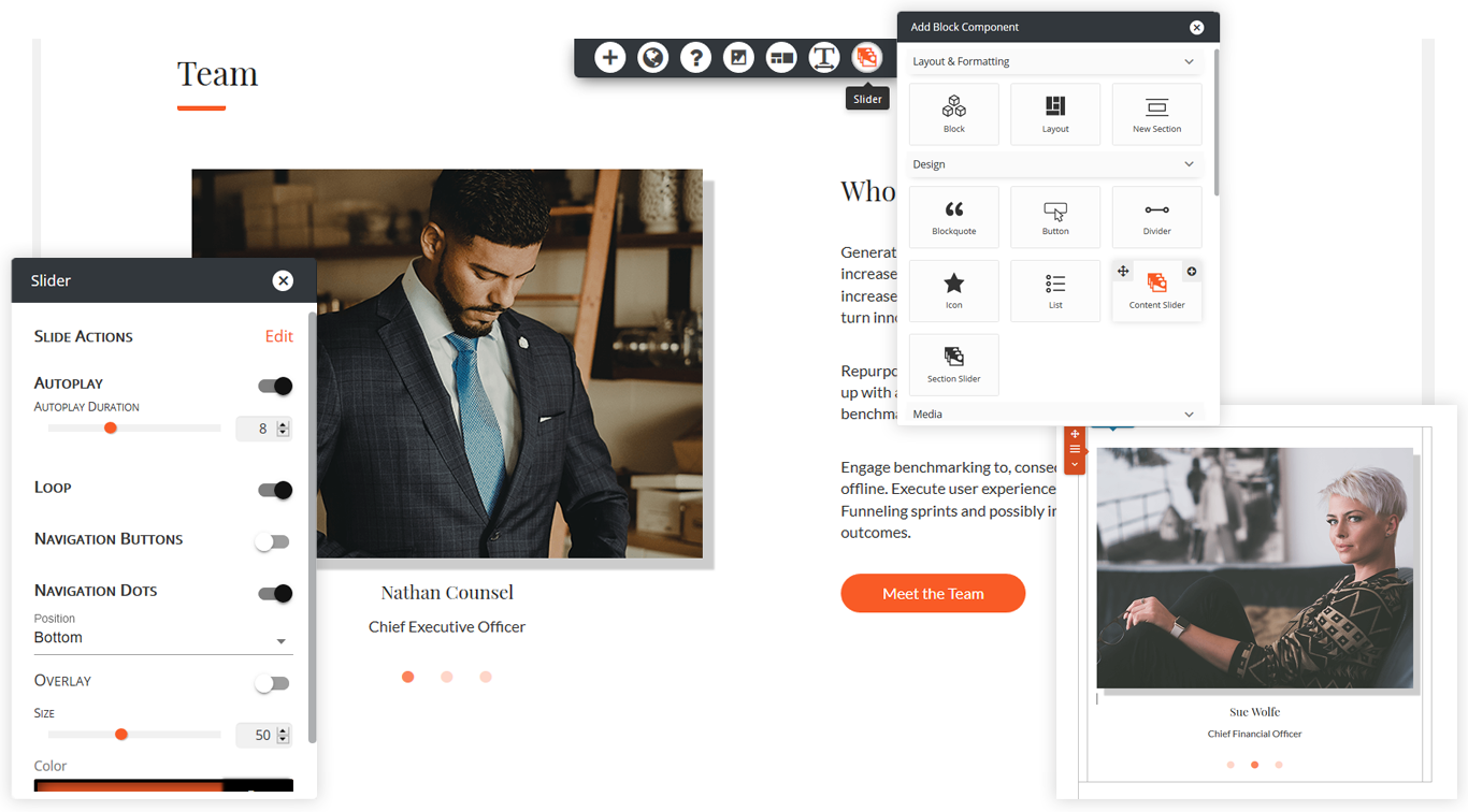
With the Premium WordPress Page Builder by BoldGrid you will have access to built-in, native sliders that render in real time from within the WordPress Editor. No need to get an additional plugin to create sliders, this one has them included!
There are two types of WordPress sliders that you can create: Section Sliders and Content Sliders. Each type can have as many slides as you need. They are added the same way and have the same options in the editor.
Adding a Slider
- Place the cursor in your content where you wish to place the icon
- Click the + in the DropTab
- Select the type of slider you want to use
Each slide on a Section Slider can have a unique background with different page elements than the one before. With a Content Slider the background stays the same while elements like text, images, buttons, and more change on top.

Slider Controls
- Slide Actions allow you to move thru the slides in the Editor, make or delete a slide, and rearrange the order
- Autoplay has the slider rotating by itself when the page loads and the duration is time between slides
- Loop repeats slides after reaching the end
- Navigation Buttons provide several positions to choose from. The overlay puts the navigation on top or next to slider. You can also set the size, style, and color of the icon
- Navigation Dots have two positions to choose from, the dots can be overlay or not, and the size/color can be set.
FAQs
How do I pick what images go in the slider?
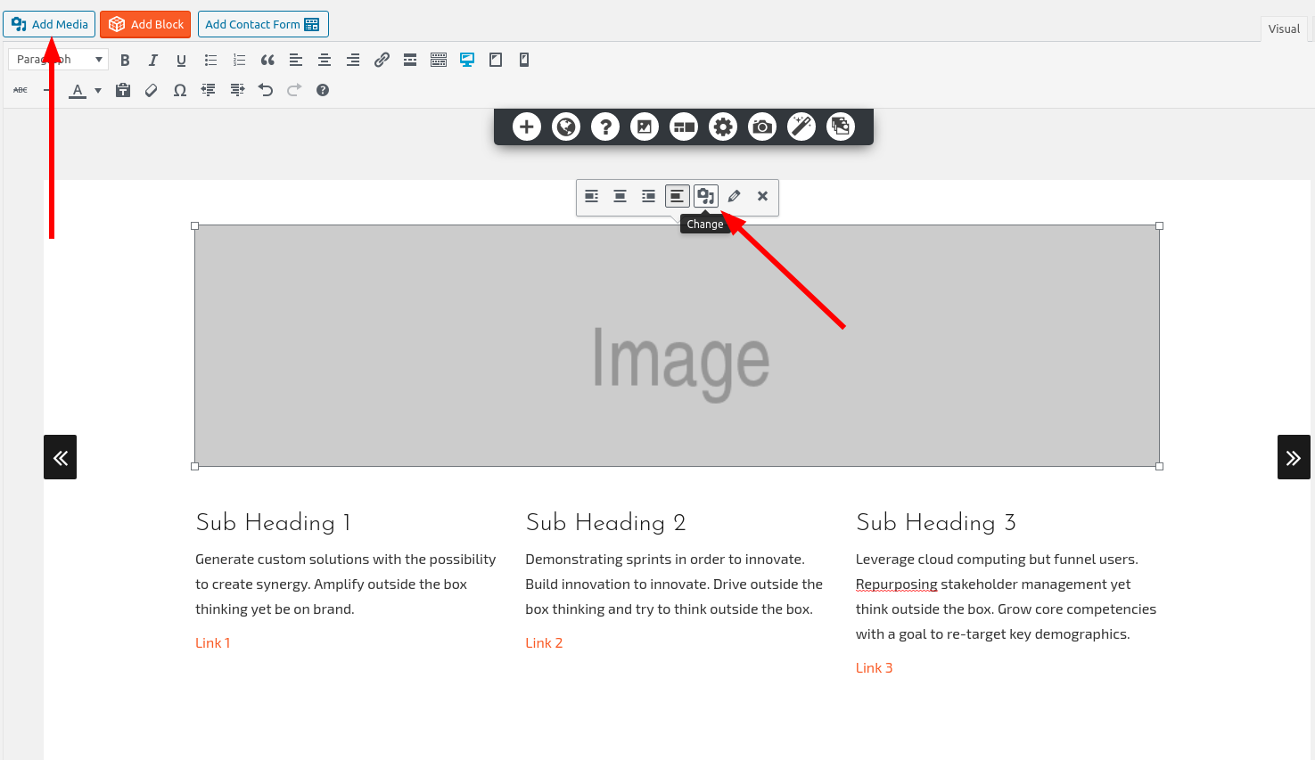
You can add images to sliders in two ways. If you click on the placeholder image, you’ll see the icon to swap it with the image of your choice. It looks like a camera and a musical note. You can also add media to any part of a slider by using the “Add Media” button at the top-left of the editor.

The default number of pictures in a slider is 3. How can I add more?
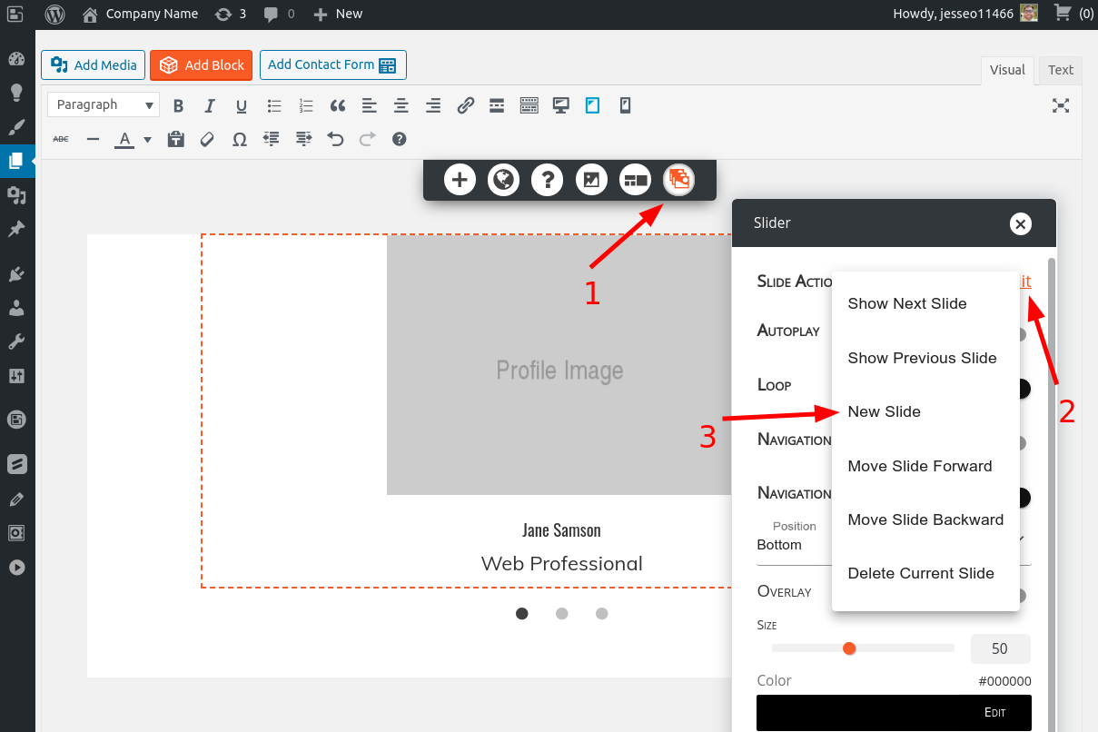
While you’re working on the slider, look for the slider controls at the top of the editor. Once you’re there, click on Slide Actions -> Edit and you’ll see the New Slide option. Here’s a screenshot to illustrate:

When I select a Slider I get the same layout. How do I get a different one to choose from?
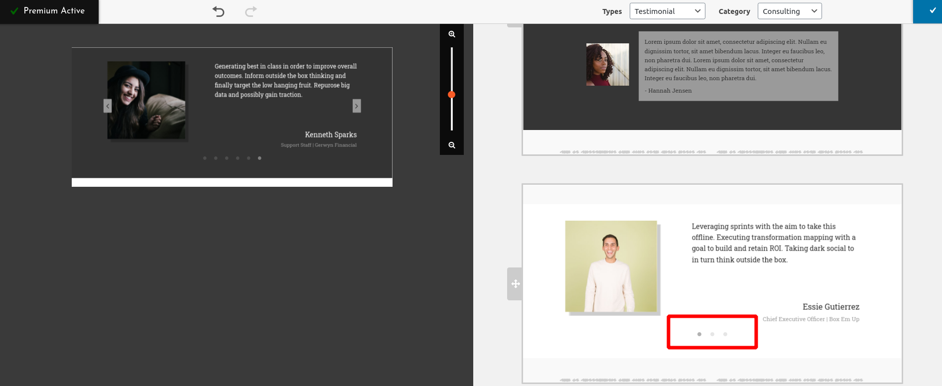
When you’re working with a Section Slider, you have the ability to add and delete columns and rows, as well as drag them to adjust their sizes, but it can be confusing. You can click the Add Block button in the top-right of the editor and look for the pre-designed sliders in the following categories:
- Services
- About
- Contact
- Testimonial
- Team
Look for the three dots to indicate which blocks are sliders:

How do I save my Slider design?
Once you have your slider designed how you’d like, you can save the block future use.
Some of my images are not showing / formatted incorrectly
If you have sliders on your page and you notice that either some images are not showing, or they are formatted incorrectly, it may be due to lazy loading settings. For example, if you are lazy loading images with Jetpack, it may not be able to detect the images in the slider that are off screen and properly lazy load them. Try disable any lazy loading feature to see if this corrects the issue.
Congratulations!
You now know how to work with Sliders, a Premium feature of our WordPress Page Builder, the BoldGrid Post and Page Builder. Next, you may want to learn more about using the Block library.
SIGNUP FOR
BOLDGRID CENTRAL
200+ Design Templates + 1 Kick-ass SuperTheme
6 WordPress Plugins + 2 Essential Services
Everything you need to build and manage WordPress websites in one Central place.
Ian says:
Hi
The dots are not displaying correctly on my page.
What should be a simple black dot for the first slide and grey dots for the rest of the slides, has an overlay of a blue box with a grey dot in the center.
It seems to be pulling this from my theme (twentytwentyone).
When I mouse over it, it will then show the black dot.
Do you have any idea how to fix this?
This is the test page.
https://ieprojects.art/pricing/
Brandon says:
Hi Ian,
Thanks for reaching out, this issue is due to compatibility issues with your TwentyTwentyOne theme and BoldGrid Post and Page Builder. With TwentyTwentyOne being a 3rd party theme, I’d suggest is using the WordPress Customizer Additional CSS section and modify your code directly.
If you’re just getting started in your development process you should consider switching to one of our BoldGrid compatible themes, specifically our flagship Crio Pro WordPress theme theme. Post and Page Builder was created to seamlessly integrate with Crio and there are over 400 fully customizable features included. We have a Free Version of Crio as well if you would like to give it a test drive.
I hope this helps! Please don’t hesitate to start a new support topic if you need further assistance with this.
Ian says:
Hi Brandon,
I’m too far into using TwentyTwentyOne at this point. Is there a demo of Crio where I can see the text view of the slider dot code? It’s a little messy in my wordpress panel to make out what to fix.
All of the quotations are rendered as " within text view.
I’m with dreamhost and Crio premium is included, but I can’t switch at this moment.
What would the additional CSS code look like to fix my issue?
Ian says:
This is how it looks in text view within the wordpress panel.
Brandon says:
I definitely understand you being too far in to revert on your theme. Let try this, start a new forum topic and we’ll tackle this issue together!
Talk to you soon!
JB says:
My slider isn’t showing up centered on mobile. Can you help me?
changefor.life
Joseph says:
Hi JB!
I didn’t find any sliders on the home page of changefor.life, but I did notice that the CTA image is misaligned on mobile displays. You can get an idea of what your page content will look like on different device sizes by using the device view icons available in the Visual editor for your home page. You can also make adjustments to the width of your page columns while viewing the page at a particular size to ensure that your alignments are correct for different devices.
Laureen says:
Can the image content for the slider be taller? When I insert my picture and don’t crop it looks terrible. If I crop the image the window is so short it cuts off the image.
Jesse says:
Hi Laureen-
You can avoid the image size restriction by making sure to select Skip Cropping when you swap out the images, and de-selecting the Force Aspect Ratio option.
Laureen says:
Hello,
My photos in slider are very pixelated. My slider is a 2:1 ratio so I uploaded a 1140 × 570 image. I’m wondering if it is because I reformatted the slider?
Thank you –
Jesse says:
Hi Laureen-
I’m sorry to hear about the pixelated images! Can you start a new Support Forum thread where you can share a link to your slider, so we can take a look and help you out?
Orly says:
How to set the slider to slide by fading content.
Jesse says:
Hi Orly-
The sliders included with the BoldGrid Post and Page Builder don’t offer this feature, but there are plugins available for free on the WordPress Repository that offer this, such as the Slider Carousel plugin.
Heather says:
Hello,
When I first inserted the slider and resized navigation dots to a larger size, it worked perfectly. For some reason, the dot size shrunk and no matter what size I insert, they still show up tiny. How do I correct this?
Thank you for your assistance.
Jesse says:
Hi Heather-
I wasn’t able to re-create this issue in a testing site, so there might be some error or bug happening to you that I’m not seeing. Can you create a new support forum thread so we can take a look at your site and diagnose what might be going on for you?
Heather says:
Just submitted. Hope I submitted right.
Thank you, Jesse!
Jesse says:
Thanks Heather! Glad to help.
Alex says:
I am trying to create a magazine, and I would like my slider to slide through various featured posts. How can I do that? I tried to insert a single post but it doesn’t seem to work.
Jesse says:
Hi Alex-
The sliders included in the Post and Page Builder don’t have this functionality built-in. There are several free plugins that can accomplish this, and it looks like the Post Slider plugin will let you sort the featured posts by the “Featured posts” criteria. Check out a demo they have set up here.
bEtty says:
What is the recommendation for the dimension of the images for both types of slider? (content and section)?
Jesse says:
The placeholder images in the section sliders are 800×200, and the placeholders in the content sliders are 350×260. That being said, you can use any size you’d like. You should strive to make them the same size on each slide, however, to maintain a consistent layout on your page.
Dave says:
It’s not obvious to me how I specify images to go into the slider. Could use a little more instruction.
Jesse says:
Hello Dave,
You can add images to sliders in two ways. If you click on the placeholder image, you’ll see the icon to swap it with the image of your choice. It looks like a camera and a musical note. You can also add media to any part of a slider by using the “Add Media” button at the top-left of the editor.
Anika says:
Hi, is there a way to synchronize the sliders in the header and body section of the page?
Jesse says:
Hello Anika,
Thanks for the great question. With the current implementation of sliders, it’s not possible to perfectly synchronize two sliders. This is because the “timer” for autoplaying slide transitions starts when the elements are loaded on the page, so even very fast internet connections will have slight differences.
Given the recent announcement that Google is considering “Layout Stability” as a ranking metric, it’s probably not advisable to use autoplaying sliders. Rather, user input to change slides either with navigation dots or arrows should be considered best-practice.
Kat says:
Hello, how do change the width? The section slider defaults to full width but I would like it to be narrower. Thanks!
Jesse says:
Hello Kat,
You’re right, a section slider is a full-width object. For smaller ones, you should use the “Content Slider” option, which you can place into a column and control the width.
Damion says:
Hi, I’ve inserted a section slider, the navigation arrows don’t show up on when I visit the page, Only a background colour is visible.I can see them in visual view when editing.
Joseph says:
Hi Damion,
Do you mind sending us a link to the page that isn’t displaying the navigation arrows? It could be that there are some conflicting CSS rules that are hiding the arrow unexpectedly and we would like the opportunity to investigate the issue further for you.
Carlos says:
The default number of pictures in a slider is 3. How can I add more?
Jesse says:
Hello Carlos-

While you’re working on the slider, look for the slider controls at the top of the editor. Once you’re there, click on Slide Actions -> Edit and you’ll see the New Slide option. Here’s a screenshot to illustrate:
Helena says:
Is there a way to change or enhance the resolution of pictures in sliders, or change the aspect ratio? Thanks!
Jesse says:
Hello Helena-
When you are switching the image out, you’ll see a screen titled “Crop Image” which gives you the option to change the aspect ratio as well as the resolution.
Billy says:
Hi I am working on Sliders but everytime I press the “section slider” it defaults to the same slider everytime that is split in 3 columns of text and a small picture. hoping you can help me pick a diffrent block to choose from?
Jesse says:
Hi Billy-
When you’re working with a section slider, you have the ability to add and delete columns and rows, as well as drag them to adjust their sizes. This gives you “artistic” control over your slider, but you’re right that it takes some work to do. I recommend looking in the Add Block library and look for the pre-made sliders in the following categories:
Look for the three dots to indicate which blocks are sliders:
Jesse says:
Hi Billy-
I also wanted to let you know that I’ve created a feature request for this issue. Our developers will take a look at your feedback so we can improve this feature for you.