- AuthorPosts
- July 17, 2019 at 6:58 am #30294
Nicole Gramlich
GuestHello!
After spending about six hours on this, I’m just at a loss.
My current hosting company is Inmotion. I have installed Boldgrid and am using the Resolve theme.
The trouble is two-fold:
1) The site-title will not scale down. It is at ~92px (using the customizer) for desktop, and seems to stay that way no matter what device I’m on. Nothing has worked to make it responsive to a mobile screen, and I can’t find anything in css that will allow me to override and tell it to scale to mobile. It’s huge and ugly on a phone.
2) The background image, while smaller, just crops to the upper left-hand corner rather than scaling to the device. I’ve read where it’s to do with not squashing/stretching the image to try to fit it to mobile, but is there a way to get it to display a different sized image for mobile without breaking the theme? I’ve tried every single configuration in the customiser – parallax/fixed/fit/default/etc etc and gotten nothing to work. I can’t find an img tag in css that will allow me to mess with the @media either.
I’m pretty new, so please forgive me if this seems like cake. I’m really frustrated at this point and my site is looking like crap. Even on desktop, scaling it larger in the browser window throws everything off as the title moves across the page and doesn’t align left at a fixed position!
I’d appreciate any help I can get because it’s really bumming me out.
(Site in question: http://www.desertflamephotography.com)
July 17, 2019 at 5:14 pm #30298Jesse Owens
GuestHello,
I’m really sorry to hear about your frustration and lost time. We’re aware of similar issues occurring to users viewing their mobile sites on iOS Safari, such as iPhones and iPads, and we’re working on a fix.
Issue #2 stems from how Mobile Safari treats the “cover” CSS background-size rule. Our developers came up with this CSS Snippet that you can paste into your custom CSS via the Customize -> Advanced -> Custom CSS & JS menu:
@media (max-width: 991px) {
    body.custom-background {
        background-size: cover !important;
        max-height: 100vh;
        background-position: center top !important;
    }
}
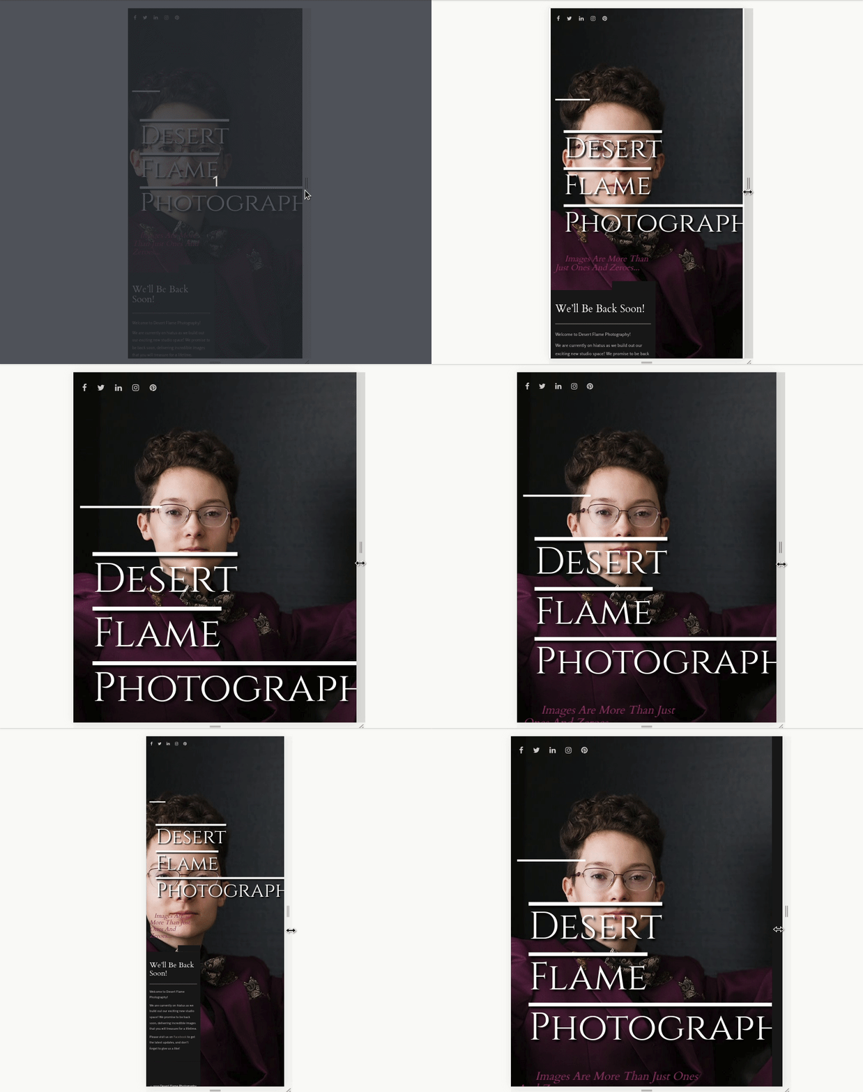
Issue #1 is a little tougher, particularly with long words like “photography.” You can see that your title is scaling down, but not enough to keep the word on the screen:

To prevent that, we can add another rule to the CSS snippet above to set the font-size to a percentage of the “View Width” (vw), like so:
@media (max-width: 991px) {
    body.custom-background {
        background-size: cover !important;
        max-height: 100vh;
        background-position: center top !important;
    }
    .site-title {
        font-size: 10vw;
    }
}
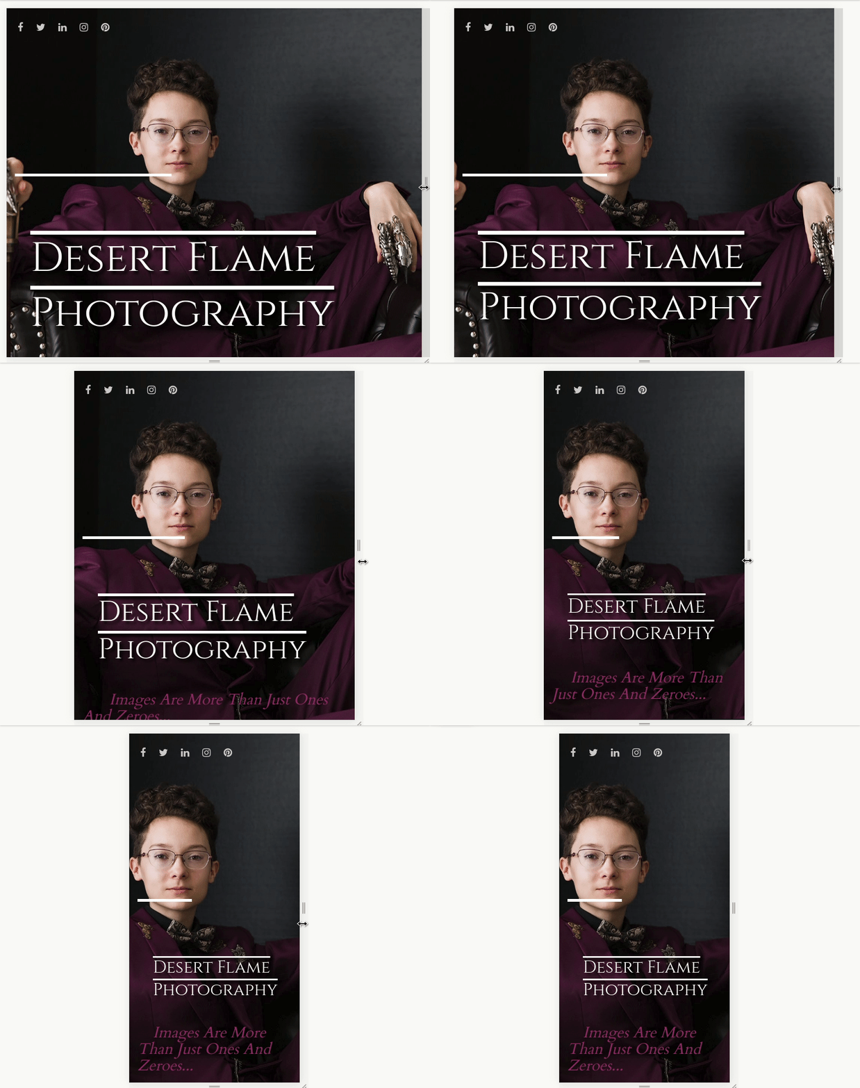
Which will look like this:

I hope this helps you out!
- This reply was modified 1 year, 9 months ago by
BoldGrid Support.
July 18, 2019 at 11:53 am #30299Jesse Owens
GuestGlad to hear I could help! If you have a moment, I’d love if you could help spread the word by leaving us a review on WordPress.org
- This reply was modified 1 year, 9 months ago by
- AuthorPosts
- The topic ‘My site-title and background image will not scale for mobile!’ is closed to new replies.

