- AuthorPosts
- September 16, 2019 at 3:10 am #30446
cruciblecom
GuestWhy is the Update button at the bottom of the page? This is a real pain. There should be two, one at the top like in WORDPRESS and one at the bottom
September 16, 2019 at 11:36 am #30447Jesse Owens
GuestHello,
Thanks for the great question, I’m sorry that you’re having a painful time using the update button.
Since BoldGrid’s Post and Page Builder is a plugin for WordPress, the general layout of the editor screen is the same as the Classic Editor for WordPress.
That is, by default, the editor screen is displayed in two columns, with the Publish/Update buttons at the top-right of the screen.
I can think of two possible reasons you may be seeing the Update button at the bottom, rather than the top-right. Those are
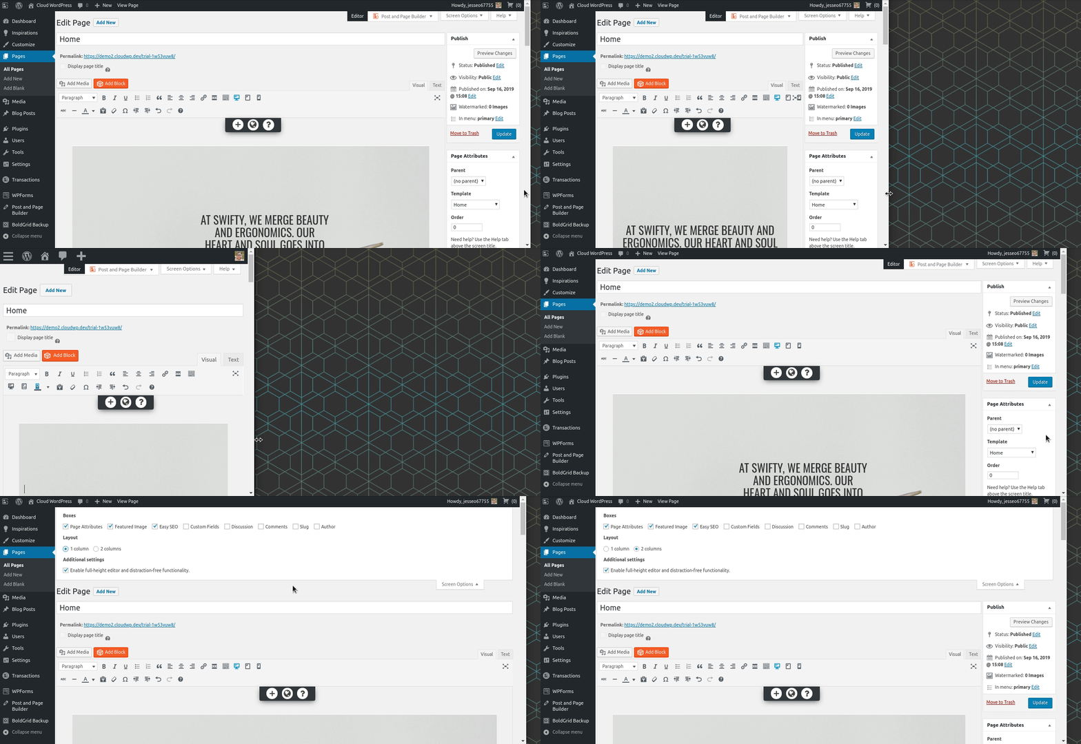
- The browser window you’re using is too narrow to show both columns, so the right column gets moved below the editing window, or
- Your Screen Options may have been accidentally set to 1 Column, rather than 2.
Presuming you’re using a standard-width desktop browsing window, check your screen options tab (at the very top of the editor screen) and make sure that it’s set to 2 Columns.
Here’s a brief animation I created to demonstrate:

If you’re unable to use a wider browser window, you might also consider disabling the “Enable full-height editor and distraction-free functionality,” which will at least make the distance to scroll down a lot shorter.
- This reply was modified 1 year, 10 months ago by
BoldGrid Support.
- AuthorPosts
- The topic ‘Update button – too far down’ is closed to new replies.