- AuthorPosts
- November 2, 2019 at 3:07 pm #30557
djwaldow
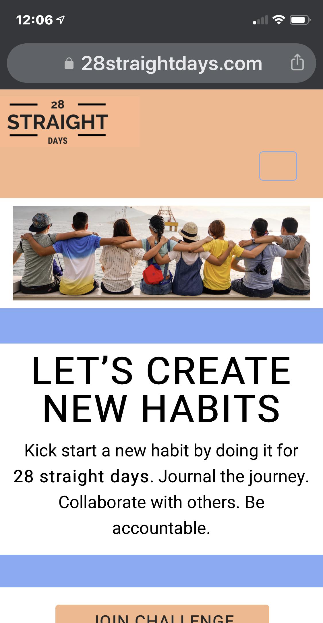
GuestSee http://28straightdays.com/ on mobile (iOS13 in this case).
Also, it’s got the blue outline, but can’t tell it’s a menu.
Cobalt theme.
HELP?

- This topic was modified 1 year, 10 months ago by
BoldGrid Support.
November 5, 2019 at 1:12 pm #30558support
GuestHi djwaldow,
Thank you for contacting us and we are happy to answer any questions you have about working with your website!
One possible explanation for the design bug in your hamburger menu could be related to using the same color multiple times in your Color Palette settings. The color used for that icon is dictated by the color selection in the fourth slot of your palette and the header background color is the fifth one, so if they have the same color assignment then that is likely the cause.
The easiest way to change that behavior is to use custom CSS code and this will allow you to use any color value you want for the hamburger icon. The following CSS snippet sets the default color for the hamburger icon to the same blue used for the button border, but you can change the value to any hexcode you desire.
.palette-primary .navbar-default .navbar-toggle .icon-bar {
    background-color: #85abf6;
}
The header template in the Cobalt theme puts your menu and site branding on separate grid rows at screen sizes smaller than 992 pixels to account for the expansion of the mobile menu when clicked. If you would like both to appear on the same line for smaller screen sizes then we can use custom CSS again to make that design change. The following snippet adds a negative margin to the top of your menu area equal to the height of your site branding so that both show on the same row for smaller screens.
@media (max-width: 991px) {
    .header-7 {
        margin-top: -59px;
    }
}
I hope that these snippets help you achieve the design you are looking for and please let us know if there is anything else that we can do to assist you.
November 5, 2019 at 2:15 pm #30559djwaldow
GuestHey Joseph! This is great. Thanks. Added both snippets. The hamburger menu is now visible (based on color change). However, I had to change the
margin-top: -59px
part to -1px or else I lost almost the entire top nav.
I’m still seeing the hamburger menu on a second line on iOS13. Do I just mess around with that max-width part?
THANKS!
November 6, 2019 at 10:07 am #30560support
GuestI am glad to hear the hamburger menu is working for you! You can try modifying the max-width property as well to see if that works, but you will also need to rework the code to apply to both header rows to make them the same width.
I revisited the code I gave you previously and added some more specificity which should only affect the header section containing the hamburger menu.
@media (max-width: 991px) {
    .row > .header-7 {
        margin-top: -59px;
    }
}
Hopefully that code gives you the design you need, but please let us know if you have any additional questions.
November 6, 2019 at 2:55 pm #30561djwaldow
GuestPERFECT. TY!!
November 7, 2019 at 12:05 pm #30562support
GuestYou’re welcome! If you ever need anything else in the future please let us know!
- This topic was modified 1 year, 10 months ago by
- AuthorPosts
- The topic ‘Cobalt Theme: Hamburger on iOS13 is wrapping to next line. HELP?’ is closed to new replies.
