- AuthorPosts
- April 16, 2020 at 9:42 pm #30900
Chris L.
GuestI am running Swifty. The logo and ‘Primary Menu’ make up two columns in a row in the header. This prevents me from centering my logo. I would like to remove the ‘Primary Menu’ section so that I can center my logo in the header. Thoughts?
April 17, 2020 at 3:51 pm #30901support
GuestHi Chris, thank you for contacting us.
Unfortunately removing or adjusting the locations of header items in the Swifty theme is not currently possible. Swifty is currently using the first version of our theme framework and that feature is missing, but you might find more success switching to our newest theme Crio which was contains the latest theme framework as does allow for adjustments to header elements.
Crio is available for free in the WordPress repository (https://wordpress.org/themes/crio/) and it offers much more control over the design or your website. I hope that Crio gives you the tools you need to get the design you want and please let us know if there is anything else that we can do to assist you.
April 18, 2020 at 1:48 pm #30902Chris L.
GuestI installed Crio last night, but overall I wasn’t happy with how our site initially looked.
We’ll find a way to make Swifty work as we love everything about our site other than the header.
Is there an easy way in Swifty to increase the font size of the menu links? We think that could be a compromise solution to our problems.
April 21, 2020 at 3:15 pm #30903support
GuestHi Chris,
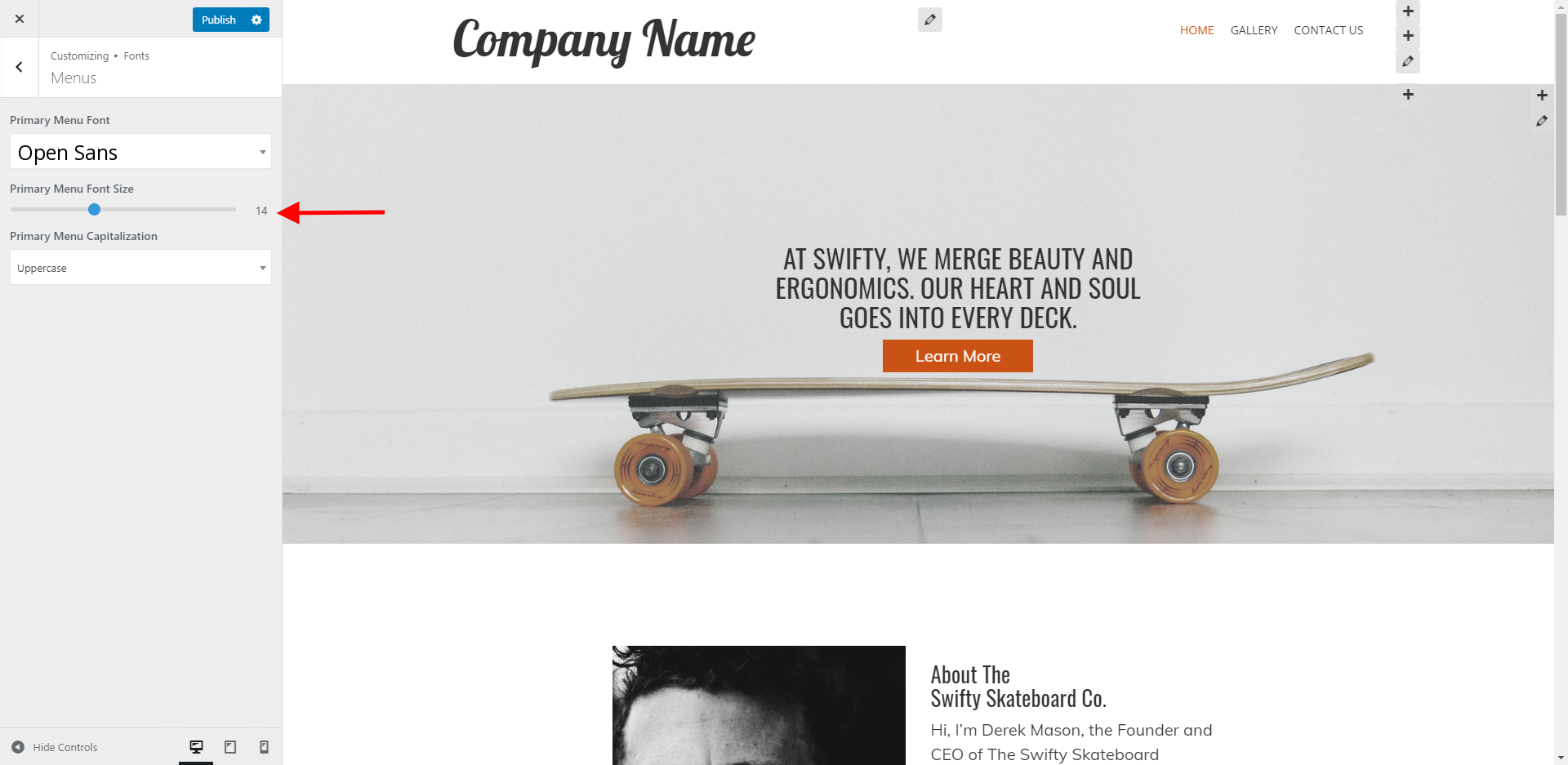
The easiest way to increase the font size of your menu items is to use the Fonts settings in your website’s Customizer.
Navigate in your Dashboard to Customize > Active Site. Once you have the Customizer opened, got to Fonts > Menus. You should then see a slider that allows you to adjust the font size of your menu items.

I hope this allows you to get your fonts displaying at the correct size and please let us know if there is anything else that we can do to help!
- AuthorPosts
- The topic ‘Remove entire menu area’ is closed to new replies.
