Tagged: Responsive Design
- AuthorPosts
- April 26, 2021 at 7:30 pm #36642
Ann Marie Blinkhorn
GuestI am using the crio theme for a client’s website. My initial design is done but is not showing properly on a smart phone. it seems fine on my tablet except for 3 buttons at the bottom of the text on the homepage.
I am not sure what I am supposed to be doing to get the responsive design correct??
thanks, Ann Marie
April 26, 2021 at 7:40 pm #36718Jesse Owens
KeymasterHello Anne Marie-
Thanks for reaching out, and for choosing the Crio WordPress theme for buisness.
I checked out your site, and I can see what you mean. It looks like the main problem is that the first button, “About Us,” is not in a centered paragraph- it is left-aligned so it doesn’t line up with the other two buttons.
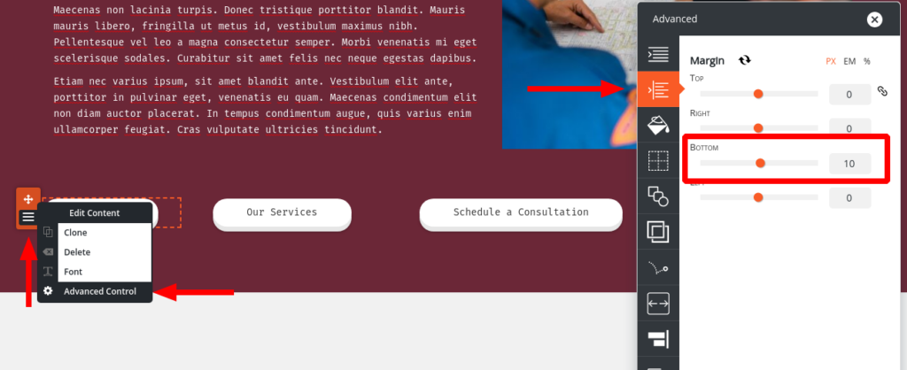
Make sure to center that first button. You might also consider adding some margin to the bottom of each button so they’re not crowding each other. You can find this in the Advanced Control for each button:
 April 27, 2021 at 1:35 pm #36775
Ann Marie Blinkhorn
Guesthi Jesse,
Thank you for your response. I think the buttons are now fixed on the responsive design.
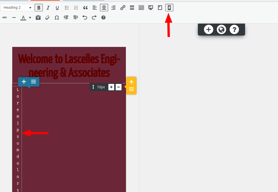
But I have text that is not displaying properly on a smart phone. Most of the pages are fine except the following: home, about us, team, careers. Help!
merci, Ann Marie
April 27, 2021 at 1:49 pm #36852Jesse Owens
Keymaster - AuthorPosts
- The topic ‘Buttons don’t line up on mobile device’ is closed to new replies.

