Tagged: Backgrounds
- AuthorPosts
- May 13, 2021 at 12:35 pm #37761
Alycia
GuestHello, I have a photo on my homepage that when I switch to check it in mobile view, it cuts off the photo and the photo does not automatically scale. I’ve tried googling and gone to all the possible places. The only thing I do see for responsiveness is to not show the photo in mobile view, which is not what I want. Any help would be much appreciated.
Thanks,
AlyciaMay 13, 2021 at 12:56 pm #37781Jesse Owens
KeymasterHello Alycia-
Thanks for reaching out, and thanks for using the Crio WordPress Theme for Buisness.
Right now, the image is set up as a background with the “Cover Page” size attribute and the 50%/50% position attribute. That means that as the device size gets smaller, the background focuses in on the center of the image:

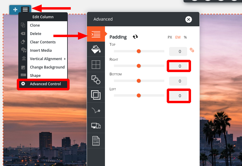
If I understand you correctly, what you want to accomplish is that the image itself scales down without any cropping. If that’s what you’d like to do, insert the image normally (using the Add Media button) instead of using it as a background. Then, you’ll need to make sure that there’s no extra padding on the sides of the column to keep it full-width:

This will give you the effect of a full-width image that scales down to the width of the viewscreen:

- AuthorPosts
- The topic ‘Can’t get my homepage photo mobile responsive’ is closed to new replies.


