Tagged: Page Headers
- AuthorPosts
- September 30, 2021 at 5:26 pm #43259
Jason Anastas
GuestHello there,
I just looked at my company website on an iPhone 13. The logo/header is all messed up on every page (using custom Crio animated header). Looks fine on my PC and other devices (iPad). Strange since it doesn’t look like anything like what the Boldgrid (Crio customizer) viewer is showing me. It looks good when switching between PC, tablet & phone views there. Looks like the logo isn’t scaling properly in phone view causing it to bled over page content below on my iPhone. I have backed up and updated the entire site and all the plugins and still looks broken. I’ve tried all the options in the Crio header setup but my limited web experience has failed me to solve this.
Any help would be greatly appreciated as this makes my site unusable atm. I thank you in advance.
Jason
September 30, 2021 at 5:33 pm #43262Jesse Owens
KeymasterHi Jason-
Thanks for reaching out! For anyone else finding this topic, Jason is using the Crio Premium Theme’s Custom Page Headers together with the Video Background plugin to create an animated header image, as demonstrated in this tutorial from BoldGrid’s YouTube channel.
Our cross-browser testing platform, BrowserStack, doesn’t have the iPhone 13 available yet, but I tested it on an iPhone 12 and I have a theory about what might be going on.

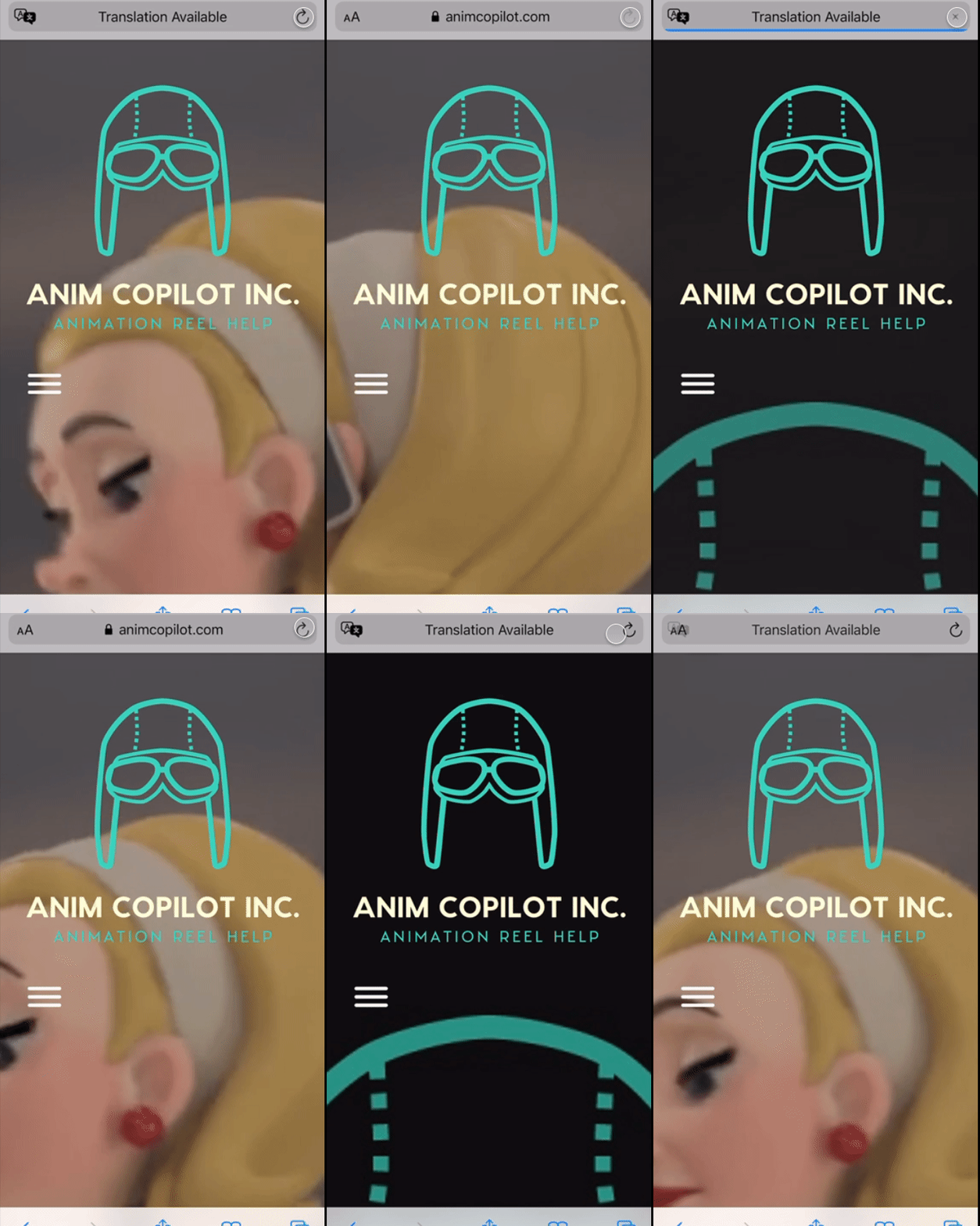
As you can see in the animation, every time I refresh the page, very briefly, you can see the large version of your logo appear. This is the Poster Image you have configured for your background animation, which is shown while the video is still loading. It’s possible that iPhone 13 may not be showing the video at all, and you’re only seeing the poster image.
You might consider updating your Poster to a frame from the video, so it looks more similar to your animated background.
October 8, 2021 at 2:59 pm #43496Jason Anastas
GuestHi Jessie,
Thank you for the quick reply. Much appreciated sir.
I thought the same but alas, it’s in all my headers so I think that would rule out the poster place holder. It’s messed up on every page of my website. It looks messed up only on an iPhone 13 from what I can tell. I tried both IOS Safari and Goggle Chrome with the same results. I’ve tried to attach a screengrab but it’s not easy using this forum (see below). Could be a Crio header issue? I don’t know.
https://www.dropbox.com/preview/Camera%20Uploads/2021-10-07%2017.48.33.png
Thanks in advance,
Jason
October 8, 2021 at 3:41 pm #43539Brandon C
ParticipantHi Jason,
Thank you for the update. I think we’ve identified a solution for your issue. This bit of CSS should help with the alignment problem:
a.bgc_logo.custom-logo-link { flex-direction: column; }
We believe it’s being caused by a nested flexbox element.
 `
`
Add your CSS using Appearance<<Customize<<CSS/JS Editor
We’ve alerted the developers and are working on a fix, but that CSS should fix it in the meantime:- This reply was modified 3 years, 5 months ago by
Jesse Owens. Reason: add lightbox to gif
- This reply was modified 3 years, 5 months ago by
- AuthorPosts
- The topic ‘Company logo/header all messed up on a iPhone 13’ is closed to new replies.

