Tagged: Page Headers
- AuthorPosts
- April 29, 2021 at 1:32 pm #36983
Ann Marie Blinkhorn
GuestI want to put the text ‘Lascelles Engineering & Associates’ above my navigation menu. The circle logo would stay where it is but I would crop out the text at the bottom of it and move it to above the navigation. I have tried everything (site title, tagline) and it won’t allow me to centre it above the navigation menu.
April 29, 2021 at 1:45 pm #36999Joseph W
KeymasterHi Ann Marie!
One way you can get that text added above your navigation menu is to use the Custom Header layout option found in the Customizer controls for Crio. We also have a guide in our support center that demonstrates how to locate and use Crio custom layouts in case you would like an additional reference.
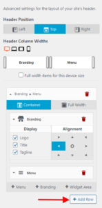
Once you have the Custom Header Layout opened, click the Add Row button to create a new empty section in your header. This empty section will be used to display your website Tagline.
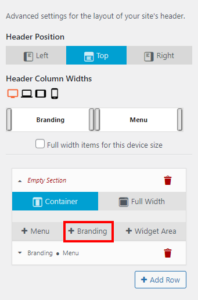
After creating the empty section drag it above the existing section that contains your Branding and Menu items and then add a new Branding widget to the empty section.
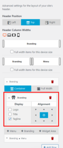
Click on the new Branding widget to display the configuration options and deselect Logo and Title in the Display column to ensure that it will only show the Tagline. You can then use the Alignment tools to change the location of your Branding widget within the new header section.
Hopefully this helps you get your content displaying as desired on your website and please let us know if you have any additional questions for us!
April 30, 2021 at 1:19 pm #37048Ann Marie Blinkhorn
GuestThank you for your quick response. It is partially working but I still can’t get the tagline centered just above the navigation menu.
April 30, 2021 at 1:38 pm #37060Jesse Owens
KeymasterHi Anne Marie-
Since the tagline and the logo/menu are in separate rows, you’ll need to use some Custom CSS to position it “just above the menu” like you’re trying to accomplish.
If you’d like to accomplish this without using any code, I recommend checking out Custom Page Headers in Crio Pro.
If you’re not ready to upgrade yet, here’s the Custom CSS I found works best to accomplish this. Navigate to Customize > CSS / JS Editor and paste this code into the CSS field:
@media screen and (min-width: 1199px){
    .site-branding.c {
       position: absolute;
       top: 120px;
    }
}
April 30, 2021 at 3:33 pm #37065Ann Marie Blinkhorn
Guesthi Jesse,
thank you for your quick response. I entered the code and it did work. A couple of questions:1. Could this code be changed so that it actually centered over the navigation menu?
2. Could the code be modified so that the tagline is higher above the navigation?
3. what if I wanted the tagline on two lines?Not sure if I want to update to crio pro just yet. But if I need would I be able to use it for all my sites without an additional cost?
Ann Marie
April 30, 2021 at 4:18 pm #37080Jesse Owens
KeymasterHi Anne Marie-
I’ll try to tackle your questions one-by-one.
1. Could this code be changed so that it actually centered over the navigation menu?
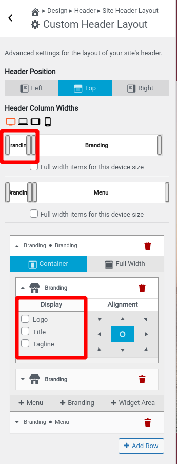
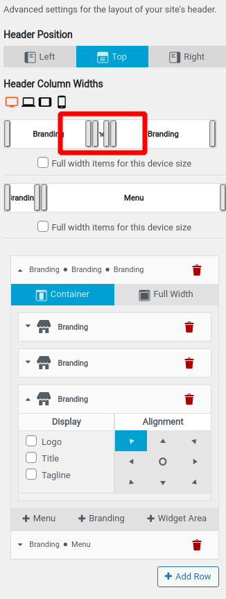
Right now, it’s centered relative to the page not the row below it. In order to accomplish that, you’ll need to add an extra column to that row that’s the same width as your logo below. You can accomplish this by adding another branding area with all three display options disabled:

2. Could the code be modified so that the tagline is higher above the navigation?
Yes, simply reduce the value
120pxto 100, or according to your preference. The lower the number, the closer to the top of the page it will be.3. what if I wanted the tagline on two lines?
This will be tough to get exactly the way you like it. One possibility is to add yet another empty branding column to the right side, and reduce the column width:

Since you’re not displaying the Site Title right now, another possibility you could try would be to add one line as he site title, and the second line as the tagline, and enable both displays in the branding widget.
…Crio Pro…would I be able to use it for all my sites without an additional cost?
You can use one license for unlimited sites within the same business, but you shouldn’t share the license if you’re delivering a site to a client. This is because your license key is similar to a password, and can be used for things like making purchases in the BoldGrid Connect Search stock photography library.
May 4, 2021 at 2:05 pm #37255Ann Marie Blinkhorn
Guesthi Jesse,
I decided to upgrade to crio pro and this has allowed me to do what I want with the header. thank you for the advice.
However, the header text “lascelles’ and the navigation below don’t seem to be centered. I have tried everything and it still doesn’t look centered to me.
help?
May 4, 2021 at 2:14 pm #37262Jesse Owens
KeymasterHi Anne Marie-
I’m glad to hear that Pro is working for you so far!
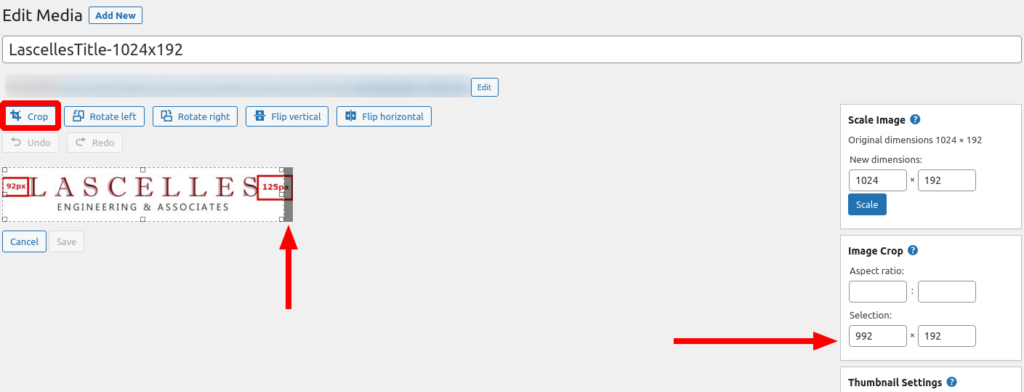
I checked it out, and I can see what you mean. The image itself appears to be perfectly centered above the menu, but the text inside the image is slightly off-center. I checked it out in an image editing program, and I could measure that the whitespace on the left is about 92 pixels, and the whitespace on the right is 125 pixels:
 May 4, 2021 at 2:23 pm #37263
Ann Marie Blinkhorn
Guestglad I wasn’t imagining it. LOL.
how can I fix this?
May 4, 2021 at 3:31 pm #37267Jesse Owens
KeymasterHi Anne Marie-
Ideally, you’d want to fix this in your image creation software itself. The exact process will depend on what software you’re using to make the image. This is more ideal than editing it in WordPress because you won’t change the image’s dimensions, which might cause a little distortion or stretching.
Alternatively, you can edit the image in WordPress to crop out the extra space on the right. Navigate to your Media Library, click on the image, and click Edit Image.
Click on Crop, and use the numeric control on the right to subtract 32 or 33 pixels or so from the width, and also make sure that the “cropped” portion is cut off the right side of the image:
 May 5, 2021 at 11:09 am #37302
Ann Marie Blinkhorn
Guestok. I understand now. it was the crop that I did of the image before i imported. I’ll try to fix that today.
as always, you are a great help.
May 5, 2021 at 11:13 am #37309Joseph W
KeymasterHi Ann Marie!
Hopefully re-cropping the image gets it aligned better with your overall design goals and please let us know how it goes! If you ever have any other questions for us please do not hesitate to ask.
- AuthorPosts
- The topic ‘Customizing Header Layouts in Crio’ is closed to new replies.
