- AuthorPosts
- March 31, 2025 at 12:19 pm #155535
Joy
GuestI am using a Crio theme through Inmotion Hosting set up with bold grid.
I cannot finish because the top images will not resize for Mobile.
There has to be a CSS code to help them along or is it Boldgrid Builder or Crio theme?
The Theme Editor or the CSS in the Customizer, or is it both that need Code?
Joy
March 31, 2025 at 12:59 pm #155646Elana
ParticipantHello Joy,
Thank you for reaching out to our support team.
BoldGrid designs are built with a CSS framework called Bootstrap, which is a “mobile-first” framework. This means the framework itself was made specifically to prioritize mobile responsiveness.
I was looking over your site and all the images that displayed seams to work on mobile. However, if you are still working on the site and you are trying to update the images to be accepted on mobile you can create images for mobile specifically. Then in the edit page you can click the “Advanced Control” from the black button at the bottom of the container and only set visibility for desktop and phone.
Also, in Post & Page builder in the menu in the editor you can switch from the different phone, tablet, desktop and large displays.
Hope that helps, let us know if you have any further questions.
Elana.April 2, 2025 at 9:01 am #155696Joy
GuestThis site shows the Home page image on Mobile fits, however the other pages top image, is cut off in Mobile. Home and all other pages image width is 1920px. I have two other Boldgrid sites using Crio themes that will not resize either. What code goes in Top of Page (not Header with logo and nav menu) that will make the images responsive?
April 2, 2025 at 9:48 am #155727Elana
ParticipantHello Joy,
Thank you for reaching out to our support team.
I can’t see the images on your other pages because they are throwing 404 (not found) errors stating they are missing.
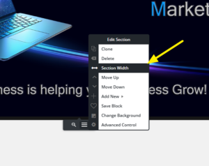
However, you could try first by setting the section width to 100% by clicking the “Section Width” on the container. Like Below:
If that doesn’t work you can add a Custom ID to the block with the background. In the below example that Jesse created, he shows how to create a custom CSS ID called my-custom-background as the custom ID.
Custom CSS to force it to scale down correctly:
#my-custom-background {
	background-size: contain !important;
	background-repeat: no-repeat !important; }
Let me know if this helps or if you have any further questions.
Elana.
April 3, 2025 at 9:37 am #155739Joy
GuestI watched the video.
I made sure the width was 100% for every page.
All images are on the pages now.I added the Custom ID to each background image: my-custom-background
I added the CSS code in Customizer CSS/JS.#my-custom-background {
background-size: contain !important;
background-repeat: no-repeat !important;
}I purged all the cache when I finished.
I did a speed test for the website.
Mobile test was very low, but Desktop was good.Could it be the # in front of the CSS code?
Do you know how to fix this?
If not, can Jesse take a look at it?Thank you
.April 3, 2025 at 9:39 am #155765Elana
ParticipantHello Joy,
Thank you for reaching out to our support team!
I noticed that the images you referenced from the video aren’t directly related to mobile page speed. Additionally, I see that you’re using WP Fastest Cache rather than W3 Total Cache. Since we specialize in W3 Total Cache, I’m unable to provide specific guidance on the settings for WP Fastest Cache.
However, based on a quick review using Google PageSpeed Insights, you may want to look into enabling WebP conversion, eliminating render-blocking resources, and adjusting settings for minification and delayed asset loading to improve performance.
For a more detailed analysis, a full performance audit would be required, which can be purchased if you’re interested in switching to W3 Total Cache.
Let me know how you’d like to proceed!
Elana.April 4, 2025 at 9:48 am #155779joy
GuestI changed cache plugin back and speed is not what this ticket is about.
I was told to use Jesse’s code, first give the background image a ID: my-custom-background
Then to add this to Customizer CSS/JS:
#my-custom-background {
background-size: contain !important;
background-repeat: no-repeat !important;
}I did this for every background picture at the top, still it does not resize on Mobile.
Is it because Jesse has the # in front of the ID name?
How can I make these images responsive, I cannot continue using these themes if they are not Mobile friendly.Thank you
.
April 4, 2025 at 11:37 am #155823Elana
ParticipantHello Joy,
Thank you for reaching out to our support team.
It looks like you have padding on your row that might be conflicting with the CSS that was added for the #my-custom-background CSS. If you can remove the Padding-Bottom: 300px from the row the image.
However, since some of these images are close to 1920px wide it would still be recommended to create mobile images and separate the images that way.
Thanks
Elana.April 4, 2025 at 11:44 am #155822Joy
GuestYou gave me Jesse’s code for the background image as this ID: my-custom-background
Then to add this to Customizer CSS/JS:
#my-custom-background {
background-size: contain !important;
background-repeat: no-repeat !important;
}I did this for every background picture at the top, still it does not resize on Mobile.
Is it because Jesse has the # in front of the ID name?
How can I make these images responsive, I cannot continue using these themes if they are not Mobile friendly.Please reply.
Thank you.April 4, 2025 at 11:52 am #155826Elana
ParticipantHello Joy,
Thank you for reaching out to our support team.
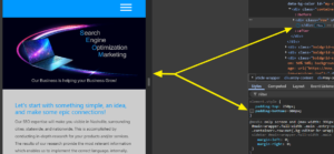
To answer your questions the code you put in there is fine. If you can see from the below image disabling that padding-bottom from the row causes the image to resize properly.
If you can remove that padding on the row in the page we can test further. The row has a padding on it and when its trying to shrink into the container it is trying to meet that padding requirement.
Thanks
Elana. - AuthorPosts
- The topic ‘Feature Images not Responsive’ is closed to new replies.

