- AuthorPosts
- December 2, 2020 at 11:33 am #31818
Jessica Ortiz
Guest1) The editor shows the border fitting perfectly on all images, but in Chrome the borders do not fit in two areas: bottom image on the Home page and the top image on the About page. I have replaced the image into the image template many times and tried adjusting the image and border. Since this isn’t showing up in the editor as a problem, I don’t know how to fix.
2) The copyright in the footer isn’t centering on the page.
3) On the site, the footer has a widget with text saying “Add another widget.” but in the editor, I don’t see it and I don’t have any other widgets. Unsure how to delete.
4) Is there a way to connect the Services menu button to the services SECTION on the home page instead of a separate page?December 2, 2020 at 12:47 pm #31841Jesse Owens
MemberHi Jessica-
Thanks for reaching out, I’ll try to answer each of your questions one-by-one.
1) The editor shows the border fitting perfectly on all images, but in Chrome the borders do not fit…
Depending on the screen size, the image is adjusting its size a little differently than the border around it. Probably the easiest way to fix this is to click on the image, and then switch over to the Text editor tab. Locate the bit of code that says width=”322″ and replace that with width=”100%”
2) The copyright in the footer isn’t centering on the page.
It looks like you’re using a Custom HTML widget to print your copyright. You could either add a centered paragraph around your custom HTML like so:
<p style="text-align: center;">...custom HTML...</p>
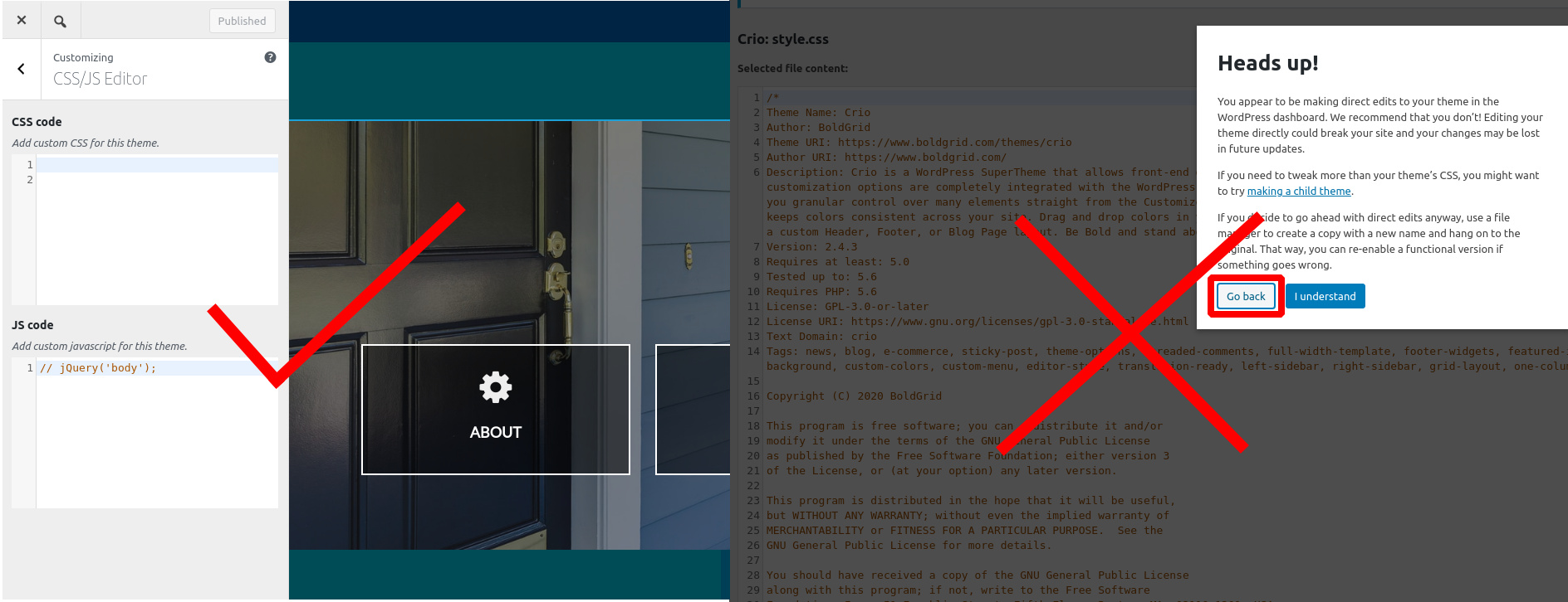
Or you could center the copyright footer with custom CSS. Navigate to Customize > CSS/JS Editor and paste this rule into your CSS Code:
.footer-1 { text-align: center; }3) On the site, the footer has a widget with text saying “Add another widget.” but in the editor, I don’t see it and I don’t have any other widgets. Unsure how to delete.
This message only appears when you’re viewing the site while you’re logged in as an administrator, your visitors won’t see it. Try viewing your site in a private browsing or “incognito” window to see it exactly how your visitors will.
4) Is there a way to connect the Services menu button to the services SECTION on the home page instead of a separate page?
This is known as using an “anchor” link. Check out this tutorial with detailed instructions or this video tutorial:
December 3, 2020 at 2:41 pm #31867Jessica
GuestThank you! I figured out how to add the add the Anchor link but now the Hover Underline only shows below the links to separate pages. Is there a way to get the Hover underline to show up under the link (services) that scrolls to a block on the Homepage?
December 3, 2020 at 2:48 pm #31903Jesse Owens
MemberHi Jessica-
Because it’s now pointing to the same page, the system interprets that as being the “Current” menu item. You’ll notice that if you visit the About Us page, it hovers correctly.
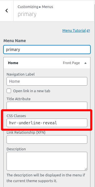
I’d recommend adding a custom CSS Class to your menu item to make sure it shows the hover effect regardless of which page you’re on. Navigate the Customize > Menus and edit the primary menu, then expand the options for your Services page (and optionally, your home page item as well) and add this to the CSS Classes field:
hvr-underline-reveal
December 3, 2020 at 6:37 pm #31909Jessica Ortiz
GuestThis has been really helpful. Just a few more questions-
1) Can I change the color of the submit button on my contact page to the green that is consistent with my color scheme? The forms is ’77.2) In the footer, I’d like to center the location address under the Location line but can’t get it to adjust.
3) Can I add a footer menu (identical to the header menu) above the copyright line? I can only get it to be a vertical menu below the copyright.
4) can I add more space above the current copyright and less below it (this may not be an issue if I add #3 above).
December 3, 2020 at 7:07 pm #31923Jesse Owens
MemberHi Jessica-
Glad to hear it’s been helpful so far! Here’s the answers to these questions
Can I change the color of the submit button on my contact page to the green that is consistent with my color scheme?
There are two ways you could go about this. First, you can edit the form itself. Navigate to weForms > All Forms and edit this form (77). Navigate to the Settings > Display Settings and select the option to Use Theme CSS. That will use your color palette’s default button color.
If it turns out that the default color isn’t the green that you’re going for, I found these CSS rules will do the trick:
input.weforms_submit_btn.wpuf_submit_77 {
    background-color: rgb(52, 68, 54) !important;
    border-color: rgb(52, 68, 54) !important;
    box-shadow: 0 1px 0 rgb(52, 68, 54) !important;
}
In the footer, I’d like to center the location address under the Location line but can’t get it to adjust.
Right now, the alignment options for widget areas aren’t available (we’re working on this feature for a future release). You can center it similar to the way that we centered your copyright notice, however. Previously you centered footer-1. When you add new rows to your footer, you can find out which class name they’re assigned by right-clicking it and selecting Inspect or Inspect Element. Check out this video at about the 45-second mark where I demonstrate how to find the right ID or Class:
Can I add a footer menu (identical to the header menu) above the copyright line? I can only get it to be a vertical menu below the copyright.
Yes, with one caveat. WordPress doesn’t let you add the same menu twice to a page. So in order to accomplish this, you’ll first need to create a copy of your primary menu with a different name.
Once you’ve got that, head to your footer design in Customize > Design > Footer > Layout. Click + Add Row to add a new row to your footer, and then click + Menu to add your new menu. (Since you mentioned it’s showing vertically, make sure you’re using + Menu and NOT a widget, which is vertical by default). Choose a location name for this menu, like Secondary Menu, then head back to your menu and assign it to that location.
Can I add more space above the current copyright and less below it?
Yes, with a little more custom CSS. This time, instead of .footer-1, we’re modifying #footer-1. By default, it looks like this:
#footer-1 {
  padding-top: 15px;
  padding-bottom: 15px;
}
Paste that code into your Custom CSS, and modify the values until they look the way you like.
December 4, 2020 at 1:29 pm #31938Jessica Ortiz
GuestThank you so much! I got 2/4 of my questions above resolved.
1) I found the Insepct code for my address lines… I think: <p class=””>[redacted]</p>
<p class=””>[redacted]</p>
<p class=””>[redacted]</p>)
But tried pasting into a new CSS/JS editor line in Customize and nothing happens. I tried various # variations and am not sure what to put it to get the lines to center below Location.2) To get more padding above the top line of the footer (previously the copyright line, now the footer menu), I am not sure what to add to make a difference. I currently have 3 lines of custom CSS-
.footer-1 { text-align: center; }
#footer-1 {
padding-top: 20px;
padding-bottom: 16px;}
// hvr-underline-revealDecember 4, 2020 at 1:45 pm #31964Jesse Owens
MemberHi Jessica:
To center your contact blocks, try this code:
.tmpl-contact-8 .bg-box {
    text-align: center;
}
Now that you’ve added the rows above your footer-1 element, we’ll need to change that previous rule to add the padding on top. Try this:
.tmpl-contact-8 {
    padding-top: 20px;
}
December 7, 2020 at 11:55 am #31971Jessica Ortiz
GuestSorry to bother you again. I’m really hoping I’ll be done with this soon! I got a message that I shouldn’t edit my WordPress dashboard and that I can lose my changes/site with future updates. Is this going to be a problem and if so, is there a way to avoid this?
1) I’m pretty much set except that I still can’t get the footer to show more padding at the top
2) and while the Location in now centered, the HOURS column looks off. I just want the entire Contact block on the homepage to be spaced evenly with the Contact and Hours left justified under that header and the Location centered below location and above the footer menu.
3) If my custom copyright css is an issue, I’m happy to do it another/better way. that is just what I found to do online. Is there a better recommendation to center it, have it auto update and possibly have a consistent font/smaller size?December 7, 2020 at 12:01 pm #31998Jesse Owens
MemberHi Jessica-
It looks like you might have solved these issues over the weekend, when I look at it now I see your contact columns looking pretty good with a new green background. Are you still having trouble with any of these issues?
Regarding the message about editing your files- you should definitely take that seriously. I don’t recommend modifying your files directly, but rather you should use the Custom CSS field in your Customizer.
December 7, 2020 at 12:54 pm #32001Jessica Ortiz
GuestI’m not sure what finally worked to get it to align, but it wasn’t doing it initially. No complaints as long as it works.
I am not sure what I’ve done that edited my files. I only added the custom html for the copyright and the things you advised me to add. Are any of those instructions editing the file? Could this be referring to the copyright and if so, what should I do to fix that issue?December 7, 2020 at 1:04 pm #32004Jesse Owens
MemberHi Jessica-
I don’t think you’ve actually changed any of your files, it looks like you’ve used a widget for your copyright notice.
As a general rule, if you see that message about modifying your files, you’re in the wrong spot. Make sure that you’re in the customizer and you can see your site’s preview, not in the main CSS/HTML editor.
 December 15, 2020 at 6:33 pm #32265
Jessica Ortiz
GuestI’m trying to add a reCaptcha to my Contact page. I have the V3 site key and secret key added to the WeForms settings page and have the reCaptcha option highlighted and clickable on my Traditional Email Form (77) page, but nothing happens when I click on ReCaptcha other than it adds an empty text box to the page. Nothing shows up in the preview. Any suggestions?
December 15, 2020 at 6:38 pm #32269Jesse Owens
MemberHi Jessica-
reCaptcha v3 is an “invisible” Captcha that only challenges the user if they don’t meet a certain “human presence score.” Information like mouse movements, speed of input, and others give your user a certain score, and when they submit your form, if they haven’t achieved enough “human presence” only then does the challenge pop up.
That gives your users the best experience without forcing them to do a puzzle, and still protects your form from bots effectively.
December 21, 2020 at 4:16 pm #32394Jessica Ortiz
GuestI thought I updated the site to have the v3 reCaptcha, but I’ve received a few spam submissions. How do I check to see if it is actually there (if it is invisible) and if it isn’t sufficient, do you have any recommendations?
December 21, 2020 at 4:23 pm #32460Jesse Owens
MemberHi Jessica-
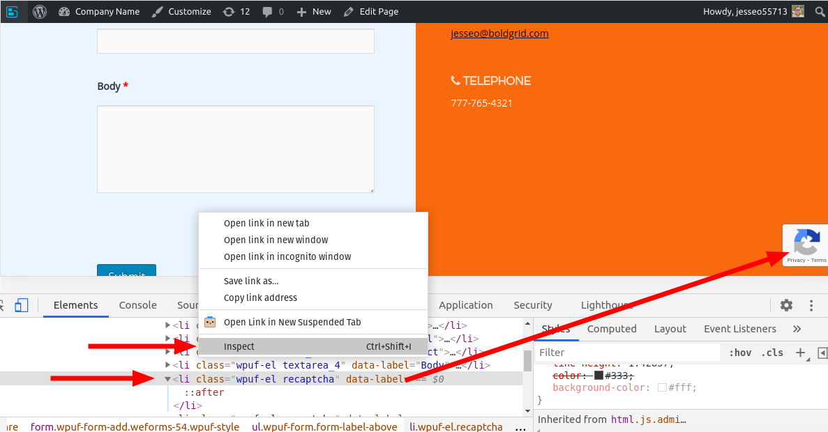
The easiest way to tell if it’s there is to look for the reCaptcha “Privacy & Terms” box that appears at the bottom-right of a page that includes your form.
Another good way to check is to right-click above your submit button, and click Inspect in Chrome or Inspect Element in Firefox. You should see an element in your form with the class wpuf-el recaptcha:

I checked out the contact page on your website, and it looks like it’s not showing up. Double-check that your form got saved after you added the reCaptcha field to the form.
December 22, 2020 at 6:00 pm #32477jessica ortiz
GuestThank you. I tried again and i see a privacy notices when logged in. Will the submissions go to my email or only to the editor page? I am having trouble with formatting in different browsers and devices. In some places, my phone number on the Contact page is black (in the editor it is white). Some browsers are still only showing my old site, some words are broken up, things are misaligned depending on phone, tablet, laptop and between Chrome, Safari or Firefox. It shows up in my editor as correct so I am not sure how to adjust for this. Tech support with my host are not able to help me figure this out.
December 23, 2020 at 2:48 pm #32495Jesse Owens
MemberHi Jessica-
From what you’ve described here:
In some places, my phone number…is black.
Some browsers are still only showing my old siteIt sounds like you may be dealing with an issue of caching. I didn’t see any caching plugins or CDN active on your site, so you may need to clear your browser’s cache to make sure you’re seeing your new site. I wasn’t able to see the black phone number in any of my tests.
One thing I do see that’s off about your contact page, and it’s partially my fault, is the First and Last name fields overextending beyond their column. That’s because I had previously advised you to Use Theme CSS for your form. Try adding this line of custom CSS:
ul.wpuf-form .wpuf-fields input[type=text] {
	width: 95%;
}
I found that resolves a lot of the issues with mobile formatting as well. If that doesn’t resolve all of the issues you mentioned, see if you can take a screenshot and let us know which browsers or pages you’re seeing the broken formatting on, and I’ll take a closer look. You can use a service like imgbb.com to share screenshots here.
- AuthorPosts
- The topic ‘Formatting issues not showing in editor’ is closed to new replies.


