- AuthorPosts
- September 3, 2020 at 12:35 pm #26414
Jennifer Clark
GuestI’m designing a site using Haven. I have two questions: 1) I want an elegant table to showcase the business’s extensive services and pricing (similar to a restaurant’s online menu of entrees and their prices). None of Haven’s options under “Pricing Table” work. Gutenberg is too plain. Do you have another option?2) I’m using a featured photo on the home page but it is also being picked up on other pages. How can I remove the featured photo from those other pages? Thank you.
September 3, 2020 at 3:18 pm #26434Jesse Owens
KeymasterHi Jennifer-
Have you taken a look at the “Services” block type? There are a lot of options there that I think meet the “menu” type of layout you’re looking for.
By default, your background image will show on all the pages, but you can change this with a little bit of custom CSS. Navigate to Customize > Advanced > Custom JS & CSS and paste the following lines into your Custom Theme CSS:
body.page-template-default.custom-background {
 background-image: none;
 background-color: #1e1e1e;
}
You can change the color to suit your needs, I thought #1e1e1e (a dark charcoal color) fit pretty well with your site’s design.
September 9, 2020 at 4:08 pm #26709Jennifer Clark
GuestThanks, Jesse, for your reply. Unfortunately, neither solution is what we’re looking for. I came up with my own pricing table, so I don’t need any further assistance there. However, I still need help resolving the background issue. While the photo is now eliminated, I do not like large empty block that is now at the top of every page (except for the Home page). Can we remove that background completely and just start each page with its section header? If the background cannot be removed, can it be condensed to half or even a quarter of its current size? It’s critical for us to see the section header immediately on each page without scrolling. Thank you.
September 9, 2020 at 4:30 pm #26725Jesse Owens
KeymasterHi Jennifer-
I see a couple of ways to reduce the size of the header area.
First, your call-to-action widget has a few paragraphs with nothing but a single “space” character in them, one above the button, one in between the button and image, and one below the image. Navigate to Customize > Widgets > Below Site Title to modify your call-to-action widget.
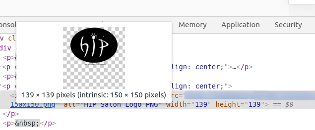
Second, the image in your call-to-action widget is actually taller than it looks. It has an area of transparency below the image:

You could crop some of this transparent area out of the image to trim up the header area a little more.Finally, you can add a custom CSS rule to reduce the margin below the call-to-action. Navigate to Customize > Advanced > Custom JS & CSS and paste the following rule into your Custom Theme CSS field:
.call-to-action { margin-bottom: 0px; } - AuthorPosts
- The topic ‘[Resolved] Haven design questions’ is closed to new replies.
