- AuthorPosts
- January 11, 2021 at 11:38 am #32847
Shawna
GuestHello BoldGrid,
I am new to BG and haven’t worked with WP in many years. I was exploring around, trying to get my bearings. I decided to see what the difference was between the BG and WP. I decided I like BG better. But I don’t know how to switch back?
Also, I used the theme “Diced”. We want a very simple site. So I removed the upper portion and started the build. On BG, it looked fine. But when I went out to the net to look at it, it didn’t remove that whole upper portion. Can someone there advise me?
Thank you in advance!
January 11, 2021 at 11:42 am #32860Jesse Owens
KeymasterHi Shawna-
Since you’re already using Diced, you’re halfway back to using BoldGrid for your pages and posts. The other thing you’ll need to do is make sure you have the Post and Page Builder plugin installed and active, and make sure you have the Editor selected as your preference in your Post and Page Builder > Settings menu.
As for that top part where the Call-to-Action would normally be in the Diced Theme, if you’re not using that at all you’ll need to add a Custom CSS rule to hide it completely. Navigate the Customize > Advanced > Custom JS & CSS menu, and paste this line into your Custom Theme CSS:
.entry-content { margin-top: 0px; }January 13, 2021 at 4:34 pm #32942Shawna Ingram
GuestJesse, thank you so much for your help! It’s very appreciated. I haven’t worked in WP for a long time. Everything has changed so much. With the addition of BG within the dreamhost platform, I’m excited about the possibilities. I just need to learn everything first. 🙂 I have been working in Concrete5 for years, so I know the basics of getting around in a WYSIWYG platform. It’s just learning a different way of doing things. Having you care enough to answer is wonderful! Thank you again.
January 13, 2021 at 4:35 pm #32953Jesse Owens
KeymasterHi Shawna-
It’s my pleasure! Please let us know if you have any more questions as you learn your way around, we’re happy to help.
January 14, 2021 at 6:27 pm #32977Shawna Ingram
GuestThank you Jesse! I do have another question for you. So thank you for offering! There was a simple hyperlink that I really liked in the Dice theme. I wanted it to link to an outward page – not part of my site. I also wanted to make it larger. I messed around with it and now it doesn’t look right. It just looks like tiny text. Is there something I can do to either bring it back or create a new one that would be larger on the page? I think the old buttons are kind of clunky? But I liked that design on the original dice opening page.
Also, do you know of a good way to take a bunch of company logos in wordpress/boldgrid and make them all look similar so I can splash them across the page to let people know who we work with? Thank you again for being here!
January 14, 2021 at 6:52 pm #32983Jesse Owens
KeymasterHi Shawna-
Thanks for the questions! I’ll try to hit on each one for you.
Is there something I can do to… bring it back?
You can, but at the risk of losing other changes you may have made to the page. You can use the Revisions history to go back through previous versions of the page. It’s in the Publish box, where you save updates.
[Can I] create a new one that would be larger on the page?
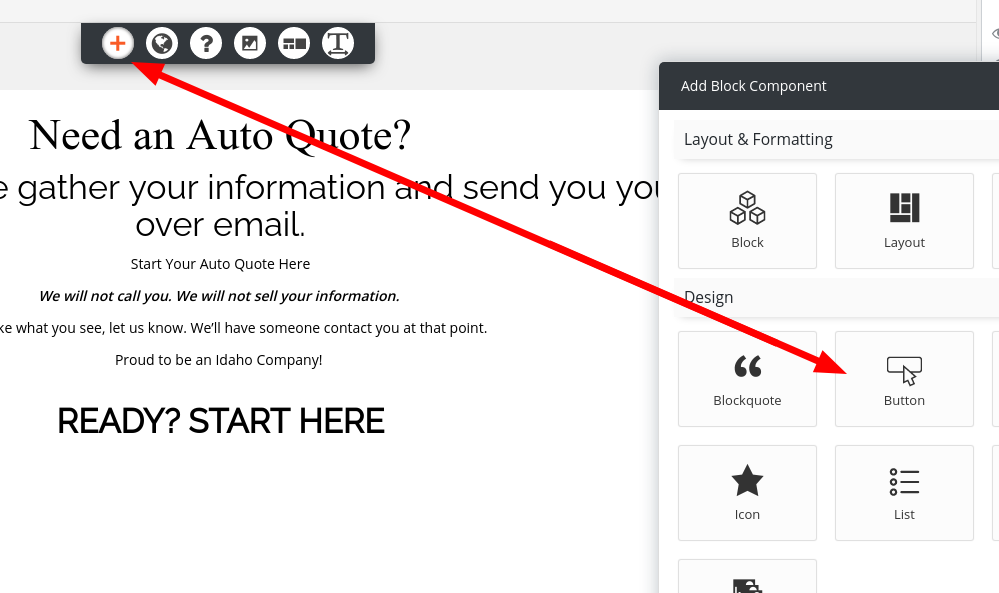
Yes, click the Add Block Component (+) icon at the top of the page, and look for the Button component.

I also wanted to make it larger… It just looks like tiny text.
You can also change font sizes easily. Look for the Font menu (it looks like a “T” with left/right arrows underneath).
Also, do you know of a good way to take a bunch of company logos in WordPress/BoldGrid and make them all look similar?
That’s a bigger question than it sounds like at first. Photoshop, GIMP, and other image manipulation programs vary pretty widely. I might recommend Canva, a very easy-to-use, free-to-start and web-based graphics design suite.
A lot of the success of this will depend on the quality of the logos you use to create them. Most companies should offer a Media Guide, “press guide,” or “style guide” where you can find high-resolution versions of their logos. Here’s BoldGrid’s Media Guide, for example.
- This reply was modified 4 years, 2 months ago by
Jesse Owens.
- This reply was modified 4 years, 2 months ago by
Jesse Owens.
- This reply was modified 4 years, 2 months ago by
Jesse Owens.
January 15, 2021 at 8:10 am #32992Shawna
GuestThank you so much for all of your help Jesse! Very appreciated!
ShawnaJanuary 19, 2021 at 6:23 pm #33091Shawna Ingram
GuestHi Jesse, Thanks to you I think I am getting the hang of this now! I added a button, but it took me a bit to figure out the customization tool. I had it perfect and published it. Now the site’s all messed up. I’m not sure where to go from here in order to clean it up. Would it be best just to start with a clean slate? If I need to start all over again, what’s the best way to do that?
January 19, 2021 at 6:26 pm #33096Jesse Owens
KeymasterHi Shawna-
Thanks for reaching out! I checked out your site and I can see what you mean. I can’t say for sure what’s going on, but there are definitely some strange things going on, like paragraphs inside of buttons and strange styling issues.
There is an easy way to start over. Navigate to the Inspirations menu, and click the Start over with a new Inspiration button. One thing I might recommend if you decide to go that route is to make a backup of what you have so far, and transfer it to a staging site in BoldGrid Cloud WordPress. Here are instructions for how to do that.
January 20, 2021 at 10:20 am #33097Shawna
GuestThank you so much again for your help. I’m baffled as well. I’ll back it up or at least take screenshots as it doesn’t show up wonky in edit mode. Then start over. It will be easier now that I’m more familiar with the platform.
Thank you again for all of your help.
January 22, 2021 at 11:34 am #33136Shawna
GuestJesse, I started over and am still having problems with the button, specifically. Should I switch to an entirely new theme? Can you take a look?
January 22, 2021 at 11:47 am #33188Joseph W
KeymasterHi Shawna, we are happy to take a look at the new button! What kinds of problems are you having with it?
The styling looks like it aligns with the default settings in the Monument theme, but I did notice that link information contains a <script> element instead of using a URL as expected. What kind of behavior are you trying to get out of that button?
We look forward to hearing back from you Shawna!
- This reply was modified 4 years, 2 months ago by
Jesse Owens. Reason: Fixing html markup
January 22, 2021 at 3:50 pm #33191shawna
GuestHi Jesse,
I switched to the Monument theme to see if the same behavior would occur. We won’t be using that theme. We prefer Diced and really want to make that work if possible.
This is what we are trying to do: I have created a form in another form creator that I am trying to link to the button in Diced in order to capture information for a quote. I was using that button to link to jotform.
What character do you think might be a problem? Do you have any other ideas? I’m stumped!
Thank you!
January 22, 2021 at 4:10 pm #33197Jesse Owens
KeymasterHi Shawna-
Sorry, there was a typo in that last post that didn’t let it finish.
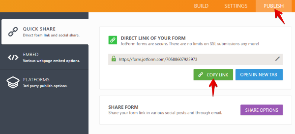
Right now, in the link for your button, you’re pasting the embed code from JotForm, not a link to the form. It’s in a <script>…</script> element, which won’t work as a button. You’d paste that into your page if you wanted the form to be embedded on your page, not link to it externally.
Putting that script into a button link would probably explain a lot of the weird behavior you’ve been experiencing as well.
Look for the Direct link of your form option when you’re logged into your JotForm account:
 January 25, 2021 at 10:33 am #33200
Shawna Ingram
GuestThis is GREAT information! Thank you.
February 2, 2021 at 12:41 pm #33450Shawna
GuestIs there a way to lock a site vertically so it doesn’t scale horizontally on a page?
Thank you!February 11, 2021 at 10:25 am #33694Shawna
GuestJust wondering if you know of a way to lock in the diced theme so it stays in the original vertical format rather than scaling horizontally to a large screen. Does that make sense?
February 11, 2021 at 10:26 am #33695Shawna
GuestHello Jesse, were you able to address my question above? I haven’t seen a reply. Thank you.
February 11, 2021 at 10:51 am #33712Jesse Owens
KeymasterHi Shawna-
Sorry about missing your last question. From what you’ve described, it sounds like you’re trying to get your site to stay scaled for a mobile device (vertical position), and keep that same format when the site is viewed on a large screen? In other words, to always display the mobile version of the site, regardless of the size of the screen?
If I’m understanding you correctly, you can accomplish this with a little more custom CSS. Try this code:
body {
    max-width: 767px;
    margin-left: auto;
    margin-right: auto;

    }
div#content {
    max-width:  767px;
}
This code will only work well if you remove the background image from Customize > Background, or if you use the Full Height background image size.
February 12, 2021 at 11:26 am #33724Shawna
GuestThank you Jesse. This is exactly what I needed!
- This reply was modified 4 years, 2 months ago by
- AuthorPosts
- The topic ‘[Resolved] How to Remove Top Part in Diced Theme’ is closed to new replies.

