- AuthorPosts
- April 4, 2022 at 10:48 am #49523
 JessGuest
Hi!
I built a very basic website yesterday using Bold Grid, and there are problems with how it appears on a mobile. Headers aren’t resizing properly so that ‘WELCOME!’ winds up split over two lines to read ‘WELCOM’ and ‘E!’
There are also problems with the Comvertkit plugin form’s appearance on mobile.
These photos show what I mean: https://ibb.co/VYkKpt7
https://ibb.co/L1KfHzvAny simple solutions??
Thanks for your help!
April 4, 2022 at 11:00 am #49580Brandon CParticipantHi Jess,
Thanks so much for reaching out!
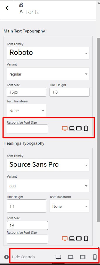
The responsiveness of many website areas in Crio Pro WordPress theme, like the header and footer sections, are automatically designed to shift their content to create a readable mobile display. There are also some Responsive Utilities provided by the Post and Page Builder that allow you to select the device type and change how your content looks for difference screen sizes.
You can control global typography from the WordPress customizer inside of the Appearance < Customize < Fonts section.

To take it a step further if you would like to remove the auto-hyphens for Headings and Sub-Headings in your content you can add this “CSS” snippet to the CSS/JS editor section of your customizer:
.palette-primary .h1, .palette-primary .h2, .palette-primary .h3, .palette-primary .h4, .palette-primary .h5, .palette-primary .h6, .palette-primary h1, .palette-primary h2, .palette-primary h3, .palette-primary h4, .palette-primary h5, .palette-primary h6 {
    word-wrap: normal;
    hyphens: manual;
    -webkit-hyphens: manual;
}
I hope this helps Jess! Please reach back out if you have any other questions for us.
- AuthorPosts
- The topic ‘Issue with mobile responsiveness in my Crio WordPress theme’ is closed to new replies.