Tagged: Rows and Columns, Typography
- AuthorPosts
- September 15, 2020 at 2:14 pm #26997
bryan forsythe
GuestHi! Thank you so much.
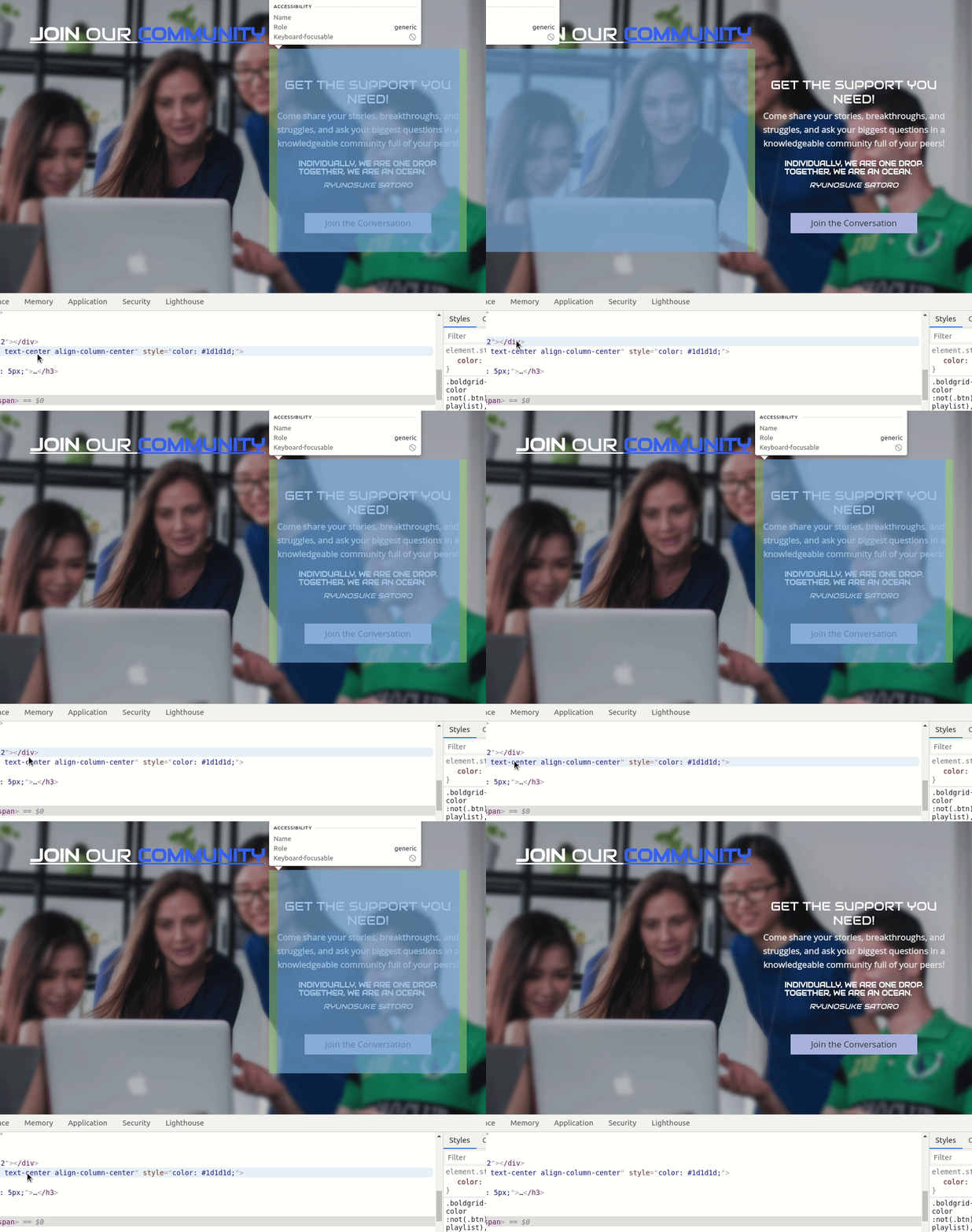
On the OUR MISSION page of Tewasi.org
I want this section to be centered right under the text
JOIN OUR COMMUNITY
GET THE SUPPORT YOU NEED!
Individually, we are one drop. Together, we are an ocean.
Ryunosuke Satoro
Join the ConversationI hope this is clear.
Thank you again.
Bryan
September 15, 2020 at 2:28 pm #27029Jesse Owens
KeymasterSeptember 15, 2020 at 4:01 pm #27051bryan forsythe
GuestHi.
Im sorry but I could not replicate that at all.
Might be because we were looking at different sites. Up until a few hours ago there were two versions of my site. Now there is only one. if you go to [redacted].org you will see what I’m seeing.
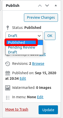
So on to my question. how come my most recent page (privacy) isnt published? How do I make sure a page is published? Why does the update button not publish?
Thank you
Bryan
September 15, 2020 at 4:42 pm #27059Jesse Owens
KeymasterHi Bryan-
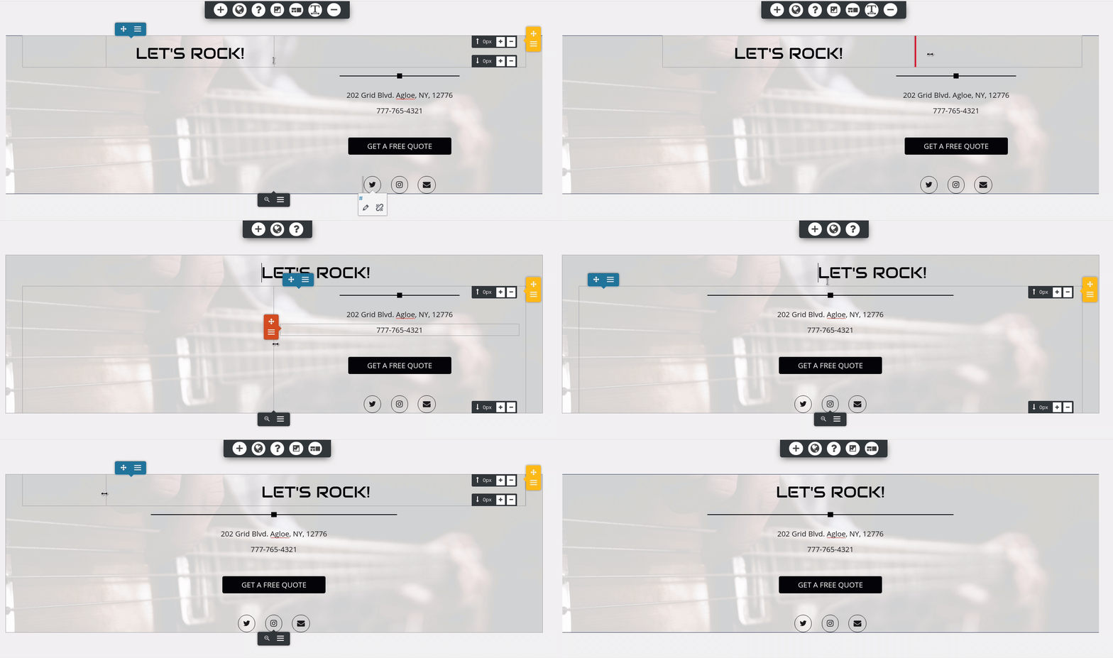
Upon closer inspection I did notice some odd things about your “Join Our Community” Block.
Take a look at this quick video I created to show you how to fix this block.
As for your Privacy Policy page, one thing to keep in mind is that these pages are usually saved as “Drafts” when they come out-of-the box in WordPress. Be sure you set the Post Status to “Publish” when you publish your page.

One thought does occur to me- you mentioned that you had two versions of your website before, and now you’re using only one. Did you publish the Privacy page on your main site, and not the other staging site?
September 16, 2020 at 5:36 pm #27172bryan
GuestHi.
Ok, so if you look at my footer.
You see TEWASI in small white letters
then totally left oriented the entre… etc.
I went in and changed that using the customize option, and all the font was much bigger and much nicer. But then when I published the page TEWASI went back to being in tiny white lettering. I purged the page thinking maybe it was an old version. But no. It just went back to the original look. I need TEWASI to be in bold at least four times the size, and preferably that whole the entre well… text block to be much smaller and center justified.
Can you help?
Thank you Bold Grid God-man you are our only hope…
Bryan
September 16, 2020 at 5:37 pm #27173bryan
GuestHi.
Also my header TEWASI is off center and I can’t figure out how to get it
exactly centered. Can you help with that?
If I ask too many questions I’m very sorry.
I have spent a solid week and a half working on this site.
I aim to get better.Thank you.
Bryan
September 16, 2020 at 6:36 pm #27183Jesse Owens
KeymasterHi Bryan-
Happy to help! You’ve got a couple of different things going on, so I took a few minutes to make this video for you.
Here’s the CSS code from the video:
footer .site-description {text-align: center; }
footer p.site-title { font-family: Audiowide;
font-size: 25px; }
September 17, 2020 at 12:37 pm #27194bryan
GuestHi.
So the header is still off even with the sticky header changes. The footer changes look awesome. Also, I’m seeing fonts not staying selected.
RE audiowide is selected as font family and I still see it using multiple fonts.Thank you for your help.
Bryan
September 17, 2020 at 1:21 pm #27206Jesse Owens
KeymasterHi Bryan-
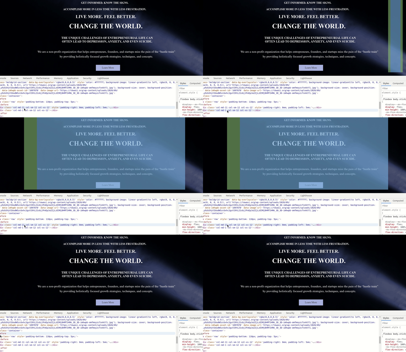
Actually it looks like the header is centered, but the top block on your homepage is actually askew.
You’ve got a tiny column to the right of your top block, that you should be able to eliminate in your editor:

As for your fonts, it looks like this might be an issue left over from your staging site. The URL for the font is still calling the site with bg_ in the URL. You should be able to fix this by going to Customize > Fonts > Headings and switching to a different font, publish your changes, and then switch back to Audiowide.
September 17, 2020 at 3:20 pm #27212bryan
GuestHi!
I looked for that piece of code which was making the header off center, I’m afraid without audio explaining what you were trying to get me to do, I just took what I thought was the right code, and it is still the same.
I did the change font, and then back again. I don’t think that worked.
The temp login is done and hopefully you have gotten an email confirmation.
Thank you again Boldgrid God-man, you make me proud to be a pizza loving humanoid!
Bryan
September 17, 2020 at 3:28 pm #27228Jesse Owens
KeymasterHi Bryan-
We’ll follow up with you on your Premium Support Ticket and get this all fixed up for you.
September 17, 2020 at 5:45 pm #27254bryan
GuestHi.
Im looking on mobile the only thing I see is the home page verbiage is still a bit off center and the text for one of the CTAs is still completely messed up.I hope you guys are still around.
I dont know what you have fixed or not, I apologize if Im asking about things you are already doing.
Thank you so much.
Bryan
September 17, 2020 at 5:48 pm #27264Jesse Owens
KeymasterHi Bryan-
I sent you an email with a summary of the changes we made in your Support Ticket. The primary issues were:
- Many of the paragraphs had custom left- or right-margins that were upsetting the centering.
- The URL for your fonts was still pointing to the deleted staging site.
Once we got these fixed up, I think everything looks better, but please let us know if you need any more help!
- AuthorPosts
- The topic ‘How to center paragraph under heading’ is closed to new replies.


