Tagged: Backgrounds, Responsive Design
- AuthorPosts
- March 16, 2021 at 4:30 pm #35061
Mike Atkinson
GuestWhen I first set up our homepage, I used a pre-formatted block and replaced the large top image with mine. You can see it on my current live site. You can see that it goes full width. But I needed to replace it so I deleted that, clicked Add Media, but it’s not allowing it to go full width. I’ve looked through all the settings and can’t find anything to change it. What can I do? TIA!
March 16, 2021 at 6:10 pm #35069Jesse Owens
KeymasterHi Mike-
Thanks for the great question, and thanks for using the Post and Page Builder plugin for WordPress.
It looks like what’s going on here is that you’re using that image as both the background, and content, for that top block. The background stretches out the full width because backgrounds automatically resize according to the size of the container, but the image is not.
You can see this on the front-end if you look very carefully at the left and right sides. I’d recommend removing the image in the content, and swapping out the background.
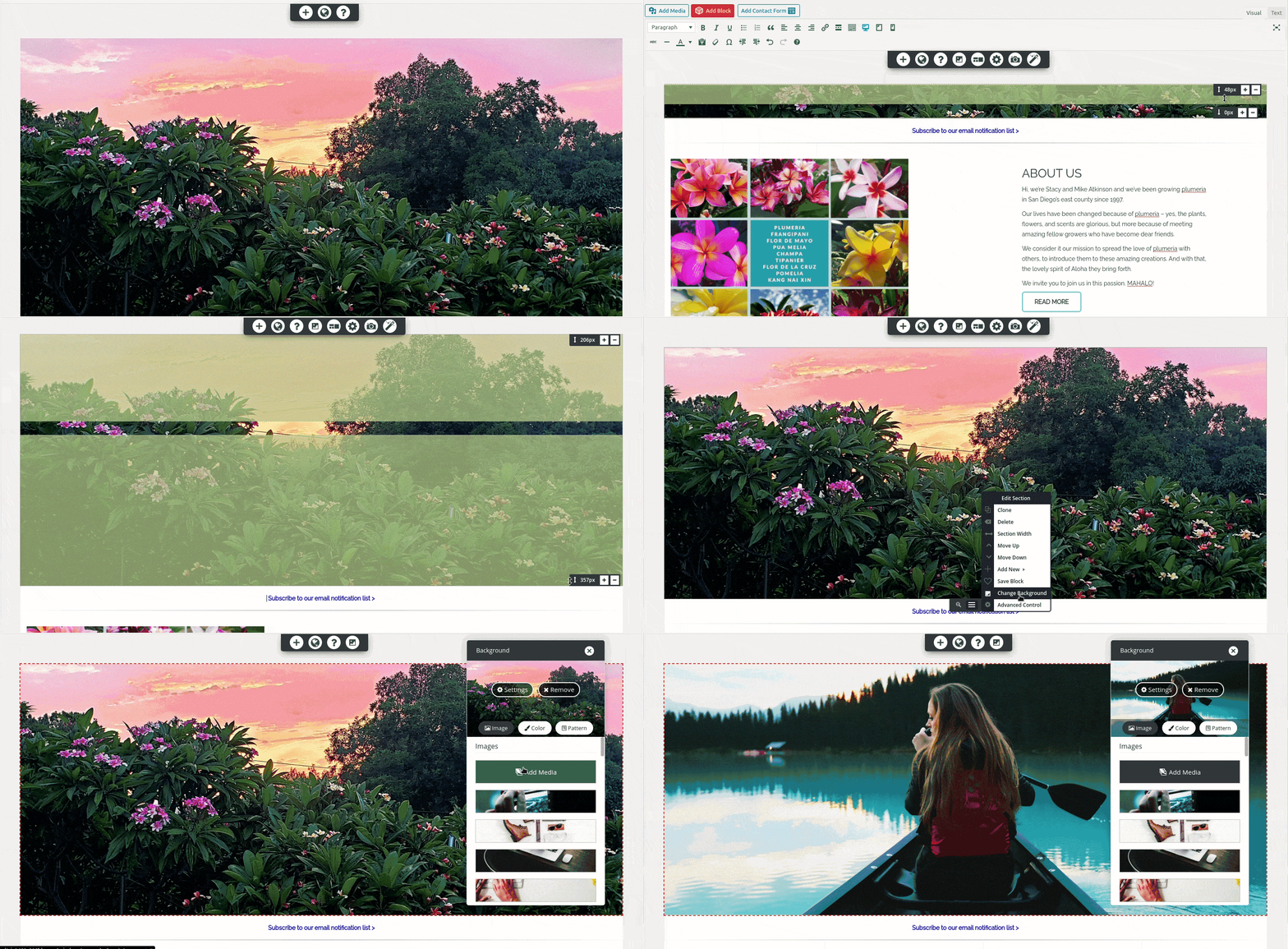
First, remove the image with the X button. Then, you’ll need to use the height controls to show the entire background image. Finally, replace the background using the gray-colored Edit Section menu. Here’s a short animation of the process:
 March 16, 2021 at 7:20 pm #35070
Mike Atkinson
GuestThanks Jessie. I totally get what you’re saying. I did forget I set it as the background. The problem is that I don’t get the height controls to drag it up to full height. I only get them for the text section below it. What am I missing? Thanks!
March 16, 2021 at 7:30 pm #35079Jesse Owens
KeymasterHi Mike-
Thanks for the reply, sorry about that snag.
I took a closer look, and I spotted the problem- that top row is missing some of the necessary markup for those controls to appear. I can’t say for sure how that happened, but here’s how you can fix it.
Switch over to the Text editor tab so you can examine the code, and look at the top few lines (you can ignore or delete the extra code that appears above this):
We need to add a Row and Column to the block. Update those lines to include these two extra
divtags:
March 17, 2021 at 11:44 am #35080Mike Atkinson
GuestDid all that and it did give me height controls for the section but not the image. The only way I’ve been able to control the image side is by changing the padding, but that tends to skew it.
So I started over and inserted a new block with the background I need. It’s close but it cutting off the bottom part with my text. I went ahead and pushed it live because I haven’t promoted the site yet and you can see the live code.
Again, I really appreciate this!
March 17, 2021 at 12:07 pm #35101Joseph W
KeymasterHi Mike!
If you need to make the bottom text of your background image visible then you could try using the Vertical Position tool in your Section background settings to shift focus of the background to the bottom portion of that image.
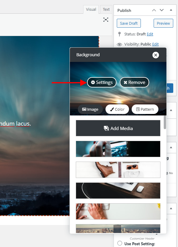
Open the Section Background controls and select the Settings option for your background image.
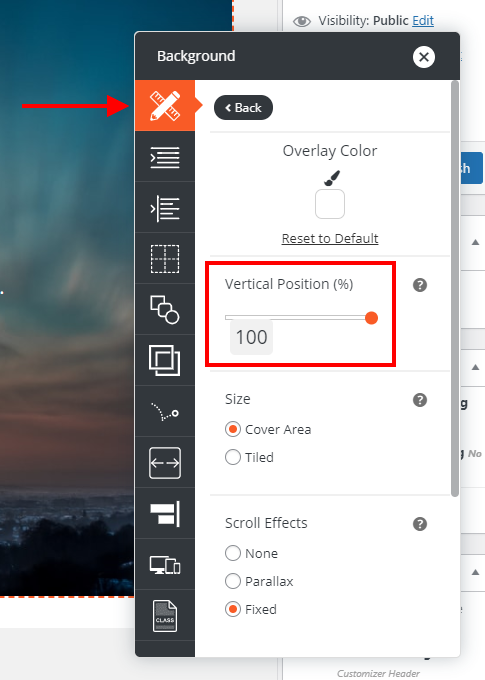
With the background settings controls opened, go to the Element Design section and move the Vertical Position slider to 100% to shift your background image up and focus more on the bottom of the image.
Hopefully that control helps you get the text on your image displayed as desired and please let us know if there is anything else that we can do to help!
March 17, 2021 at 4:50 pm #35106Mike Atkinson
GuestI did that but it is now cutting off the top of the image. You can see that on the live site. In the admin, it looks fine however. What should I do?
[I tried to insert an image URL and was denied. No way to show you a screenshot?]
- AuthorPosts
- The topic ‘How to replace large banner image’ is closed to new replies.


