Forum Replies Created
- AuthorPosts
Jesse Owens
MemberHi Shawna-
Sorry about missing your last question. From what you’ve described, it sounds like you’re trying to get your site to stay scaled for a mobile device (vertical position), and keep that same format when the site is viewed on a large screen? In other words, to always display the mobile version of the site, regardless of the size of the screen?
If I’m understanding you correctly, you can accomplish this with a little more custom CSS. Try this code:
body {
    max-width: 767px;
    margin-left: auto;
    margin-right: auto;

    }
div#content {
    max-width:  767px;
}
This code will only work well if you remove the background image from Customize > Background, or if you use the Full Height background image size.
Jesse Owens
MemberHi Natasha-
Thanks for reaching out, and for using the Wedge WordPress Theme from BoldGrid.
Wedge features an alternate-color first letter for both the Site Title, as well as the first letter for Page and Post titles. Add this code to your Custom Theme CSS in the Customize > Advanced > Custom JS & CSS menu:
.site-title::first-letter, h1.entry-title::first-letter { color: unset !important; font-size: unset !important; }- This reply was modified 5 years, 1 month ago by
Jesse Owens. Reason: Fix typo in CSS code
February 10, 2021 at 4:02 pm in reply to: [Resolved] How to open links in the same tab in WordPress #33683Jesse Owens
MemberHi Ann Marie-
Depending on which link you’re working with, the process will be a little different.
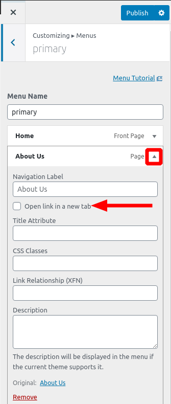
For your menu items that are opening in a new tab, navigate to Customize > Menus > Primary Menu and expand each of your links using the triangle icon, where you’ll find the checkbox to Open in a new tab:

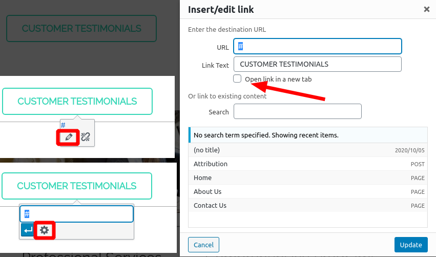
For your links that are in your Post or Page content, click the Edit (pencil icon) icon, then click on the Link Options (gear icon) where you’ll find the Open in a new tab checkbox:

Jesse Owens
MemberHi Tracy-
Thanks for the great question, Comment Spam is one of the oldest and most persistent problems for WordPress website owners.
There are a few ways you can fight spam comments on your blog. Here on BoldGrid.com, we use the Advanced noCaptcha & Invisible Captcha plugin as a first “wall of defense.”
This plugin has a couple of benefits, primarily that you can get all of the most important features completely for free. This is the familiar “I’m not a robot” checkbox, just like the one you checked when you asked this question, although there are also invisible options that don’t require your human visitors to interact with the checkbox.
It does take an extra step of signing up for a reCaptcha API key from Google, but the plugin makes this very easy by providing a link directly to the Google reCaptcha dashboard. You can get this key for free using any Gmail or gSuite account.
Some Spam still gets through reCaptcha, because there are still actual humans posting Spam comments out there, but it goes a long way to reduce the burden for you.
The other biggest way to fight Spam Comments is the Akismet plugin, and this is also where marking comments as “Spam” or “Trash” makes a difference.
By default, WordPress treats your Spam and Trash folders the same way, but when you’re using Akismet, you share a spam filter database with over 5 million other WordPress websites, and each time you mark a comment as Spam, that feedback is added to the database to improve it. Akismet will automatically sort spammy comments into your spam folder, and if you mark them as “not spam” then the false positive is also added to the database.
The only downside to Akismet is that it is not free to use for commercial websites, it’s only free for “Personal Blogs.” It is quite affordable, however, and if you’re spending more than about $8 worth of your time every month fighting Spam on your website, then I recommend making the investment.
February 10, 2021 at 11:07 am in reply to: Keep Slider Block Same Height with Different Images #33668Jesse Owens
MemberHi Cliff-
One alternative you could consider is using a slider-type image gallery, if your slider consists of only images, or images with captions. That will display images in a lightbox-style gallery that pops-up above the page content, and doesn’t shift the page layout.
Jesse Owens
MemberHi Chris-
This is a public support forum, so I’ve removed your personally-identifying info from this post. Can you file a ticket to our Premium Support and Billing team to sort this out for you?
Jesse Owens
MemberHi Aaron-
You’re absolutely right! I’ve already got this bug in the developer’s queue.
Jesse Owens
MemberHi Robert-
Thanks for reaching out, I’m sorry to hear about the trouble with your new account. Thank you for purchasing a BoldGrid Premium WordPress Bundle.
First thing, since you’re a DreamHost Customer, you already have access to the Premium versions of all of BoldGrid’s products, and you shouldn’t need to input any additional keys into your site hosted there, or make any additional purchases through us.
This is a public support forum, so I can’t provide any of your private billing details or your Connect Keys here, but I encourage you to file a premium support ticket so our billing team can get your purchases and keys all fixed for you.
When you describe, “there is no access to Inspirations or other options I have on another site,” it sounds like your new site might not have the Inspriations plugin installed. You can download Inspirations directly from this link and install it on your new site via the Plugins > Add New > Upload Plugin menu.
Jesse Owens
MemberHi Kate-
Swifty is designed with the menu and logo in the same row by default, but it is possible to accomplish what you’re looking for.
First off, I’m not entirely certain how your menu got to be vertically stacked like that. I think that might have been added by your web designer, using the QuickStarter Menu plugin. Try disabling that plugin to see if you get the normal horizontal menu appearance.
Then, the next step is to modify the logo and menu columns so that they’re both the full width of the page. Navigate to Customize > Advanced > Custom JS & CSS. Here you’ll find two fields, your Custom Theme JS, and your Custom Theme CSS.
Paste this code into your Custom Theme JS:
jQuery('div.col-md-6.header-6').removeClass('col-md-6').addClass('col-md-12');
jQuery('div.col-md-6.header-7').removeClass('col-md-6').addClass('col-md-12');
Then, to center both your logo and your menu, paste this code into your Custom Theme CSS:
.site-title { text-align: center; }
.navbar-default { float: unset; }
.navbar-header { text-align: center; }
.navbar-toggle { float: unset; }
If you’re interested in a theme that lets you completely customize your header without using any code, I recommend checking out the Crio WordPress Theme for Business.
- This reply was modified 5 years, 1 month ago by
Jesse Owens.
February 8, 2021 at 7:12 pm in reply to: Pinterest Social Media menu icon not working in Vacation Theme #33638Jesse Owens
MemberHi Matt-
Thanks for reaching out, I’m sorry to hear that you’re having trouble with your Pinterest icon in your social media menu.
I checked out the website you mentioned, and I can see the Pinterest icon is working correctly now. I did notice that you’re using a caching plugin, Autoptimize, and you may have needed to clear the cache before you could see it working correctly.
Please reach out if you’re still having trouble with this, and let us know what browser or device you’re seeing the text for Pinterest, so we can take a closer look for you.
February 8, 2021 at 7:02 pm in reply to: Offsite storage uploads fail with Google Drive and FTP #33635Jesse Owens
MemberHi Richard-
Thanks for reaching out, I’m sorry to hear about the difficulty getting your remote storage to work.
Each of these logs appear to be a successful upload. In the case of the FTP log, we can even see the backup files that remain on your FTP Server:
[2] => -rw-r--r-- 1 settl359 settl359 1990885436 Feb 6 10:20 boldgrid-backup-www.stalkeldaschurchgiggleswick.org_.uk-8f264049-20210206-091835.zip
[3] => -rw-r--r-- 1 settl359 settl359 2842024185 Feb 7 12:24 boldgrid-backup-www.stalkeldaschurchgiggleswick.org_.uk-8f264049-20210207-065814.zip
There are errors here that you have two different WP_MEMORY_LIMIT constants in your wp-config.php file, but that shouldn’t prevent the uploads from working (although you should make sure only your new 512MB directive is present and delete the older one).
Do be sure to double-check the upload directory, these backups will be in their own directory in both Google Drive as well as your FTP server.
February 8, 2021 at 6:51 pm in reply to: How to add Circle Mask to Boldgrid Coverflow gallery #33630Jesse Owens
MemberHello Marta-
Thanks for reaching out! You’re right that the circle image design is only available for individual images, not galleries at this time.
At this time, the best way to accomplish this would be to use image editing software to create your images as a circle with a transparent background, and use those in your gallery.
February 8, 2021 at 6:42 pm in reply to: Images not showing in Chrome, work in Firefox and Edge #33628Jesse Owens
MemberHello Fanny-
Thanks for reaching out, I’m sorry to hear about the difficulty with your images showing up in Chrome.
I’m making the assumption that the images you’re talking about are the ones with the links, “Infos sur les cours,” “Prix,” and “Horaires.” Please let me know if I’m wrong about that assumption.
The reason that these images aren’t showing is because they’re actually the images from your DreamHost Staging site, http://www.example.com.dream.website. Notice in that address, the protocol is http, but your main website is https://example.com, with https.
Chrome won’t display “insecure” content loaded over http on a website that is using https. What you’ll need to do in this case is edit those images to use the URL of your production website, not your staging website.
One way you can accomplish this is to use a plugin like Better Search and Replace. Search for “www.example.com.dream.website” and replace those with “example.com” (making sure to swap out “example” for your domain name).
Jesse Owens
MemberHi Michael-
Thanks for reaching out! This is possible, in a few different ways.
Probably the best way to accomplish this is to use a plugin like W3 Total Cache to connect to an asset CDN. That way, not only will FontAwesome be loaded from a CDN, but all of your site’s static assets like JavaScript, CSS, and fonts will be served from the network.
That also has the added bonus of not requiring modifications to any theme files. Keep in mind that if you edit your theme files without creating a child theme, you’ll lose any of your modifications any time the theme is updated.
All of that being said, the files in which the FontAwesome Woff2 file is referenced are these:
boldgrid-gridone/inc/boldgrid-theme-framework/assets/css/font-awesome/font-awesome.css
boldgrid-gridone/inc/boldgrid-theme-framework/assets/css/font-awesome/font-awesome.min.css
boldgrid-gridone/inc/boldgrid-theme-framework/assets/scss/font-awesome/_path.scss
boldgrid-gridone/inc/boldgrid-theme-framework/includes/kirki/controls/fontawesome/font-awesome.css
boldgrid-gridone/inc/boldgrid-theme-framework/includes/kirki/controls/fontawesome/font-awesome.min.css
Search for
fontawesome-webfont.woff2to locate the references.Jesse Owens
MemberHi Cliff-
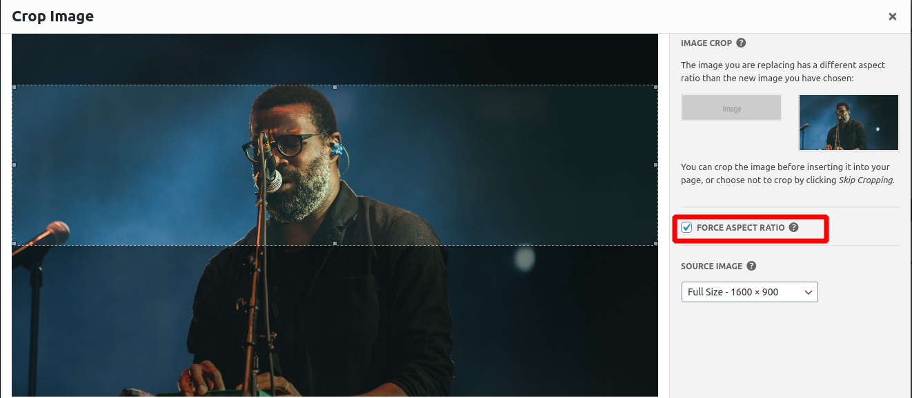
Thanks for reaching out! Probably the best way to avoid this issue is to make sure that the images you’re using in your slider maintain the same aspect ratio. When you first add images to your slider, you’ll be presented with this dialog to make sure your slides remain the same size:

This is the ideal way to handle that, because if you do start using images of different aspect ratios, they’ll be scaled differently on different screen sizes. So if you force it to remain the same size on a desktop monitor, they may end up looking too tall on a mobile phone.
It may be possible to add some Custom CSS to your sliders to make sure that they stay the same height, but it will be unique to the images you’re using and various screen sizes.
Jesse Owens
MemberHi Cliff-
There are a couple of ways to go about creating a sticky menu in the Resolve theme.
Probably the easiest way is to use the plugin Sticky Menu, Sticky Header (or anything!) on Scroll.
If you choose to use that plugin, use the element
.row.header-14for your Sticky Element.If you’d like to check out a theme with built-in sticky menus without the need for additional plugins, I recommend checking out the Crio WordPress Theme for Business.
Jesse Owens
MemberHi Jordan-
Thanks for reaching out! I’ll be happy to assist you with those PayPal buttons in the Post and Page Builder for WordPress.
It actually looks like you’ve got a couple of the buttons up and running on your
/services-2/page. If the script that PayPal provided to you was in a <script> tag, you’re right that you’ll only see a small icon in the editor, although they should work on the front-end of the page.I’d recommend checking out some of the many plugins available for making PayPal buttons easier, in particular it looks like the PayPal Buy Now Button will fit your needs.
February 8, 2021 at 5:01 pm in reply to: Remove empty space for “Primary” header + Add Sidebar to Homepage in GridOne #33607Jesse Owens
MemberHi Joe-
Checking out your site today, it looks like you may have already solved most of these issues.
In case anyone else is interested in the solutions, here’s how I would accomplish this.
First, to get rid of the empty space in the “Primary Menu” location when you’re using a different menu location in Grid One. In my testing, there should only be 1 pixel in this row if you’ve removed the menu. Double-check in Customize > Widgets > Below Site Title to make sure that there aren’t any Widgets there taking up extra space.
If you’re still experiencing that, try the following Custom CSS in Customize > Advanced > Custom JS & CSS:
.row .header-11 { display: none; }Second, adding a side-bar to the Home Page. Joe, it looks like you’ve solved this by adding the sidebar with some custom coding. The Grid One theme doesn’t normally include a sidebar.
If you’d like to easily set up a sidebar for your website, I recommend checking out the Crio WordPress Theme for Buisness, which has full design controls for every aspect of your site.
Finally, making your sidebar “Sticky,” so that it remains static as your user scrolls. This may take some fiddling around with to get it just right the way you like, but I found that the following Custom CSS will do the trick:
@media (min-width: 992px) { div.col-md-3 aside.sidebar { position: fixed; width: 12.5%; } }Jesse Owens
MemberHi Marco-
Thanks for reaching out, I’m sorry to hear you can’t log into your account.
We here at BoldGrid don’t have any access to your website to assist with your WordPress account or password, but your web hosting provider may be able to help.
I checked out your website, and it looks like you are hosted by one of our Premium Support WordPress Hosting providers, InMotion Hosting.
InMotion has 24/7 telephone support available, check out their support page for information.
Jesse Owens
MemberHi Aaron-
Thanks for reaching out, I’m sorry the background pattern in the Linx theme is so frustrating.
That background is hard-coded into Linx, so it takes a little bit of extra work to modify it. In order to use a solid color background, paste this code into your Custom Theme CSS in your Customize > Advanced > Custom JS & CSS menu:
body.custom-background,
.page-template-page_home .entry-content,
.site-content,
.site-footer, .mce-content-body {
    background-image: none !important;
}
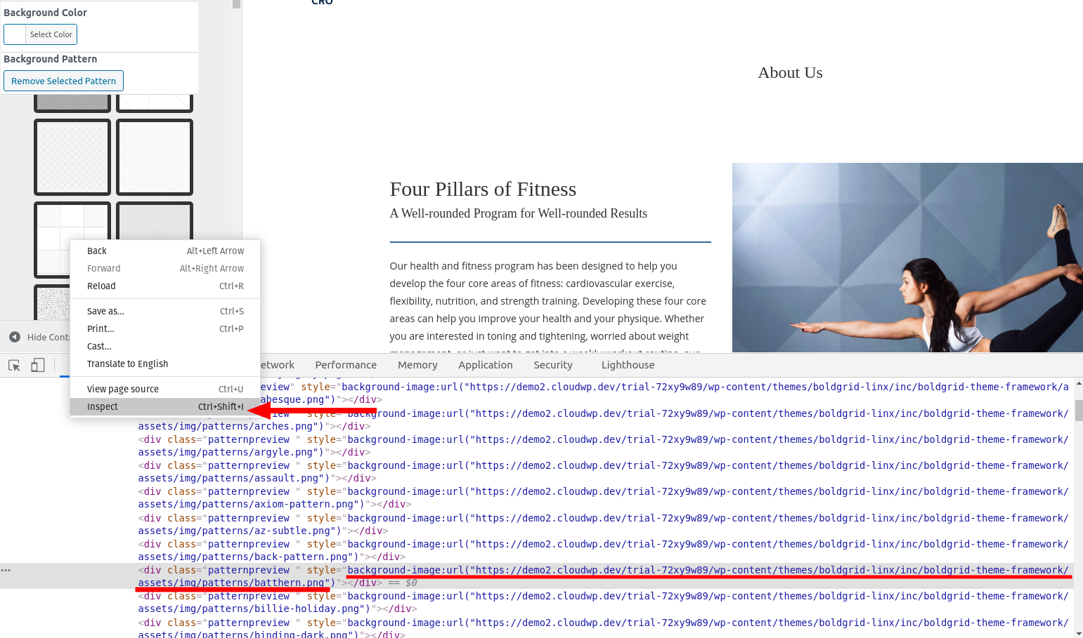
If you’d like to choose from the other background patterns, there’s another step to take. While you’re browsing the patterns, right-click on the one you’d like to use, and select Inspect (in Chrome) or Inspect Element (in Firefox), and copy the background-image:url(..) from your browser inspector.

Once you have that URL, you can add code similar to this in your Custom CSS:
body.custom-background, .page-template-page_home .entry-content, .site-content, .site-footer, .mce-content-body { background-image: url("https://demo2.cloudwp.dev/trial-72xy9w89/wp-content/themes/boldgrid-linx/inc/boldgrid-theme-framework/assets/img/patterns/batthern.png") !important; }Jesse Owens
MemberHi Todd-
Thanks for the additional info. Were you able to check the connection from outside your local network?
A test like that would eliminate the possibility that there are any issues with your Router/Firewall configuration with the FTP Connection.
Another way to test would be to log into your hosting account via SSH and attempt the connection from your server. If you can share the connection details including Protocol (FTP, FTPES, or SFTP), port number, and FTP Mode (please don’t share username, password, or host), I can provide you with a sample command to make the test.
Jesse Owens
MemberHi Todd-
Thanks for the update! I notice that you mentioned you’re using a local server for FTP. When you tested that connection with FileZilla, did you do that test from within your own network?
It’s possible that you might be hitting a firewall, and one way to test that would be to attempt the same login credentials from outside your local network, for example using a mobile hotspot connection.
Jesse Owens
MemberHi Todd-
Judging from this log, it looks like the connection was successful, but Total Upkeep failed to create the backup directory on your FTP server:
Unable to create backup directory on remote host.This might be a permissions issue, for example if the FTP user only has read access to your main directory.
You mentioned that you had tested this using FileZilla, can you attempt to create a directory in FileZilla to see if you get a similar error?
Jesse Owens
MemberHi Todd-
Thanks for reaching out, I’m sorry to hear about the trouble storing your WordPress Backups remotely with FTP.
To start troubleshooting what’s going wrong, the first thing to check is your upload log. Navigate to Total Upkeep > Tools > Logs and look for the files called
ftp-upload.logas well asftp-connect.logand paste that info here, and we’ll be able to narrow down what might be causing the problem.- This reply was modified 5 years, 1 month ago by
Jesse Owens. Reason: Added second log file name
Jesse Owens
MemberHi Peggy-
Yes, that’s correct- it’s related to the browser you yourself are using when you’re switching between the Text and Visual editors, not your visitors.
February 3, 2021 at 4:42 pm in reply to: I would like to cancel my subscription to Total Cache #33502Jesse Owens
MemberNo worries James! Our team will get in touch with you and get your subscription cancelled.
Jesse Owens
MemberHi Peggy-
Thanks for reaching out, and thanks for using the Post and Page Builder for WordPress. I’m sorry to hear about the frustrating space characters.
This bug has been haunting WordPress users for some time, and it’s tough to completely resolve because it only happens to certain browsers when switching between the editors.
I made a copy of your
/hire-support/page, and I couldn’t get the bug to occur for me in the latest version of Chrome for Linux. You may be able to get around this easily by switching to a different browser, such as Chrome or Firefox.The article I linked above also has a number of different technical solutions, including this one that you can copy and paste directly into a plugin like Code Snippets.
February 3, 2021 at 3:23 pm in reply to: I would like to cancel my subscription to Total Cache #33497Jesse Owens
MemberHi James-
Thanks for reaching out, and I’m sorry to hear about the frustration logging in. Since this is a public forum, we can’t discuss account-specific or billing details here.
You can reach out to our billing team privately directly from your WordPress Dashboard, in the Performance > Support menu, or by using this contact form.
Jesse Owens
MemberHi Sam-
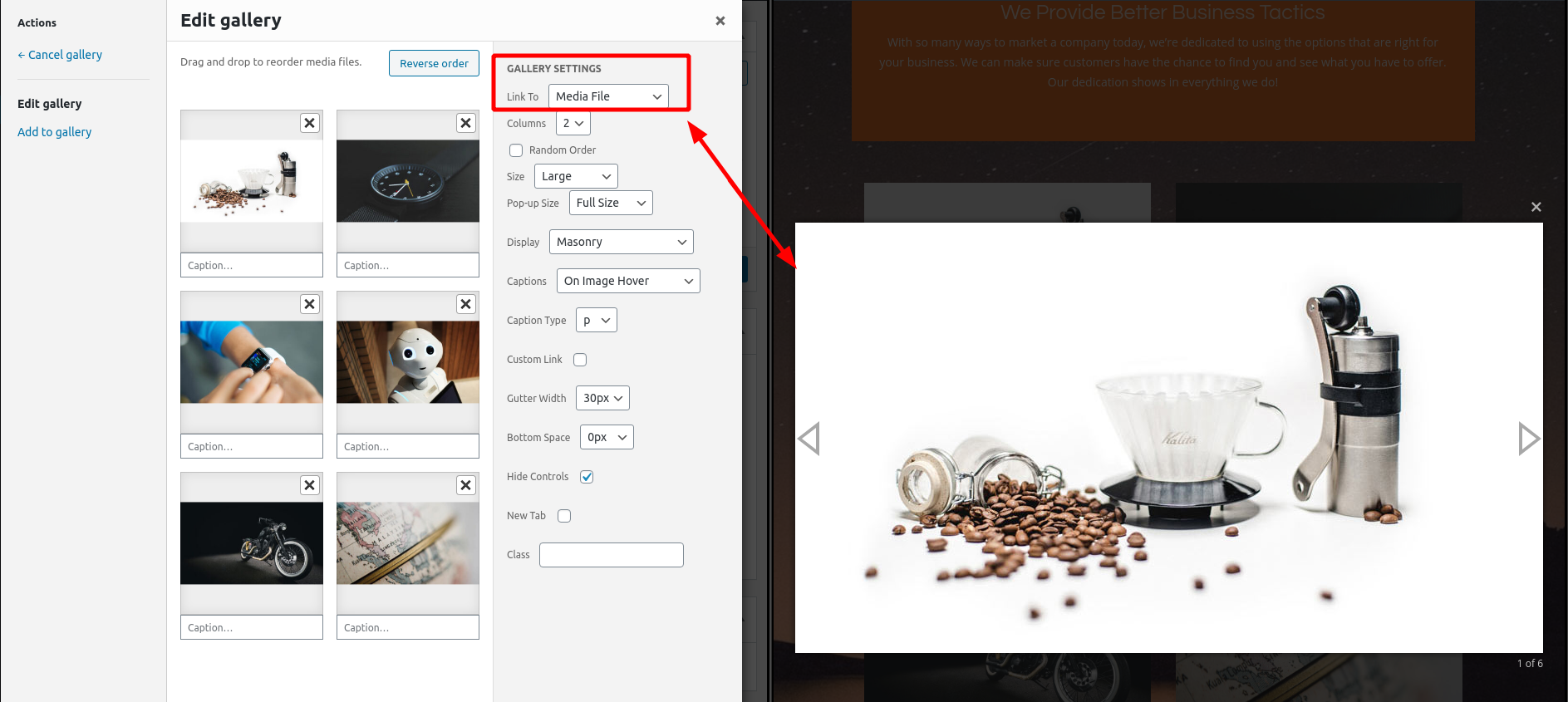
When the gallery is set to “Link to: Media File,” your gallery images should be displayed in a “lightbox” without navigating to a different page:

If that’s not the behavior you’re seeing, first make sure that you have the BoldGrid Gallery plugin installed and active. You can download that plugin directly from this link.
If you do have BoldGrid Gallery installed and active, then there may in fact be a bug happening for you. To troubleshoot that, the first thing to check is your browser’s error console when you’re viewing your gallery on the front-end. Here’s a quick video on how to check your error console:
February 3, 2021 at 12:53 pm in reply to: How do I change the behavior in the Wedge theme which has the first letter in the website name and menu items as a different color? #33480Jesse Owens
MemberHi Coral-
Thanks for reaching out! I suspect that all you’ll need to do to make your code work is add an
!importantdirective, like so:h1.entry-title::first-letter { color: unset !important; font-size: 100% !important; }Jesse Owens
MemberHi Sam-
Thanks! You’re right, I misspoke. I did mean to say “Media File” not “Image File.”
Jesse Owens
MemberHi Alessio-
Thanks for the question! You can use a plugin like Use Any Font to upload your custom fonts to your website, and that plugin will also add your custom font to the Customizer in the Hifidel WordPress Theme.
Jesse Owens
MemberHi Sam-
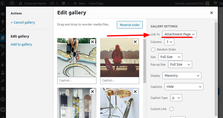
The quickest way to accomplish this for the entire gallery would be to switch the gallery’s Link To setting to Image File:

If you do still want your gallery to link to the Attachment Page where you see the comment form, you’ll need to disable Discussion on each image. In order to find that, look for the Screen Options drop-down menu at the top of the page, and enable Discussion.

Once that’s enabled, you’ll see the option to disable comments near the bottom of the page.
Jesse Owens
MemberHi Sam-
The quickest way to accomplish this for the entire gallery would be to switch the gallery’s Link To setting to Image File:

If you do still want your gallery to link to the Attachment Page where you see the comment form, you’ll need to disable Discussion on each image. In order to find that, look for the Screen Options drop-down menu at the top of the page, and enable Discussion.

Once that’s enabled, you’ll see the option to disable comments near the bottom of the page.
February 1, 2021 at 7:19 pm in reply to: Terms and Conditions and Policy Page Background Color #33447Jesse Owens
MemberHi RaeVen-
Thanks for the question, and thanks for using the WordPress Page Builder plugin from BoldGrid. It looks like that footer is being added by the WP AutoTerms Plugin outside of the normal footer styles for your theme, which is why it’s not getting the correct colors and background.
Here’s an easy fix for you. Navigate to Customize > Advanced > Custom JS & CSS and paste this snippet into your Custom Theme CSS field:
.wpautoterms-footer {
    background-color: #8224e3;
}
I copied the lavender-purple color (#8224e3) that’s at the bottom of your last block so it looks consistent for you.
Jesse Owens
MemberHi Juan-
Thanks for reaching out, I’m sorry to hear about the difficulty setting up CloudFront with W3 Total Cache.
One of the first things I noticed, that may or may not be related to this issue, is that your domain does not have an A Record or CNAME set up for the primary domain, only the www. subdomain, which may be contributing to the very long initial pageload time.
Double-check the CloudFront Setup instructions, including that you’ve set your S3 Buckets as the Origin.
Jesse Owens
MemberHi Cheryl-
Thanks for reaching out- I deleted some of the log you posted for length and for your privacy.
There were some errors in this log, but it does look like the archive was successfully transferred over to your hosting account.
To verify, did you get the 504 error when you were transferring the backup, or while you were restoring the backup?
Jesse Owens
MemberHi Jason-
Thanks for reaching out!
BoldGrid and Beaver Builder work very well side-by-side, as long as you only use one or the other to create and edit a given page.
However, since they’re built on very different frameworks, converting existing Beaver Builder pages to the BoldGrid Post and Page Builder for WordPress isn’t very straightforward.
BoldGrid uses an industry-standard framework called Bootstrap, whereas Beaver Builder’s design framework is completely custom to their ecosystem. Because of this, it’s usually better to rebuild your Beaver Builder pages manually in BoldGrid rather than try to “convert” them over.
Jesse Owens
MemberHi Jaclyn-
Thanks for reaching out, I’m sorry to hear about the corrupted images.
We have had one other report of a similar issue, and here’s what happened in that case. When you upload a new image to your Media Library, several copies of the image are created in different sizes, typically thumbnail, small, medium, large and full size.
That user found that the full size image (the one that had not been converted and resized) was OK, but all the other sizes showed up as gray lines like you described.
In the end, we discovered that their PHP Memory Limit was too low for WordPress to process the other image sizes, and once they increased their memory limit, new image uploads worked correctly.
As far as I can tell, your website is hosted with an A2 Hosting Reseller, so here are two articles you can reference on how to change the PHP Memory Limit at A2:
Jesse Owens
MemberHi Jordan-
Thanks for reaching out! You have impeccable timing, because as of today Crio’s Inspirations are available to DreamHost users for the first time.
As one of BoldGrid’s Premium WordPress Hosting providers, our team and the DreamHost team have been working hard to make Crio Inspirations available to you, and now you’ll be able to find them.
Make sure you’re running the latest version of Inspirations, go back to “Start over with a new Inspiration,” and you should see Crio available in a couple of variations and content sets.
- This reply was modified 5 years, 1 month ago by
- AuthorPosts
