Forum Replies Created
- AuthorPosts
Jesse Owens
KeymasterHi Bryan-
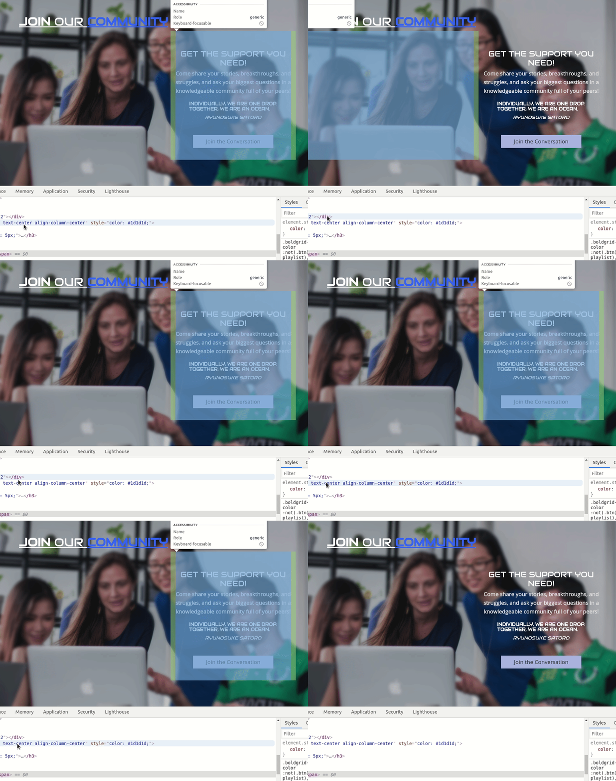
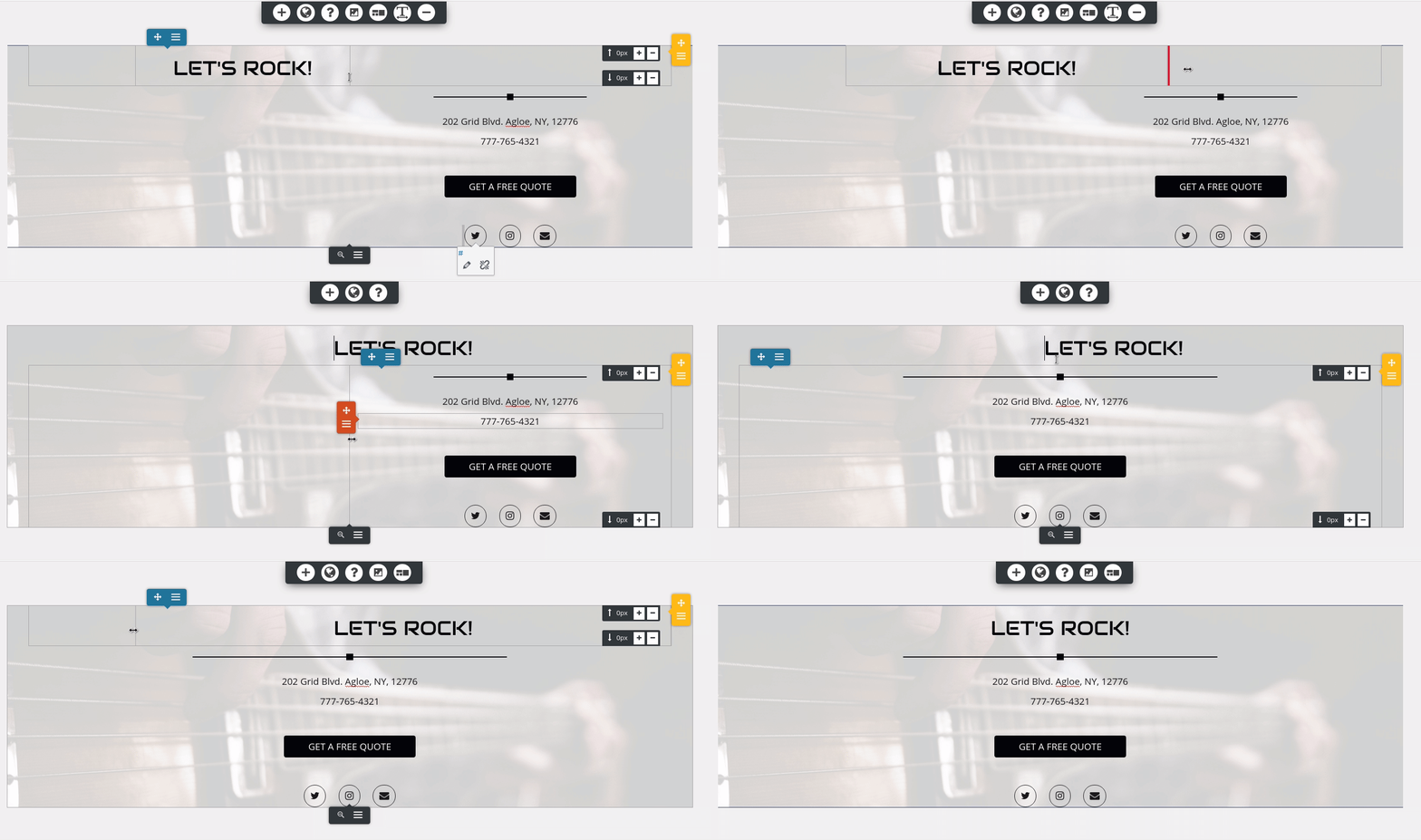
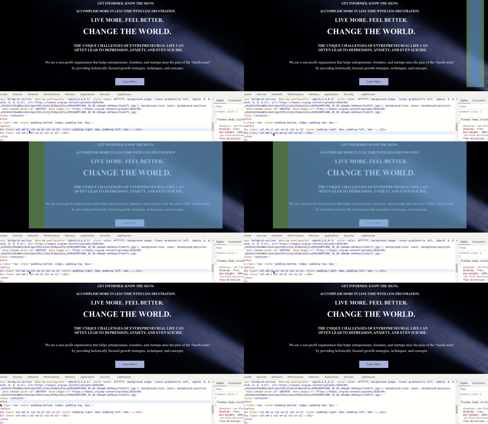
Actually it looks like the header is centered, but the top block on your homepage is actually askew.
You’ve got a tiny column to the right of your top block, that you should be able to eliminate in your editor:
As for your fonts, it looks like this might be an issue left over from your staging site. The URL for the font is still calling the site with bg_ in the URL. You should be able to fix this by going to Customize > Fonts > Headings and switching to a different font, publish your changes, and then switch back to Audiowide.
Jesse Owens
KeymasterHi Bryan-
Regarding your header being off-center, did you get a chance to check out the video I posted on your other support thread?I took a look at the “Our Mission” section, and it is indeed pretty “crazy wonky” right now. I might even suggest re-building that block from scratch.
If you can wait until tomorrow morning, I’ll record another video on fixing this block for you.
Jesse Owens
KeymasterI’m really glad to hear that helped Neil! Please do get in touch if you do get stuck, we’re happy to help.
Jesse Owens
KeymasterHi Betty-
Glad to hear you’re on the right track so far! Here are the JavaScript lines to finish the job:
jQuery('.comment-notes').text('您的電子郵件地址不會被公開。 必需的地方已做標記 *');
jQuery('#commentform > div.form-group.comment-form-author > label').text('綽號 *');
jQuery('#commentform > div.form-group.comment-form-email > label').text('電子郵件地址 *');
jQuery('#commentform > div.form-group.comment-form-url > label').text('網址');
As for learning to code these yourself, one great place to start is w3schools.com, which has great resources for CSS and jQuery.
Jesse Owens
KeymasterHi Bryan-
Happy to help! You’ve got a couple of different things going on, so I took a few minutes to make this video for you.
Here’s the CSS code from the video:
footer .site-description {text-align: center; } footer p.site-title { font-family: Audiowide; font-size: 25px; }Jesse Owens
KeymasterHi Bryan-
It looks like I might be too late- the Community Section looks like it’s been removed. That said, I do see that your mobile view does look a little funky, specifically the layout shrinks down further than the view-width.
At a glance, it looks like the the “scroll-to-top” element is causing this, but I haven’t been able to recreate that behavior in my testing sites.
I’m going to investigate further to see if I can find you a good resolution for this. In the meantime, you can disable the scroll-to-top button in Customize > Design > Site Content > Scroll to Top menu.
Jesse Owens
KeymasterHi Neil-
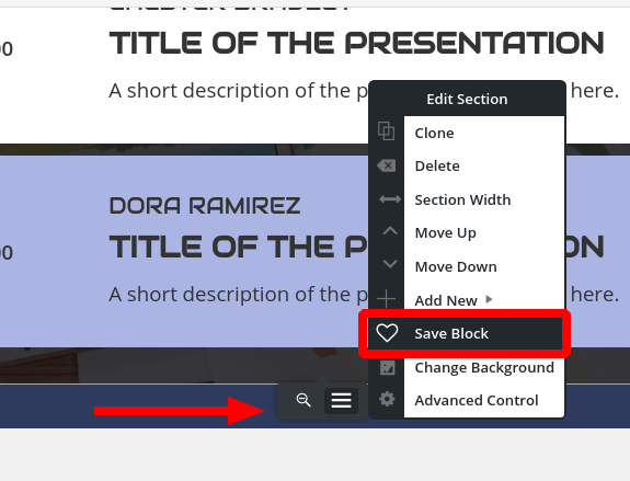
I’ll tackle the easy question first, how to save a custom block as a template.
At the bottom of each block is the Edit Section menu, which appears as a gray pop-up when you’re hovering over the block. From here, you can save your blocks:
Then, whenever you go to add a new block, you’ll see your saved blocks under the Block Library block type.
For your main question about designing a custom block, it’s a little tough to guide you on exactly how to accomplish what you’re after from what you’ve described so far. That said, I’m confident you can accomplish your goal with a little customization. If you have a few minutes to spare, I created this video to hopefully show you how to do your custom design.
Jesse Owens
KeymasterHi Susan-
This looks like a duplicate question from your other post here. Let’s pick up the conversation on that thread.
Jesse Owens
KeymasterHi Bryan-
I’m putting in a request to HR to get “BoldGrid God-Man” on my business cards now.
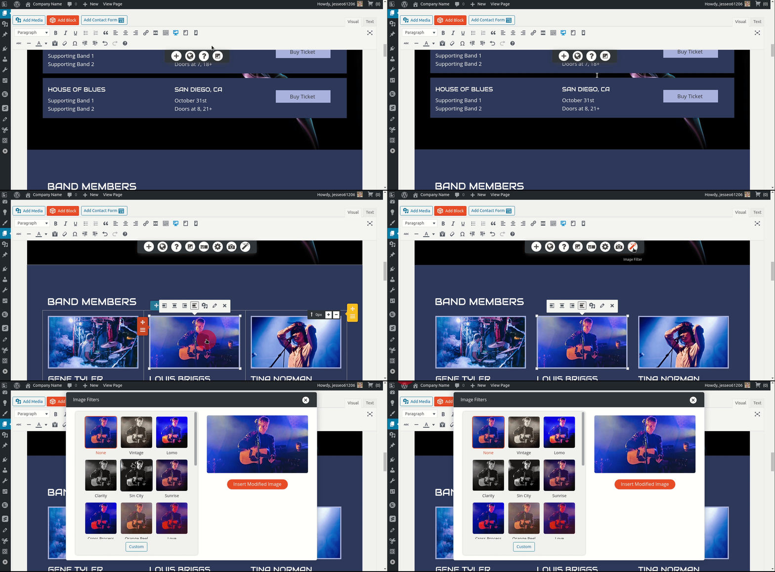
Anyway, in my testing I haven’t been able to recreate the issue where the image filter tool doesn’t show up when an image is selected in the editor. One possibility I can think of is that it’s not available for background images, only for regular images and images that are in galleries.
Since you’re an InMotion Hosting customer, you already have access to premium support included with your hosting plan. So, if you’ve got an image that isn’t working as expected with the tool, file a premium support ticket and a member of our team (all gods and goddesses) can log into your dashboard and see if we can diagnose the issue for you.
Jesse Owens
KeymasterHi Susan-
Two things are needed to make sure Crio Pro is working.
First, you’ll need to install the premium add-on plugin. You can download the Crio Pro add-on from your BoldGrid Central Account or download it directly from this link.
Second, you’ll need to make sure that you’re using the right connect key for your Crio Pro subscription. Since you previously mentioned you’d purchased Post and Page Builder Pro and Crio Pro seperately, you may need to have our support team combine your connect keys. If that’s the case, reach out to our billing and support team with a premium support ticket so we can make adjustments to your subscription and billing.
Jesse Owens
KeymasterHello Iman-
I checked on your account and it looks like your purchase of Crio Premium was done separately, rather than as an add-on to one of your existing keys.
Your Crio Premium is associated with the key ending in e02445257. If you need this to be associated with one of your other keys, please log into your BoldGrid Central Account and submit a premium support ticket and our team can fix your subscription status.
Jesse Owens
KeymasterHi Curt-
Thank you for purchasing the Total Upkeep backup plugin, we’ll be happy to make sure it’s working correctly for you.The first thing to check is your backup logs. If you have a couple of minutes, check out this video where our developer walks you through the most common troubleshooting steps to take, including how to check your logs:
Try switching the compressor to System Zip as Brad mentioned, and if you’re still having trouble, reply with the log from your backup so we can take a closer look.
Jesse Owens
KeymasterHi Bryan-
The image filter control should be present any time you select an image on your page. Look for the “Magic Wand” icon:

As for your Call-to-Action, did you get a chance to check out the video I sent you in your other post?
If you have a moment to check it out, I’ll show you how to fix this:
Jesse Owens
KeymasterHi Ellen-
I took a look at your site, and it looks like you’re actually using the Bold Page Builder and the Kids Club theme, which are developed by Bold Themes.
I know the names are very similar, but we’re not affiliated with Bold Themes. Here’s a link you can follow to find their support team.
Jesse Owens
KeymasterHi Giuliano-
If you’re seeing a 403 error, I’m thinking you’re running into some kind of security or firewall issue.
Try disabling any security plugins you might be using and see if the error persists.
If you’re still seeing it, it may be a server-level security setting. One good first step would be to check your Apache or NGINX logs and see if you can find any errors logged there. Your web hosting provider or System Administrator may be able to help you locate these logs and check for the error.
Jesse Owens
KeymasterHi Susan-
Sorry that the rules I provided before only worked on the homepage, that was an oversight on my part.
If you’re looking for maximum customizability, I’d highly recommend checking out the Crio Supertheme. It’s available in both free and premium versions, and both will let you customize the site title’s color independently.
I checked out your site and it looks like you’ve started using a different theme and Contact Form 7. Here’s a guide I found on how to reduce the input box sizes using Contact Form 7
Jesse Owens
KeymasterHi Hilmar-
Yes, once you update the URL to your production site, simply navigate to Performance > General Settings > Licensing and re-authorize the key by clicking Verify License.
Jesse Owens
KeymasterHi Neil-
We’re almost out of moles to whack I think!
The last bit of space above your blog post list is coming from the inner paragraph itself.
Here’s a trick I use to figure out where margins and padding are coming from, if you have a few moments to watch this short video:
In summary, there’s still 100 pixels of margin, on the bottom of the paragraph element. You can remove this in the Text editor, or use the advanced controls on the paragraph itself.For your navigation hover customization, the code didn’t work because I made a typo! Sorry about that. Here’s the correct CSS rule, with the period (.) at the beginning of the selector:
.palette-primary .navbar-default .navbar-nav > li > a:hover {
border-bottom: 5px solid #ffffff;
}
To re-subscribe to email notifications, make sure you check the box for “Notify me of follow-up replies” when you respond or make a new topic. Currently, the forum software is set up so that we can’t force-subscribe email addresses without you checking that consent.
September 15, 2020 at 6:04 pm in reply to: [Resolved] Customizer color palette it has disappeared in Child Theme #27073Jesse Owens
KeymasterHi Orlando-
Thanks for trying that for me.
If you delete and re-install the theme, your configurations are still saved, so it’s worth a try. Activate a different theme, then click on Theme Details for Callaway.
Then, click Delete at the bottom-right of the Theme Details screen.
Finally, re-install the theme (you can download it directly from this link).
If that still fails, can you fill out a premium support ticket (be sure to log in with the email address you use for your DreamHost account) so we can log in and take a closer look for you?
Jesse Owens
KeymasterHi Lee-
Yes, this is possible! If you only want bullets on the sub-items, use this code:
ul.nav>li>ul>li>a {
   display: list-item;
   list-style: disc;
}
There are other options for the “list-style,” including “circle” and “square” depending on what look you’re going for.
Jesse Owens
KeymasterHi Susan-
Yes, this rule is a little more complicated to find the right selector. Here’s how to do it:
.palette-primary .navbar-default .navbar-nav > li > a { color: #993366; }Jesse Owens
KeymasterHello Lee-
Forgive my misunderstanding, I was assuming your main objective was to get the indented format back.
The other piece of the puzzle is the padding around the elements. You can fix that with this Custom CSS rule:
ul.nav>li>a {
    padding-top: 0px;
    padding-bottom: 0px;
}
Keep in mind that if your primary audience is using a slower internet connection like mobile hotspots, you may want to consider a simpler design with fewer large images to slow down the loading process. This will help prevent the “jumping” behavior you’re experiencing.
Jesse Owens
KeymasterHi Bryan-
Upon closer inspection I did notice some odd things about your “Join Our Community” Block.
Take a look at this quick video I created to show you how to fix this block.
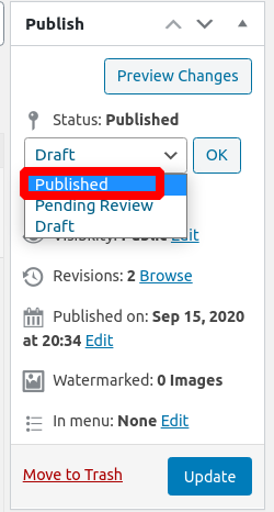
As for your Privacy Policy page, one thing to keep in mind is that these pages are usually saved as “Drafts” when they come out-of-the box in WordPress. Be sure you set the Post Status to “Publish” when you publish your page.

One thought does occur to me- you mentioned that you had two versions of your website before, and now you’re using only one. Did you publish the Privacy page on your main site, and not the other staging site?
Jesse Owens
KeymasterSeptember 15, 2020 at 3:51 pm in reply to: Does the Pro W3-Total-Cache plugin support multiple domains? #27046Jesse Owens
KeymasterHi Corey-
Please reach out to our Sales team from your WordPress Dashboard, Performance > Support and use the option for Billing Support and our team will work to find a solution for your needs.Jesse Owens
KeymasterHi Susan-
You’re right that the Florentine theme doesn’t have a direct control for the Site Title and Tagline color, they’re automatically generated to be a color that contrasts with your color palette.
You can control these with Custom CSS. Navigate to Customize > Advanced > Custom JS & CSS and paste the following code into your Custom Theme CSS field:
h1.site-title a { color: black !important; }
h3.site-description { color: black !important; }
Then, replace “black” with the color of your choice, either by name, hexcode, or rgb value, eg #000000 or rgb(0,0,0).
Your font size can be changed without code. Navigate to Customize > Fonts > Main Text and drag the Font Size slider to your desired size.
Jesse Owens
KeymasterHi Hilmar-
Licensing for W3 Total Cache is on a “per-installation” basis. So for example, if you had several domains on a WordPress Multisite instance, you will only need one license, but if each domain has its own WordPress installation, you will need a license for each site.
If you’re setting up staging and development servers, you can use Pro Dev Mode on your development environments.
Jesse Owens
KeymasterHi Renascence-
Probably the easiest way to avoid this is to use links rather than pasting in the long URL’s. For example, rather than pasting the URL
https://www.washingtonpost.com/graphics/politics/policy-2020/climate-change/Instead, post a link to Washington Post’s Democratic Climate Change Platform Summary.
You can do this with the “Chain Link” icon in the editor or the shortcut Ctrl-K.
Jesse Owens
KeymasterHi Steven-
I’ve asked one of our CDN experts to review your questions and get back to you, please stand by for some more information.
Jesse Owens
KeymasterSeptember 15, 2020 at 2:10 pm in reply to: [Resolved] Customizer color palette it has disappeared in Child Theme #27019Jesse Owens
KeymasterHi Orlando-
Thanks for the additional details.
I created a testing site with Callaway just to double check your code, and it looks like you’ve got everything correct now. The color palette on my testing site works with the code just like you’ve got it.
Just to make sure we don’t have any typos, copy-and-paste the code from these two GitHub Gists:
This file contains hidden or bidirectional Unicode text that may be interpreted or compiled differently than what appears below. To review, open the file in an editor that reveals hidden Unicode characters. Learn more about bidirectional Unicode characters<?php function boldgrid_enqueue_styles() { $parent_style = 'boldgrid-callaway'; wp_enqueue_style( $parent_style, get_template_directory_uri() . '/style.css' ); wp_enqueue_style( 'child-style', get_stylesheet_directory_uri() . '/style.css', array( $parent_style ), wp_get_theme()->get('Version') ); } add_action( 'wp_enqueue_scripts', 'boldgrid_enqueue_styles' );
This file contains hidden or bidirectional Unicode text that may be interpreted or compiled differently than what appears below. To review, open the file in an editor that reveals hidden Unicode characters. Learn more about bidirectional Unicode characters/* Theme Name: Boldgrid callaway Child Theme URI: https://www.boldgrid.com Description: BoldGrid Callaway Child Theme Author: BoldGrid Support Author URI: https://www.boldgrid.com Template: boldgrid-callaway Text Domain: boldgrid-callaway-child Version: 1.0 License: GNU General Public License v2 or later License URI: http://www.gnu.org/licenses/gpl-2.0.html Tags: */ One other troubleshooting step I’d like you to try. Activate a non-BoldGrid theme, such as Twenty Twenty, then re-activate your child theme. This should load the BoldGrid libraries fresh for you.
Jesse Owens
KeymasterHi Nik-
I checked out the site you sent over privately, and it looks like you’ve solved this pretty creatively by deleting the image file.
Kudos for the solution! But, I would like to warn you that when the theme gets updated the image background will reappear.
It looks like you actually had the code very close to correct, the only problem is the period (.) right before body. You had:
.body.custom-background{
background-image: none !important;
background-attachment: scroll !important;
background-color:#ffffff !important;
}
Instead, try this:
body.custom-background{ background-image: none !important; }Jesse Owens
KeymasterHi Betty-
Yes, you can do this with a little more Custom CSS. Here’s the code I used to “reverse” your submit button, so that it is black with yellow text instead of the other way around:
input#commentsubmit {
color: #000;
border: 1px solid #000;
}

input#commentsubmit:hover {
color: #f5d76e;
background-color: #000;
}
And then, to change the title:
.palette-primary .comment-reply-title, .palette-primary #reply-title { color: #000; }Jesse Owens
KeymasterHi Lee-
Thanks so much for the link to your staging site, that definitely helps out.
I simulated loading your website on a slower connection, like a mobile hotspot, and I was able to see the behavior you described. This is because one of the stylesheets is loading later in the process and changing the behavior of the nav list.
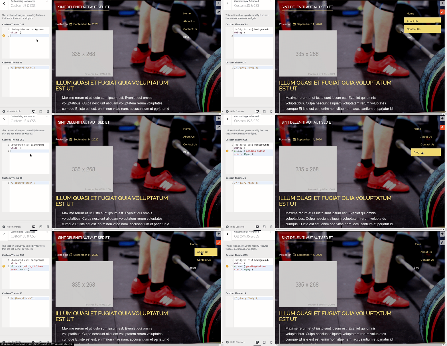
I found this Custom CSS rule restored the indented formatting that you want. Navigate to Customize > Advanced > Custom JS & CSS and paste this code into your Custom Theme CSS:
ul.nav { padding-inline-start: 40px; }Jesse Owens
KeymasterHi Neil-
I’ll try to answer each question in turn.
I want to remove that wasted space, but can’t see a way to tighten that up, its probably more custom CSS!
Actually, it looks like there might still be some customizations in your page content causing this. Since they’ve been manually modified with the Post and Page Builder controls, it’s better to fix it there than to try and muscle it in with CSS. When the formatting has gotten in the weeds like this, I recommend switching to the Text editing tab.
- The top block has a 32px margin-bottom as well as a 5em padding bottom. Switch to the Text editing tab, and look for the following element that should be near the top of your page:
<div class="tmpl-call_to_action-5 boldgrid-section dynamic-gridblock background-parallax color4-background-color color-4-text-contrast bg-background-color" style="color: #ffffff; margin: 1px 1px 32px; padding: 5em;">
Change the very last part to read:
margin: 1px 1px 0px; padding: 5em 5em 0em;
- The rest of the space is coming from the text block, that starts out with, “The Self-Mastery Blog.” That block has a 20% padding-bottom. If you’re still in the Text editor, look for this:
<div style="padding: 20% 12%;" class="bg-box">
<h1 class="color2-color" style="font-size: 4em; margin: -100px 0px 9px;">The Self-Mastery Blog</h>
Change the first line to:
<div style="padding: 20% 12% 0%;" class="bg-box">
The date and the blog post title are not lining up vertically, and I would like them to align in all views.
The only way I found to make this match reliably was to make it match the heading. Here’s the Custom CSS I found:
.bgc-single-body > p > span {
font-family: Oswald;
font-size: 18px;
line-height: 1.1em;
vertical-align: top;
}
In the main navigation bar, I’d like to change the link status display that identifies the page we’re on so its different from the display of the page we’re hovering over and going to. Just changing the color of the bar under the link title would work.
Here’s a CSS rule you can use for this, simply change “#ffffff” (white) to the color you’d like:
palette-primary .navbar-default .navbar-nav > li > a:hover {
border-bottom: 5px solid #ffffff;
}
Can I display the title of each blog post in a more obvious link format that changes when you hover over it?
Yes you can, this was being overridden by the H4 style, rather than the link style which underlines by default:
a:hover > h4 {
text-decoration: underline;
}
I need to be able to easily lay out and combine an image, a large text block, a list, a chart, and a combo box that has the dates, times, cost, and sign up procedures for a class. I’m not seeing an efficient way to do that.
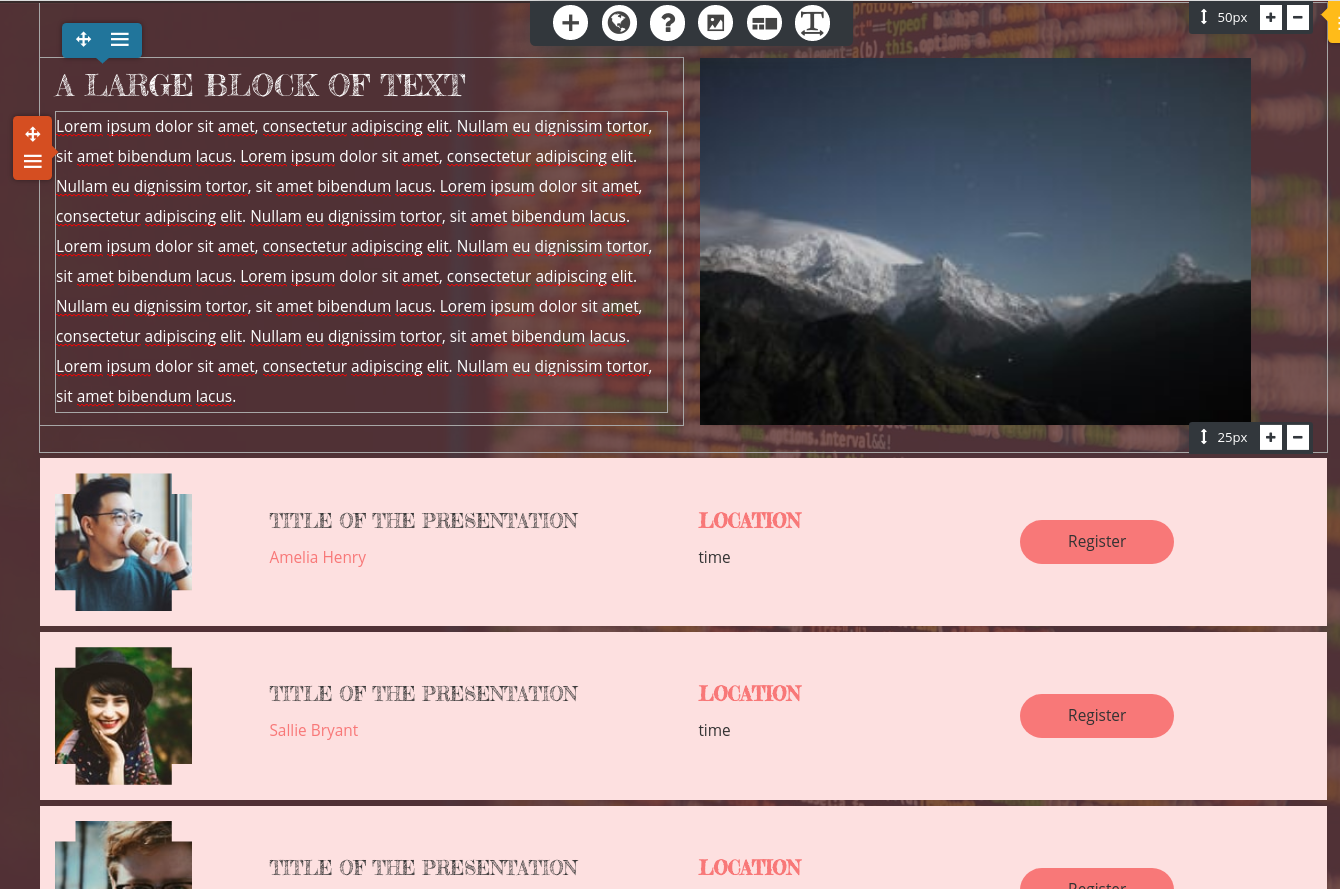
Have you checked out the “Schedule” block type? There are blocks there that might fit the need for a “box that has dates, times cost, and sign up procedures.” Here’s an example:
Jesse Owens
KeymasterHi Lenn-
Currently, we don’t have an Italian Translation, and the only one of our themes that is fully translation-ready is the Crio Theme. You can download Crio directly from this link.
That said, I’ll do some research into Loco Translate’s XML configuration option and I’ll update you here as soon as I can see if we can set one up for you.
Jesse Owens
KeymasterHello Lee-
It’s a little tough to speculate what might be going on based on your description. When you say the page “jumps,” is it reacting to clicks/hovering over menu items in your widget?
You mentioned that some formatting shows correctly for a moment and then loses its format once the page is fully loaded, which sounds like there might be a CSS rule or JavaScript that is loading late on the page.
You mentioned your site wasn’t live yet in your private data, is there a staging site that you have live that we might be able to take a look at so we can help you out? It won’t be published, just let us know in your reply if we can see this so we can check it out.
September 14, 2020 at 8:45 pm in reply to: Site tagline still not showing despite option being clicked #26975Jesse Owens
KeymasterHi Bryan-
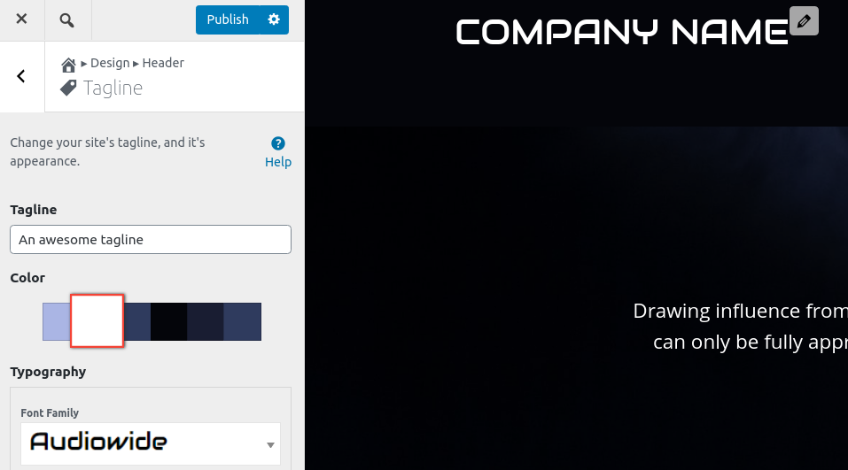
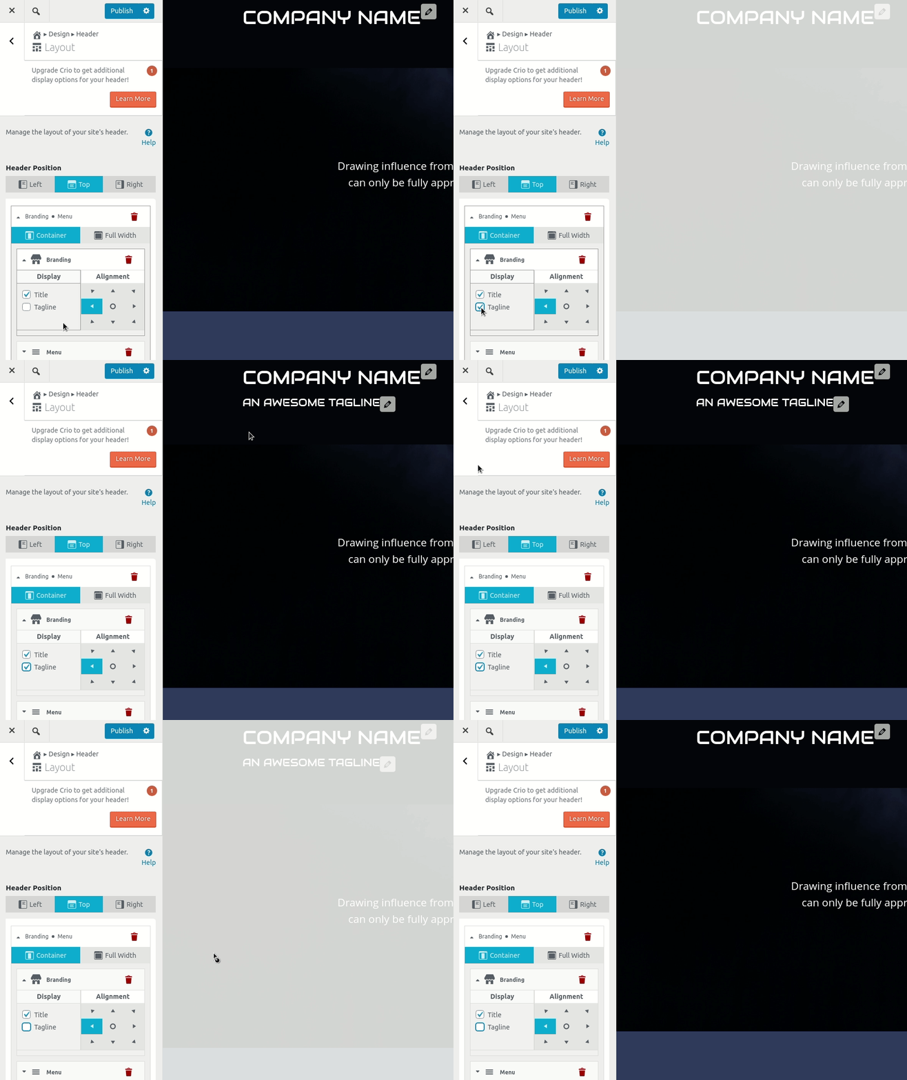
Two things are needed for the tagline to show on the Crio Theme.
First, make sure you have the tagline entered in Customize > Design > Header > Tagline.
Then, enable it in your Customize > Design > Header > Layout > Branding.
If you’ve taken both of those steps already, you might be experiencing a bug. If that’s the case, can you fill out a premium support ticket so our team can take a closer look for you?
Jesse Owens
KeymasterHi Bryan-
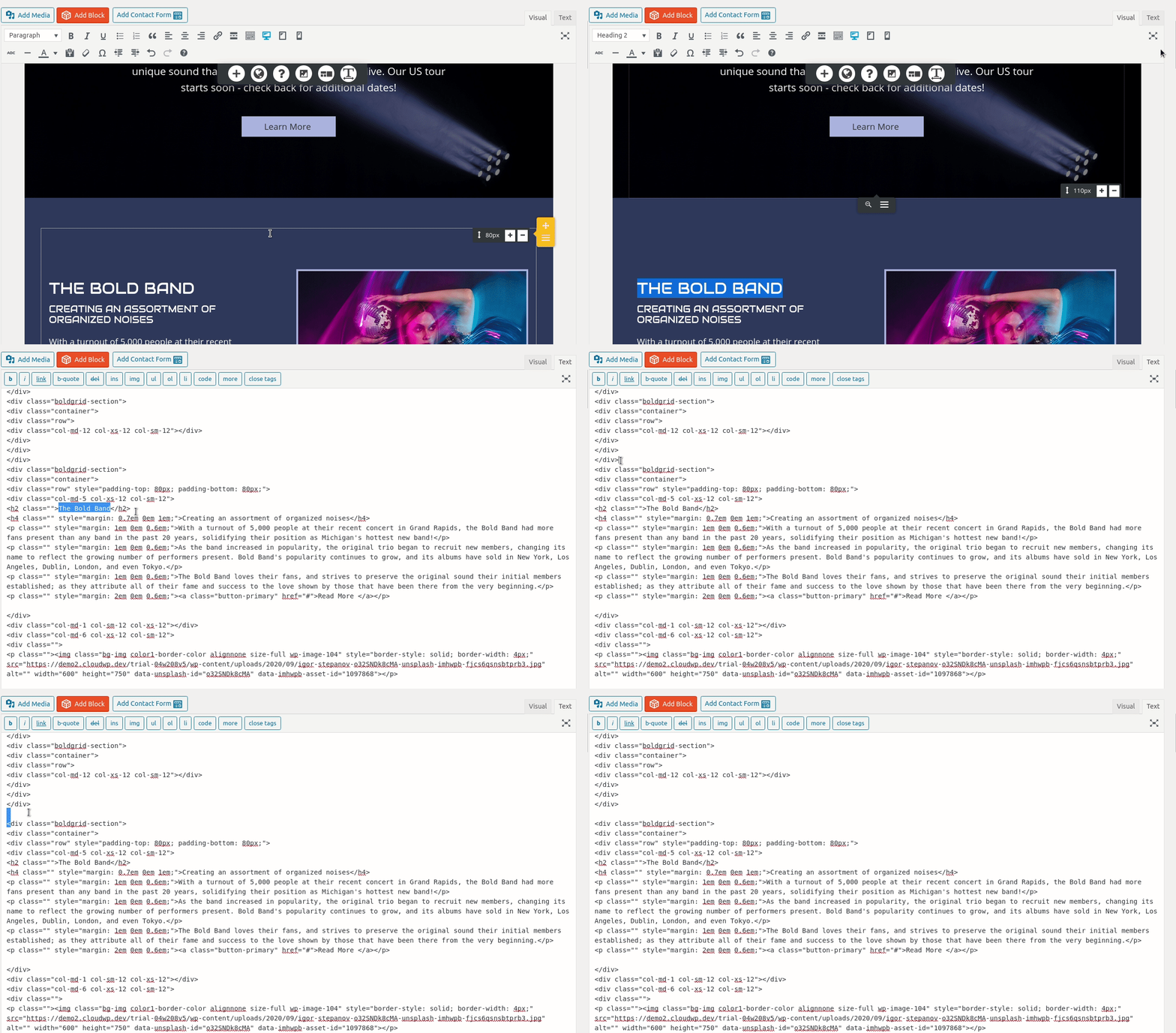
The easiest way to copy an entire page into another one is to actually use the WordPress text editor.
First, edit the page you want to copy. Switch over to the <strong>Text</strong> tab at the top-right of the editor screen, then select all and copy.
Now comes the semi-tricky part- locating the right spot to paste it in your other page. You mentioned you need it to be right after the CTA. Here’s my trick for doing this- highlight some text in the editor near the place you need to paste, then switch over to the Text tab.
Once you’re near the spot you need to paste into, find the end of the block above, and the block below, by looking for code similar to this:
</div>
</div>
</div>

<div class="boldgrid-section">
<div class="container">
<div class="
Make a new line in between the </div>’s and the <div>’s and paste your page’s code there.
Jesse Owens
KeymasterHi Brian-
There’s a couple of ways you can accomplish this with the Crio Theme. For both methods follow these steps first:
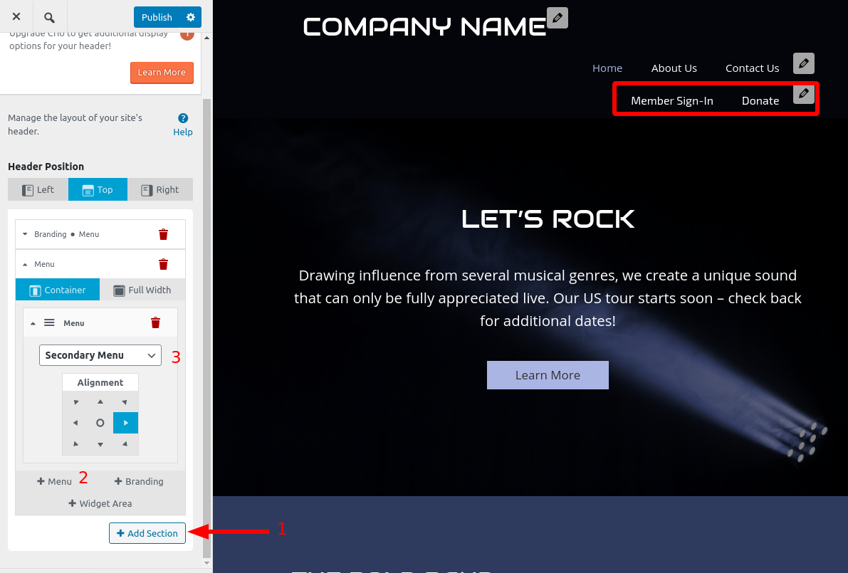
Create a new menu in Customize > Menus with two Custom Links to your Member Sign-in and Donate pages. Assign it to the Secondary Menu location.
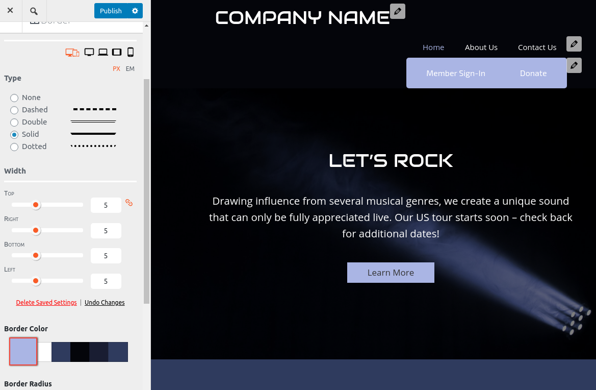
Then, head over to Customize > Design > Header > Layout and add a new section to your header. Add a menu to this section, and set it up to display the Secondary Menu. If we’re on the same page, you should see this now:

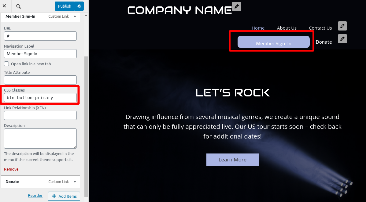
OK, now that you’ve got your menu set up, there’s two ways to turn the links into “buttons.”
You can add a Custom CSS class to each menu item in the Customize > Menus to turn them into a button. Add these custom classes to both menu items:btn button-primary
If you’d like more fine-grained control over your button appearance, you can use the Border, Border Radius, Background, and Spacing controls in Customize > Design > Menus > Secondary Menu.

- The top block has a 32px margin-bottom as well as a 5em padding bottom. Switch to the Text editing tab, and look for the following element that should be near the top of your page:
- AuthorPosts
