Forum Replies Created
- AuthorPosts
Joseph W
KeymasterHi Joshua!
The Category: prefix that appears before each title on the Category pages is automatically added by WordPress to help differentiate which kind dynamic page is currently being viewed.
It is possible to remove that prefix with a custom PHP script and personally I like using the Code Snippets plugin to add custom PHP to websites.
I tried out the following snippet in one of my testing environments and it removed the Category: prefix from my Category pages as expected, so hopefully you find the same success with it.
function remove_category_title_prefix( $title ) {
if ( is_category() ) {
$title = single_cat_title( '' , false );
}
return $title;
}
add_filter( 'get_the_archive_title', 'remove_category_title_prefix' );
Code Snippets allows you to choose where to run your individual custom PHP snippets and I recommend using the Only run on site front-end option when first setting up the snippet. Doing that will prevent the code from running in the administrator area of your website and allows you to deactivate the snippet if there are any typos in the code that trigger a fatal error.
Please let us know if you have any other questions for us Joshua!
Joseph W
KeymasterHi Heather!
I took a look at the Quick View for Single Products in your WooCommerce shop and I believe I have a CSS solution that might work for you. It seems like changing the cart submission form within that window to use a flex row is what you are looking for. The following code should help you get that submit button aligned next to the quantity input field.
.palette-primary.woocommerce-page .xoo-qv-container.single-product form.cart {
	flex-direction: row;
}

.palette-primary.woocommerce-page .xoo-qv-container.single-product form.cart .quantity.input-group {
	flex: 0;
}
Please let us know if you have any other questions!
Joseph W
KeymasterHi Britney, our team is happy to answer any questions you have about working with the Resolve WordPress Theme to design your website!
Resolve is one of our earlier themes and uses an older version of our theme framework to manage menu displays. One of the limitations of the older framework is that only menus that use the Primary menu location will have the subitems in the menu converted to a dropdown.
I also recommend checking out Crio, our most powerful theme, that is built with the latest version of the theme framework. Crio lets you create highly customized header layouts and it does not have the same limitations found in Resolve with regards to creating dropdown menus.
Please let us know if you have any other questions for us!
Joseph W
KeymasterHi Edouard, sorry to hear that there are some recent problems getting Total Upkeep backups to complete properly on your website and our team will do everything we can to help!
Total Upkeep keeps a log for each backup attempt made on your website and the information in that log file will likely point us towards the cause of the recent backup failures. The log data is located under Total Upkeep > Tools > Logs in your WordPress dashboard, and we also have a guide in our support center that demonstrates how to find the log information for your website. Could you send us the log information from the most recent backup attempts? Once we see the logs we should have an idea of how to get backups working properly again.
Thank you for your patience while we get this sorted out and please let us know if you have any additional questions for us along the way!
Joseph W
KeymasterHi Ann Marie!
Hopefully re-cropping the image gets it aligned better with your overall design goals and please let us know how it goes! If you ever have any other questions for us please do not hesitate to ask.
May 4, 2021 at 12:23 pm in reply to: Google Drive Storage Conflicts with WP Mail SMTP Gmail – unauthorized_client – Unauthorized #37250Joseph W
KeymasterHi Antonis!
Did you try temporarily deactivating the Total Upkeep Premium plugin and then attempt to authorize your Gmail account with WP Mail SMTP yet? I just tested that behavior and I was able to get my Gmail authorized successfully once the plugin was deactivated. Once the initial authorization is complete you should be able to reactivate Total Upkeep Premium and get both plugins working together.
I also created a bug report for this issue with our developers to investigate this behavior further and hopefully we will be able to release a permanent fix for the problem in an upcoming release.
I hope that temporarily deactivating Total Upkeep Premium allows you to get WP Mail SMTP authorized with your Gmail Account successfully and please let us know if you have any additional questions for us!
Joseph W
KeymasterHi Ethan, sorry to hear that there are still some problems getting your font to display as expected!
I took a look at your website in a mobile view and it appears that your rule to change the font size of H1 elements is now working.
One possible reason why you might not have seen that changes on your last attempt is browser caching. Forcing your browser to fetch the new CSS rules by either clearing the cache or viewing ytour website is Private/Incognito window is the best to way to ensure that you are getting the most updated style rules for your website.
I hope that this was just a caching issue and the fonts are working as expected on your end now, but please let us know if there is anything else that we can do to help!
Joseph W
KeymasterHi Rachel!
Sorry to hear that using VW to control your font sizes did not work out as expected and we will do everything we can to help work with our WordPress themes on your website!
Right now the best way to control the specific font sizes of HTML text elements on mobile displays in our themes is to use some custom CSS with media queries.
The following CSS snippet uses a media query that tells the code within it to only run on when the webpage is displayed below a particular pixel width, in this case the break point between mobile and tablet sizes.
@media only screen and (max-width: 767px) {
h1, h2 {
font-size: 30px;
}
}That code is currently configured to only target elements the use the H1 and H2 element types, but please let us know if you need any additional help getting the code tailored to fit your website structure and we will help as best we can! If you ever have any other questions for us in the future please do not hesitate to ask, we are always happy to help!
Joseph W
KeymasterHi Ann Marie!
One way you can get that text added above your navigation menu is to use the Custom Header layout option found in the Customizer controls for Crio. We also have a guide in our support center that demonstrates how to locate and use Crio custom layouts in case you would like an additional reference.
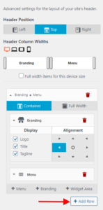
Once you have the Custom Header Layout opened, click the Add Row button to create a new empty section in your header. This empty section will be used to display your website Tagline.
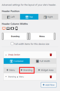
After creating the empty section drag it above the existing section that contains your Branding and Menu items and then add a new Branding widget to the empty section.
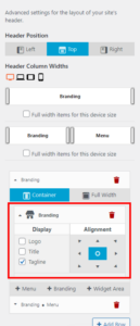
Click on the new Branding widget to display the configuration options and deselect Logo and Title in the Display column to ensure that it will only show the Tagline. You can then use the Alignment tools to change the location of your Branding widget within the new header section.
Hopefully this helps you get your content displaying as desired on your website and please let us know if you have any additional questions for us!
Joseph W
KeymasterHi Tim!
Rebuilding the site in Crio will be the best way to future-proof your website build and make updating it in the future much easier, but if you want to stick with Evolv then we can try to provide some custom code to help you make the required adjustments.
The first step to aligning those header items as needed is to update the Bootstrap column classes assigned to the elements containing the logo and the menu to each span the entire width of your header and stack on top of each other. The following jQuery code should get those column classes adjusted properly:
jQuery('.site-header .header-6 .header-6, .site-header .header-7 .header-7').removeClass('col-md-6').addClass('col-md-12');
The next thing is to remove the custom float that is currently assigned to the col-md-12 class from the new column areas. This CSS will help with that:
 .header-6.col-md-12,
 .header-7.col-md-12 {
 float: none;
 }
After that is taken care of you can center the logo with this:
 .site-branding {
 text-align: center;
 }
The last step to creating your design is left the menu items in the site navigation. The important part in this code is that we only want to change the menu item alignments for screen sizes where the entire menu is expanded, in this case Tablet and Desktop displays. The following code uses a media query that only triggers on those screen widths and will alter the display of the Mobile view.
 @media only screen and (min-width: 768px) {
 #site-navigation {
 width: 100%;
 display: flex;
 justify-content: flex-start;
 }
 }
Hopefully that code helps you get the design you are looking for and please let us know if there is anything else that we can do to help!
Joseph W
KeymasterHi Deborah, we are happy to help you change the preset images added with BoldGrid Inspirations!
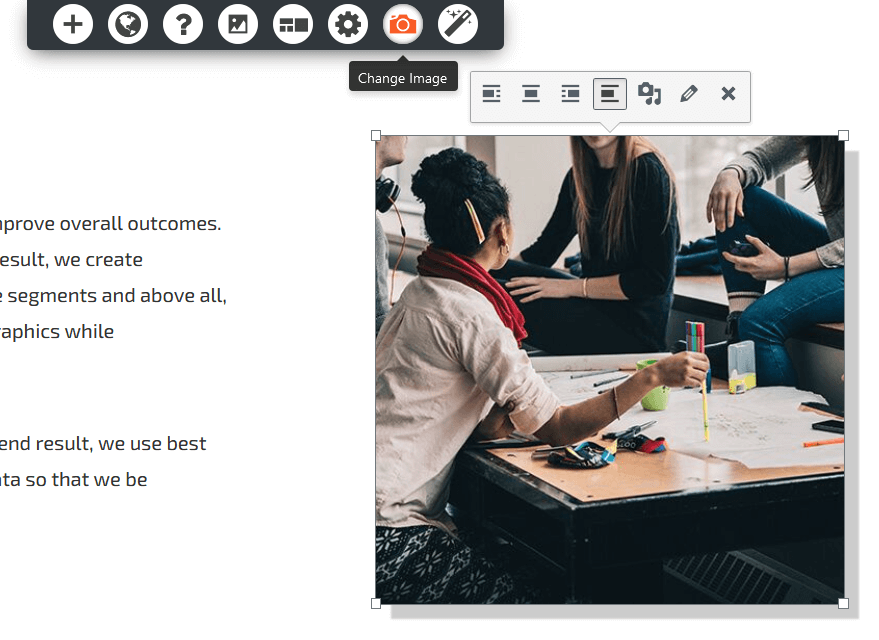
You can change any of the images added after installing an Inspiration by selecting the image in the Visual editor and then clicking the Change Image icon in the dynamic menu (it’s the one that looks like a camera).
Clicking that icon should display your Media Library where you will be able to choose an image to replace the existing one with.
I hope that this helps you update the preset image content on your pages and please let us know if there is anything else that we can do to help!
Joseph W
KeymasterThank you for sending us your feedback Crystal! Good luck on learning to use WordPress and if you ever have any questions for us please do not hesitate to ask!
Joseph W
KeymasterHi Stephen, we are more than happy to help!
Now that you have WordPress installed, then next step is to get the Inspirations configured on your website. Log into the WordPress administrator dashboard for your new installation and navigate to Plugins > Add New using the menu items on the left side of that dashboard. At the top of the Add Plugins page you should see a button labelled Upload Plugin, click that button and use the Choose File tool to locate the Inspirations Zip file you previously downloaded and install it on your website.
The Post and Page Builder plugin is our visual editing tool that makes it easy to create new content for Posts and Pages on your website. The $30 subscription is for the Premium plugin extension that includes the ability to add things like page sliders as well as access to Premium exclusive blocks. The Post and Page Builder, like all of our other plugins, is available in as a free version and there is no need to make an additional purchase to start using it on your website.
The $60 subscription is for a Premium Connect key, which includes a premium license for both the Post and Page Builder and our backup plugin Total Upkeep. Total Upkeep Premium unlocks the ability to use remote locations like Google Drive or Amazon S3 to store your backups and keep them safe in case there are ever any failures on your website’s server.
The Crio Premium bundle not only provides you with a Premium Connect key but also a license for Crio Pro, our most powerful WordPress theme. Crio also has a free version available like our plugins and I recommend trying out the free versions on your first to see if you enjoy using them to customize your website.
I hope that this answers some of your questions Stephen and please let us know if there is anything else that we can do to help!
Joseph W
KeymasterHi Eric!
The only way to truly know for certain if your backup is complete is to restore it and make sure that all of your website data is there following the restoration. Generally speaking, if your backup is similar in size to one that you know is complete and you see the Backup Complete! message near the end of the archive log file then there is a high degree of certainty that everything was included in your backup as expected.
Please let us know if you have any other questions for us, we are always happy to help!
Joseph W
KeymasterSorry to hear that you no longer need your BoldGrid account Crystal and we have removed all information associated with your email address from our system as requested.
If you have a moment we would appreciate any feedback you have regarding your experience using our products on your website including any areas where they might not have met your expectations.
We look forward to hearing your feedback and please let us know if there is anything else that we can do to assist you!
Joseph W
KeymasterHi Ann Marie!
If you ever have any questions about working with Crio on your website please do not hesitate to reach out to us, we are always happy to help!
Joseph W
KeymasterHi Ann Marie!
We just released an update to the free version of Crio that allows you to select from a few predefined header layouts, and one of those options centers the logo and puts the navigation bar below. Purchasing the Pro version will allow you to create custom header layouts on a page by page basis, but if you just want to change the overall layout for your entire site then the free version will likely give you all the tools you need to achieve your design goals!
I hope that you decide to give Crio a shot on your website and please let us know if ever have any other questions for us!
April 15, 2021 at 1:59 pm in reply to: How to EDIT (NOT remove) Attributions/”Special Thanks” Page #36146Joseph W
KeymasterHi BeckieSue!
The information on the Special Thanks/Attribution page is automatically generated for all of the images that are added when installing an Inspiration that have a Creative Commons Attribution license associated with them. All of the images included on that page should appear in your Media Library and the attribution data will be removed automatically from the Special Thanks if the associated image is deleted from the library.
I hope that helps explain where the content on that page comes from and please let us know if you have any other questions for us!
Joseph W
KeymasterYou’re welcome Tim, we are always happy to help! If you ever have any other questions for us in the future please do not hesitate to ask!
Joseph W
KeymasterHi Annette, we are happy to hear that DreamHost was able to switch your server from using FastCGI and get your backups working!
The WPCORE and /wp-content groups listed next to Included in the FILE AND FOLDER SETTINGS are the default inclusions when creating a full backup of your website.
WPCORE is the shorthand used in Total Upkeep to refer all of the WordPress files that are required to make your website work, such as the login scripts and configuration files. The /wp-content directory show in the Included list is added to ensure that all of your website’s plugins, themes, and media files will get added to your backups. Post and Page information is all stored in the database and it does not appear that any tables are excluded from the backup either, so all of your website’s relevant information should be contained in your backup archive files.
The .git and node_modules shown next to Excluded are also left out of Full Site backups by default since they are necessary items during the development process for plugins and themes but are not needed for live websites. Are there any files or other items that should be included in your backups that are being left out?
We look forward to hearing back from you Annette and please let us know if you have any additional questions for us along the way!
Joseph W
KeymasterHi Atrish!
The problem you described can be related to a number of things. The first step I recommend is making sure all of your plugins, themes and core files are updated to their latest version. I also suggest making a backup of your website before running any of these updates in the unlikely event that something happens during the update process. That way, you will have something to restore from should any issues occur.
If the updates do not resolve the problem, or there aren’t any available updates to run, then the duplicated content could be coming from a plugin conflict. One thing you can do to test for a plugin conflict is to systematically disable any non-BoldGrid plugins to see if the content stops duplicating.
We would also appreciate it if you could send us a link to the page that is showing the duplicated content. There might be something in the source code that points us towards a solution and hopefully we can figure out what the problem is soon!
We look forward to hearing back from you and please let us know if you have any additional questions for us along the way!
Joseph W
KeymasterHi Tim!
I think I know why you are unable to see the same controls displayed in the screenshots that Jesse posted earlier. Those controls are only available on websites that use Crio as their active theme and if I remember correctly your website is using Evolv, is that correct?
If you are using Evolv then the following CSS should change the display of menu items added with a Navigation Menu widget to a horizontal configuration instead of vertical.
 .site-footer .widget_nav_menu .menu.nav {
 display: flex;
 flex-wrap: wrap;
 }
I hope that code helps you create the design you are looking for and please let us know if you have any additional questions for us!
Joseph W
KeymasterHi Abby!
Thanks for reaching out and thanks for choosing one of our Platinum WordPress Hosting partners. Sorry to hear about the login problems after changing the domain name on your website and our team will do everything we can to help!
Is your website running any caching or security plugin? If so then it is possible that those plugins are holding onto some of the old domain information that might be interfering with login attempts on your mobile devices.
Another potential cause could be the browsing cache for your iPhone and iPad. If you haven’t already done so, try clearing the browsing cache on your mobile and tablet devices to see if that allows you to get the login working properly.
Explicitly defining the Cookie Domain for your website in your website’s wp-config.php might also help fix the problem you are seeing. To define the Cookie Domain, open up the wp-config.php for your website via FTP or with your web server’s File Manager and add the following code just before the line /* That’s all, stop editing!…*/ in that file.
define('COOKIE_DOMAIN', $_SERVER['HTTP_HOST'] );
I hope that one of those solutions helps you get your login functioning as expected on your mobile and tablet. Please let us know if you have any additional questions for us, we are always happy to help!
Joseph W
KeymasterHi Antonis!
I sent this CSS in a response to your Premium Support ticket, but I am including it here as well just in case someone else might need to achieve a similar design with their sliders. The following code should vertically align the horizontal slider images to appear in the middle instead of pushed up against the top.
body.page-id-725 .slick-initialized .slick-slide { display: flex; }body.page-id-725 .slick-slide { height: 310px; align-items: center; justify-content: center; }body.page-id-725 .slick-list { height: unset !important; }Unfortunately there isn’t a way to advance the slides by clicking on them directly, only the navigation dots and arrows will advance on click, but you can also click and drag on each of the slides to move through your slider content.
Please let us know if you ever have any other questions for us!
Joseph W
KeymasterHi Luke, sorry to hear about the missing image in the Post and Page Builder Posts List widget.
I was able to see the missing image in the Posts List widget on the My Blog page on your website and I think I know where the problem is coming from, it looks like you might not have a Featured Image configured for that post. I clicked on the post listed in that widget and on the page for that blog post I did not see a Featured Image displayed on that page either.
You can set a Featured Image for your post by using the Featured Image tool that appears on the right side of the Visual editor when editing the content for that page. I hope that configuring a Featured Image gets your Posts List widget displaying as expected and please let us know if you have any other questions for us!
Joseph W
KeymasterHi Sandra, sorry to hear that W3 Total Cache is not compatible with your hosting environment and we will do everything we can to help!
If you would like to receive a refund for your Pro subscription please get in touch with our W3 Total Cache Sales team by navigating to Performance > Support > Billing Support in your WordPress dashboard or by using the contact form on the W3 Total Cache website.
Please let us know if you have any other questions for us, we are always happy to help!
Joseph W
KeymasterHi Tim, thank you for sending us the link to your form!
If that is the form that you are having trouble sending messages with then I believe I know the source of the problem you’ve been having. Cloud WordPress installations do not have the same functionality and websites hosted on traditional web servers and one of the key features they are missing is email capabilities. Any attempt to send an email, including contact form notifications, on a Cloud WordPress website will fail and explains why you have been running into so many problems getting contact forms working.
Please let us know if you have any other questions for us!
April 7, 2021 at 11:24 am in reply to: Change the Sidebar menu for larger Screens to us Hamburger-Menu #35821Joseph W
KeymasterThank you for providing that link to your website Nathan!
I looked at the rules on that page and created some new rules which should get the Hamburger menu working on desktop displays. You can replace all of the previously provided CSS with the following rule:
 @media only screen and (min-width: 768px) {
 .flexbox .header-left.standard-menu-enabled input:not(:checked):not(.hidden)~.sm-clean {
 display: none;
 }
 #main-wrap {
 flex-direction: column;
 }
 .standard-menu-enabled label[id$=-menu-btn] {
 position: relative;
 top: 0;
 align-self: flex-start;
 }
 }
Hopefully these new CSS rules help you get the design you are looking for on your website and please let us know if you have any other questions for us!
April 2, 2021 at 1:31 pm in reply to: Change the Sidebar menu for larger Screens to us Hamburger-Menu #35660Joseph W
KeymasterHi Nathan, our team is happy to answer any questions you have about working with our Crio WordPress theme on your website!
It sounds like you are trying to change the behavior of your menu display on desktop screen sizes to show up with the Hamburger configuration instead of the expanded menu, is that correct? If so, then we actually had another user ask about a similar configuration in the past and we were able to help them created that design by using some Custom CSS in Crio. Their layout did not use the sidebar header configuration, but there’s a good chance that the code will have a similar effect. Here is the CSS that turned their menu into a Hamburger on desktop:
 @media only screen and (min-width: 768px) {
 .standard-menu-enabled input:not(:checked):not(.hidden)~.sm-clean {
 display: none;
 }
 .standard-menu-enabled label[id$=-menu-btn] {
 position: relative;
 top: unset;
 }
 #main-wrap {
 display: flex;
 }
 }
If that code doesn’t work for you, could you send us a link to your website so our team can take a look at the page markup and figure out a better way to tailor the code to your specific configuration?
Hopefully that CSS gives you the design you are looking for and please let us know if there is anything else that we can do to help!
Joseph W
KeymasterHi Bernard, sorry to hear that there are still some problems with your Google ads not displaying correctly.
I did some more digging in the Google AdSense Help Center and one of the things recommended in there is to use Google’s Site Kit WordPress plugin to manage ads on your website. Installing that plugin might help you get the ads working properly on your website.
The Site Kit plugin also has a very active support forum on WordPress.org and you might want to try asking there to see if anyone on that team is able to determine why Google Ads are not showing up as expected.
Please let us know if they find any issues caused by our theme that might be hindering AdSense performance and we will do everything we can to make the appropriate corrections on our end.
Joseph W
KeymasterThank you for contacting us Garrison, and thanks for using the Resolve Theme for WordPress. Our team is happy to answer any questions you have about working with Category pages on your website!
Category pages are dynamic displays that are automatically generated by the WordPress framework, and unfortunately this means that they cannot be edited in the same manner that you would use for static Pages under normal circumstances. However WordPress is an open source platform which means that there are a wide range of user generated plugins available that might provide the functionality you need to have better control over your Category pages. I was able to locate a plugin called Category Editor in the public WordPress repository which should allow you to edit Category pages just like regular ones to help you achieve your design goals.
The 404 error you are seeing on your Categories is likely related to the Permalinks configuration on your website, most likely the Category Base setting. Navigate to Settings > Permalinks in your WordPress dashboard and check the Category Base field on that page. If you see a “.” in that field remove that character and Save your new settings configuration to see if that fixes the 404 problem. Using a period character for the Category Base setting can create issues with Category pages not rendering as expected when combined with the /%category%/%postname%/ Permalink structure. Essentially what happens when that configuration is used is that the normal category base text is truncated from the URL and WordPress then attempts to serve up a static page instead of a dynamic one and then returns the 404 when it cannot locate a static page with that exact Permalink structure.
I hope that this information helps you get your Category pages working properly and please let us know if you have any other questions for us!
Joseph W
KeymasterThank you for contacting us Mika. I am sorry to hear that there are some problems getting your headers working as expected and our team will do everything we can to help!
Our Crio WordPress theme, which appears to be that active theme on your website, should have controls available in the Customizer that allow you to change the Column Widths of the different items in your header. Normally they can be found by opening up the Customizer and navigating to Design > Header > Layout, are those controls not displaying properly for you? We also have a guide in our support center that demonstrates how to locate those controls and use them to further customize the look of your headers.
Crio Pro also has the option to create Custom Page Header templates which lets you use the Post and Page Builder features to customize your header layouts with a visual editing interface.
Which one of the header design interfaces is currently having problems working as expected on your website? Are there any error messages shown in your browser console or on screen when attempting to save your updates that might explain why your customizations to the header layouts are not saving properly? We would also appreciate it if you could send us the exact steps our team needs to follow in order to replicate the problem on our end. Once we figure out how to recreate the issues we should be able find a fix for the bugs with header customizations.
Thank you for bringing these issues to our attention and I hope that we can get them sorted out soon!
Joseph W
KeymasterThank you for contacting us, and thanks for using the Post and Page Builder for WordPress. Our team is happy to help you get your background image styled properly across a range of device sizes!
The cropping you are seeing with your background image is happening because the image displayed on your homepage is wider than it is tall, but the available space to display the background on mobile is the opposite aspect ratio. Background images automatically scale up to fill the entire space when using the Cover size property and this can lead to problems getting images to look the same across all devices.
Jesse, our community manager, created a video for another user that had a similar situation with their background image. In the video Jesse explains how to use custom CSS IDs and rules to adjust the display of your background images so they look better on smaller screens.
Hopefully those steps help you get your image working as expected too and please let us know if there is anything else that we can do to help!
Joseph W
KeymasterHi Heather!
I took a look at your Checkout page and I wrote some CSS that should allow that Create an Account? button to stretch to the length of the other bars on that page.
 .woocommerce-checkout .create-account .woocommerce-form__label-for-checkbox {
 display: flex;
 align-items: center;
 }
 .woocommerce-checkout .create-account .woocommerce-form__label-for-checkbox span {
 width: 100%;
 }
That code worked in the development tools in my browser, so hopefully it has the same effect when implemented through your website’s Customizer.
I think the best place to get help for the issues with the Asset Cleanup plugin is in their public support forums on WordPress.org. Their team should be able to help you write the appropriate enqueue scripts so you don’t have to reload your CSS on every WooCommerce page if you make a change. I also recommend trying out Code Snippets for managing custom PHP scripts on your website. That plugin allows you to add custom PHP without having to directly modify the functions.php file in your theme and should prevent your custom code from being overwritten whenever the theme files are updated.
Please let us know if you have any other questions for us!
Joseph W
KeymasterHi la gaspard, our team is happy to answer any questions you have about working Crio on your website!
One possible explanation for the dark background on your submenus is that you do not have a Header background color selected in the Customizer controls. To set a background color for your Header, open up the Customizer and navigate to Design > Header > Background. Select an option from the palette under the Background Color control section and publish your changes. The submenus should then start using the color assignment you selected in that palette.
Please let us know if you have any other questions for us!
Joseph W
KeymasterHi Lukas!
Thanks for reaching out, and thanks for using BoldGrid’s WordPress website builder.
Unfortunately our plugins and themes do not have the ability to change the items displayed in a menu when a login session is detected. However our plugins and themes operate within a WordPress environment which allows you to use a wide range of additional plugins to help create the behavior you are looking for on your website.
I located a plugin in the public WordPress repository called User Menus which looks like it will allow you to change the visibility of your menu items for your logged in users.
Hopefully that plugin helps you achieve your design goals and please let us know if there is anything else that we can do to assist you!
Joseph W
KeymasterYou’re welcome Annette! If you ever have any other questions for us in the future please do not hesitate to ask!
Joseph W
KeymasterSorry to hear that there are some problems getting your post content to display in full-width Andrea, our team will do everything we can to help!
The width of your Post and Page content can be changed using the Section Width toggle in the Post and Page Builder Visual editing tools.
You can change the width of a particular block on your page by click the Edit Section button that appears in the gray Section tools that shows up when hovering over a Section in your Post or Page content. The Section Width option toggles the width of that element between Full-Width and Contained settings.
Please let us know if you have any other questions for us!
Joseph W
KeymasterHi Annette!
The best way to change the color of your link text is to use the Text customization controls available in the Post and Page Builder Visual editor.
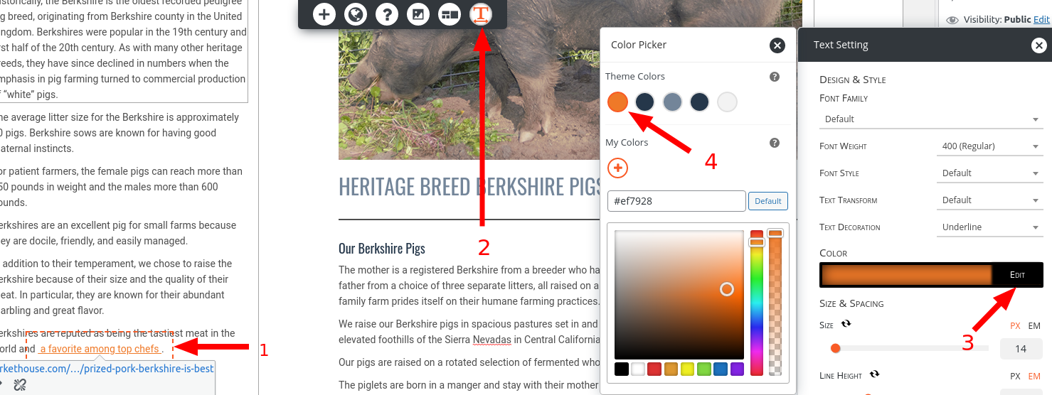
First, highlight the text that you want to change the color of in the Visual editor. Next, click the Text settings option that appears in the dynamic menu at the top of the editing screen to open up the Text Settings pop up window. In the pop up, click the Edit button in the Color controls and then choose which color you want to use for your link text.
I hope that the Text Setting controls help you get your link text displayed with the correct color and please let us know if you have any other questions for us!
Joseph W
KeymasterHi Heather!
Are you by chance saving all of the new Customizer selections as a Draft? If so then that might be one explanation for why the original colors are displaying instead of the new selections when using the Preview link.
Saving as a Draft instead of Publishing could also be the reason why the other page is not showing up as expected since a Draft of a page will not be publicly accessible and can only be viewed if a login session is detected.
Hopefully once your customizations are published your website elements start displaying as expected and please let us know if you have any other questions for us!
- AuthorPosts
