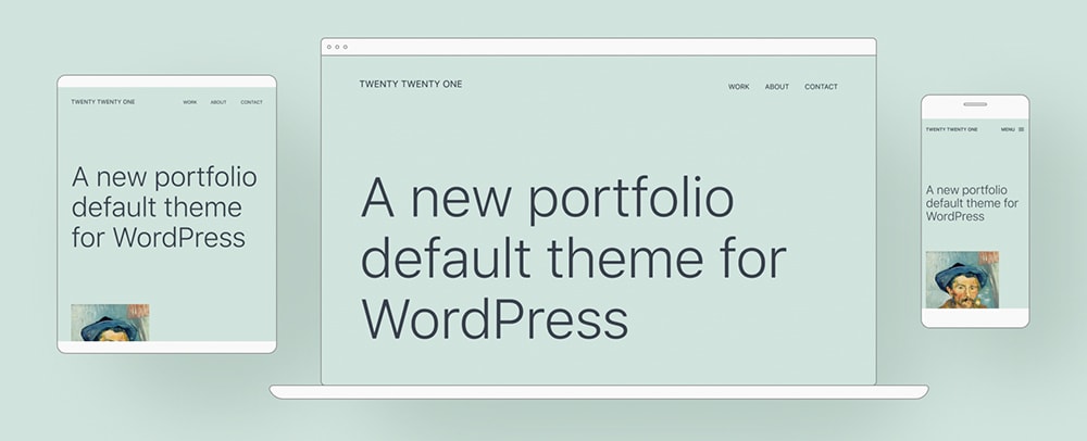
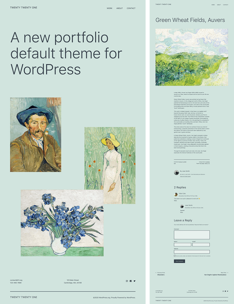
We’ve known for a while that WordPress 5.6 will include a new default theme and today we get our first look! The Twenty Twenty-One theme has a minimalist design – a blank canvas for the block editor – and sets the stage for Full Site Editing.
Twenty Twenty-One Theme Design
At its core, Twenty Twenty-One uses a modified version of the Seedlet theme. This base makes creating child themes easier than ever thanks to nested CSS variables (a simple overview of these terms is provided at the end of this article).
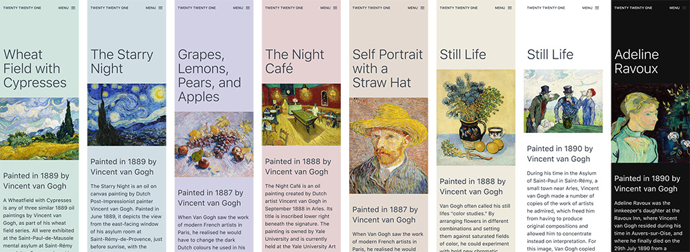
The theme is designed to use a pastel green background with two shades of gray for text. The default color palettes are pastels, which are growing in popularity, but using the color picker you can select any background color you’d like.
What is the theme’s screenshot going to look like? The starter content is still being worked on, so it’s hard to tell, but make sure you follow this ticket to be one of the first to know!
What About Gradient Backgrounds?
According to @carolinan, “The theme currently has no custom gradients, but a placeholder for editor-gradient-presets has been left in functions.php to make them easier to include.”
However if no custom gradients are added, this code will removed for Beta 1, which is scheduled for release on October 20, 2020. These gradients were recently tested by the Mel Choyce, the Default Theme Design Lead, and she had these comments:
- All of them look great when inside a block with the border style
- The lighter colors don’t look as good against the default mint background, without any sort of divider
- The gradients that go from mint to another color, or another color to mint, look good. And, you can do fun things by combining those with a solid color group blocks to get a smooth color transition
Starter Content
While there will be changes to the Twenty Twenty-One starter content, this release gives you an idea of how the theme will look and feel.
Starter Content Improvements
In a recent WordPress.org post, @helen had the following to say:
Helen Hou-Sandi
Core Lead Developer
Since we have a new default theme coming, we should consider what kind of starter content can both showcase the theme in a demo and also help new users get started with block patterns and other fun features – a walkthrough, if you will. Based on experience with starting content, we will want to strike a balance between showing users what they can do and adding too many individual pieces of content that have to be tracked down and removed if they don’t want it. For a future release, we should start exploring what it might look like to opt into importing starter content into existing sites, whether wholesale or piecewise.
In a recent #core meeting, the ability to import starter content with existing sites was discussed. Currently, starter content is only available on fresh sites. Once you’ve created or modified a page or post, the theme’s starter content won’t load in your Customizer.
It sounds like the community is on board for trying to get these changes in a future Core release, as the deadline for WordPress 5.6 is approaching too quickly. Here’s what a few users had to say on starter content:
I love the idea of enhancing starter content, I feel like it’s not widely used, because it’s not properly utilized by [wordpress.org], so that would be wonderful!
Yes yes yes on starter content, wizards, anything that can get new users all setup nicely
I feel like starter content is like the mannequin for themes on a website and the smaller the distance between the preview and the actual content on the site, the better
@helen also mentioned that one goal of Twenty Twenty-One is to highlight block patterns, and to do this the theme’s preview needs to do this very well. We’re not sure what changes will come about to help accomplish this, but her wheels are spinning.
New Block Patterns
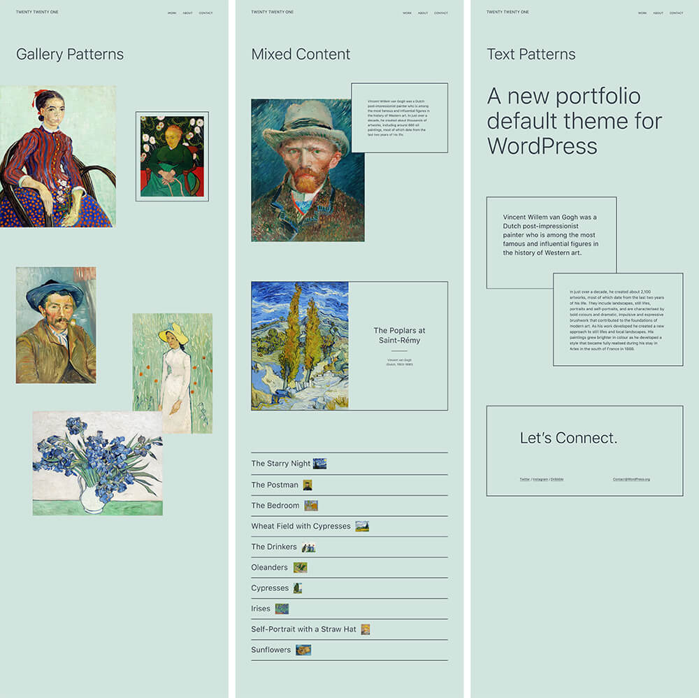
While support for patterns is currently available in WordPress 5.5, the Twenty Twenty-One theme will include unique patterns perfectly designed to match.
What is a Block Pattern?
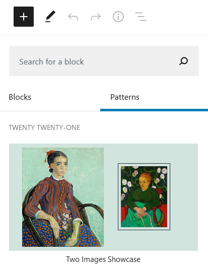
A standard WordPress Block is made up of a single element – Paragraph, Heading, List, etc. A Block Pattern is a layout consisting of multiple elements. To access Block Patterns, click the blue + button in the upper left of the editor. Next to the Blocks heading is Patterns, click that to see available Block Patterns.
Below are a few designs, but they have yet to make their way into the Twenty Twenty-One theme itself. Current Block Pattern designs and discussion on new ones are shown in the add initial block patterns ticket. Core is actively looking for more ideas, you can submit a block pattern today!
Block Designs
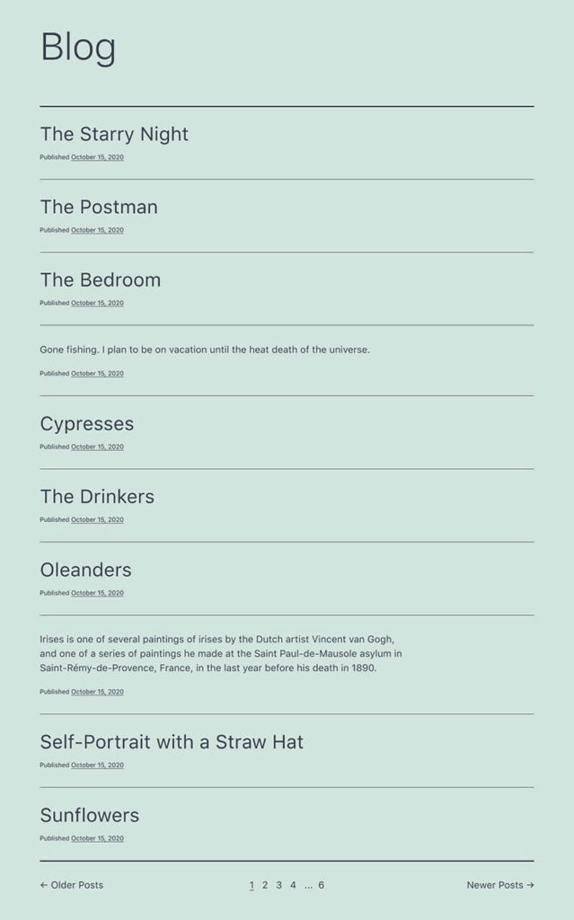
The “Latest Posts” block is currently under development too. Here’s a preliminary screenshot of what it could look like, but you’ll want to follow this ticket to learn more.
Using Full Site Editing with Twenty Twenty-One
WordPress previously announced there will be an official Full Site Editing version of the WordPress 5.6 default Twenty Twenty-One, called Twenty Twenty-One Blocks. This theme has been renamed to TT1 Blocks to avoid confusion with the Twenty Twenty-One theme once both themes are in the WordPress directory.
Before you get started, it’s important to find a safe testing environment. We recommend using BoldGrid’s Cloud WordPress service to create fully functional free WordPress installations in the cloud within seconds. If your install does something unexpected, simply delete and start fresh!
Start by installing and activating the main Gutenberg plugin, or updating to the latest version.

Then go to https://github.com/wordpress/theme-experiments and download the zip.
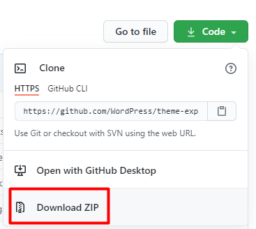
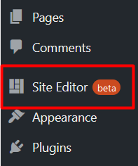
Unzip the file, which is called theme-experiments-master, to see everything available. Look for the tt1-blocks folder, and create a new zip archive with ONLY this folder. This will be the theme you upload to your WordPress installation. Now there will be a link for Site Editor (beta) in your WordPress dashboard, like shown below. If you do not see this link, Full Site Editing will not be active.
Now navigate to the front end of your website. Looking at the top of the screen, you will see the Customize link is missing from the top admin bar and has been replaced with an Edit site link.
![]()
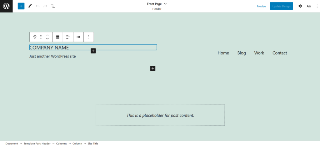
Clicking the Edit site link will reload the page in an editing view that looks very similar to the core WordPress editor. Now simply click on any element you want to change, or click a + icon to add a new element. At the bottom of the screen you will see what you are editing and how it’s added to your site, in our example we’ve clicked on the Site Title.
WordPress Core Call for Testing
WordPress Core is actively looking for feedback on the Full Site Editing functionality. There are several ways you can leave feedback. Before January 13, 2021, you can comment on this Core post. You can always create new issues in github on either the Gutenberg or theme experiments repo.
Twenty Twenty vs Twenty Twenty-One
Twenty Twenty and Twenty Twenty-One are very different themes meant for different use cases. On the WordPress Core blog, Mel Choyce-Dwan described Twenty Twenty-One as “a fresh canvas, waiting to be painted.” There are no bold colors or fonts to be found, which is a stark contrast from Twenty Twenty’s big bold fonts and bright pink. See our in-depth analysis of Twenty Twenty-One from a design standpoint here.
Impressive Speed Improvements
The Twenty Twenty-One theme boasts significant speed improvements over Twenty Twenty as well. We set up two websites on a Shared WordPress web host environment, with no extra caching, and with identical content generated by the FakerPress plugin, including pages, posts, and images, and then tested the blog archive page. Here were the striking results:
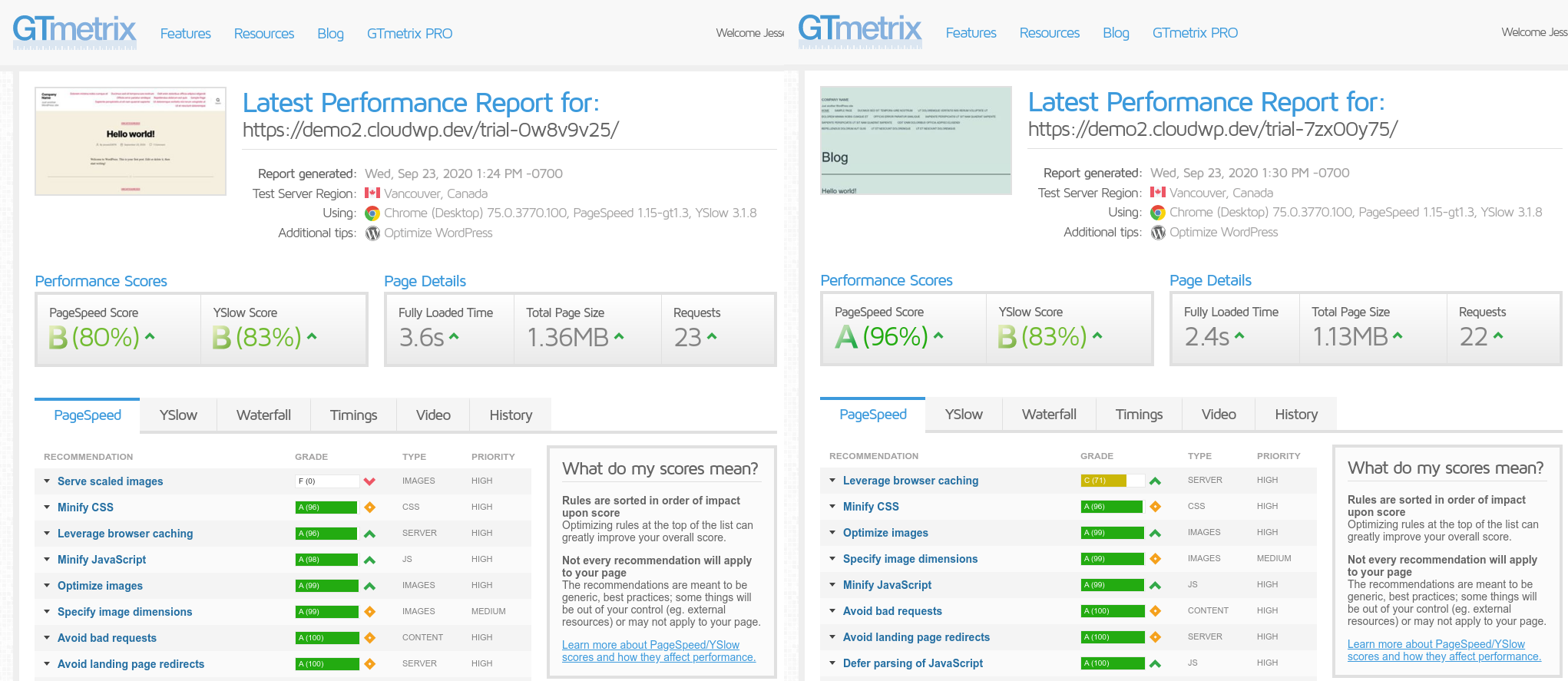
As you can see, Twenty Twenty-One loaded over a full second faster, with a PageSpeed Score improvement of 16%, scoring an eye-opening 96% out of the box. At a glance, Twenty Twenty-One handled serving scaled images better, and made fewer requests since it uses native system fonts rather than the custom Inter font that was bundled with Twenty Twenty.
Google PageSpeed Insights shows similar results:
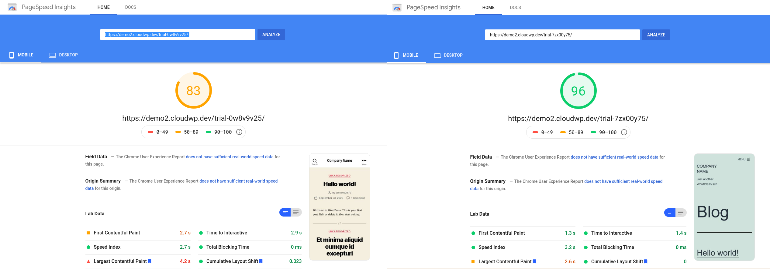
Overall, here were the statistics:
| GTMetrix | PageSpeed Insights | ||||
| Fully Loaded Time | Total Page Size | Requests | Mobile | Desktop | |
| Twenty Twenty | 3.6s | 1.36MB | 23 | 83 | 93 |
| Twenty Twenty-One | 2.4s | 1.13MB | 22 | 96 | 99 |
Accessibility
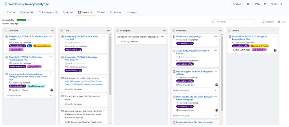
It looks like Accessibility is also an important feature of the Twenty Twenty-One theme. You can see various questions and tasks within the Twenty Twenty-One GitHub Accessibility project.
All of the current 16 cards in this project were created by the wonderful Carolina Nymark (shout out to her themes site!), so you can tell she’s taking Accessibility in Twenty Twenty-One very seriously.
Languages
Looking at GitHub, we can also see a change in the languages used between Twenty Twenty and Twenty Twenty-One. As you can see there’s a new language used this year – SCSS – which is how we utilize nested CSS. In Twenty Twenty-One almost 85% of the code is CSS or SCSS.
Twenty Twenty
- CSS 58.3%
- PHP 34.3%
- JavaScript 7.4%
Twenty Twenty-One
- CSS 64.8%
- SCSS 19.9%
- PHP 14.2%
- JavaScript 1.1%
What is SCSS?
SCSS, or Sass, is CSS on the next level and the official documentation can be found here. In this article we will go over the specific features of SCSS used in the Twenty Twenty-One theme – Variables and Nesting.
What Are SCSS Variables?
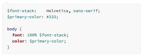
Using consistent fonts and colors is easier than ever before with variables. When writing your own code you won’t have to remember the exact hex of a color or how to spell a font. You can declare a variable once and use the variable in place of the hex or font name.
Variables also makes design changes significantly easier – since the font name and color only appear one time in the stylesheet, they only need to be changed one time. This one change will cause everywhere the variable is used across your site to update accordingly.
Nesting
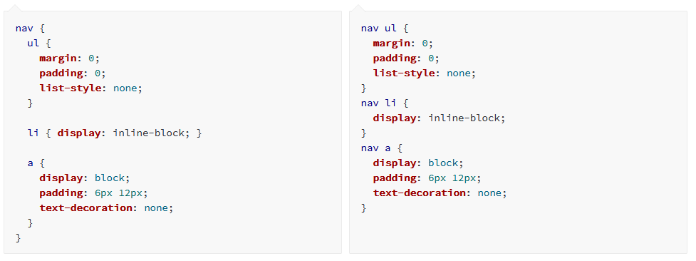
When using CSS it’s up to the author to group similar code together, like in the example below on the right. There are 3 elements related to nav that are being styled but they need to be completely separate.
This same code is written in SCSS on the left. Notice nav only appears once and the styling for the 3 elements is nested inside. This provides cleaner, easier to read code.
Frequently Asked Questions
Will There Be a Dark Mode?
The Twenty Twenty-One theme will include a Dark Mode, however we are unsure how this functionality will be implemented. A recent Core post is asking for user feedback on whether Dark Mode should be included with the theme itself, or if moving the feature to a plugin makes more sense.
The WordPress 5.6 Beta 4 has a new Colors & Dark Mode panel. Here you can decide if your site will opt-in to Dark Mode Support, which uses the visitor’s device setting. When using Dark Mode, a button appears on the front end of your website and in the Customizer to turn Dark Mode on or off. When Dark Mode is enabled, the background will be a dark grey with light text and images have a lower contrast.
How Does Dark Mode Work?
Here is a video showing how enabling Dark Mode changes the front end design:
Can the Twenty Twenty-One Theme be Translated?
Recently the translatable strings were pushed to GlotPress, so Twenty Twenty-One can now be translated.
SIGNUP FOR
BOLDGRID CENTRAL
200+ Design Templates + 1 Kick-ass SuperTheme
6 WordPress Plugins + 2 Essential Services
Everything you need to build and manage WordPress websites in one Central place.


Carlos says:
I’m building a site with it and all’s good. Except for two problems:
1) Too much space at the bottom.
2) My logo appears at the bottom and I only want it on top. Any idea on how to fix it?
https://erikatorresdoula.com
Joseph says:
Hi Carlos!
The Twenty Twenty-One theme doesn’t really have controls built into the theme itself to make those adjustments to the styling, but you can use the Custom CSS controls available in the Customizer to make some modifications.
You should be able to remove the website logo in the footer with the following CSS:
.site-footer .site-logo {
    display: none;
}
However, there is a .site-info wrapper around the .site-logo which contains some additional padding and margins that you might want to remove as well to reduce the amount of space at the bottom of the page. You can remove the entire .site-info area in your footer with the following:
.site-footer .site-info {
    display: none;
}
Hopefully that CSS helps you get the design you want on your website and please let us know if you have any other questions!
Serge says:
I love this theme. But is there an easy way to insert header image with not standard 300×100 aspect ratio in pixels? 1000×500 for example?
Jesse says:
Hi Serge-
I’m not certain exactly what you mean by “Header Image,” but if you mean the Logo image from the Customize > Site Identity section, you can avoid using the aspect ratio by clicking Skip Cropping at the aspect ratio screen.
Raacho says:
The container width in 2021 is narrow. The rest is all good.