What are media queries?
A media query is a CSS technique that was introduced in CSS3, which uses the @media rule to allow for CSS properties within the query to be active if certain conditions are true. The conditions can be a number of things, such as screen resolution, color depth, aspect ratio and much more. BoldGrid uses the screen size to dictate these breakpoints in pixel size.
A great example of this is to imagine that you like how your site looks on your phone, and tablet as well, but when you view it on the desktop the menu needs to be moved up to match the sites title. If you just use CSS rules to move it, then it will move it on all 3 device types or screen sizes. That is not what you desire, since your mobile and tablet design is just how you want it. This can be accomplished with a media query that specifies the rule should only apply if the screen is at least 992 pixels wide. The following guide will explain how media queries can be used to change the design rules for one or more elements within a screen size range, while leaving the other screen sizes ranges design the same.
What sizes are available?
Within the BoldGrid Theme Framework, you have 3 distinct sizes that can be used for CSS media queries. We label them as Mobile (up to 768 px wide), Tablet (from 768 to 992 px wide) and Desktop (everything over 992 px wide).
| Extra small devices Phones (<768px) | Small devices Tablets (≥768px) | Medium devices Desktops (≥992px) | |
|---|---|---|---|
| Grid behavior | Horizontal at all times | Collapsed to start, horizontal above breakpoints | |
| Container width | None (auto) | 750px | 970px |
| Class prefix | .col-xs- | .col-sm- | .col-md- |
| # of columns | 12 | ||
| Column width | Auto | ~62px | ~81px |
| Gutter width | 30px (15px on each side of a column) | ||
| Nestable | Yes | ||
| Column ordering | Yes | ||
Why use media queries?
Media Queries allow you to create separate, distinct rules that will be applied to your website based on the condition of the display. In regards to BoldGrid, media queries are responsive web design rules that dictate how your website will appear based on the screen size it is being viewed on. In the past, you would simply develop CSS rules, and it would apply to your site across all display sizes. Now, using media queries, you have a way to create different CSS rules that will apply to your websites layout based upon the screen size being used to render the site’s design.
BoldGrid Media Queries
Mobile
@media (max-width:767px) {
/* CSS RULES HERE */
}
Tablet
@media (min-width:768px) and (max-width:991px) {
/* CSS RULES HERE */
}
Desktop
@media (min-width: 992px) {
/* CSS RULES HERE */
}
Congratulations! You now know how to make changes to certain elements based on the screen size using media queries. We recommend that you use Google Chrome Developer Tools to help you Customize the CSS in BoldGrid, however most modern browsers have a comparable tool built in. The following tutorial will walk you through a practical example of applying a media query within your BoldGrid website.
Applying a media query
Once you have decided on the CSS changes you require, you can either apply the newly created media query within the Customizer, or create a child theme of your current install to create that change in your theme’s style.css file. For this tutorial, we are going to be applying our media query in the Customizer. Since the header adjustments do not allow me to align the bottom of the menu in the way I am attempting for only the desktop version, we are going to create a rule to move the menu up a few pixels, but only when it is at least 992 pixels wide.
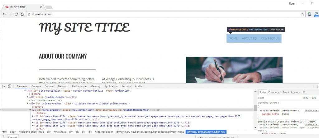
Using the Chrome Developer Tool, create the CSS changes you wish to make. We are going to be adjusting the menu, which has both an ID of menu-primary, and a class .navbar-nav, and use the li and a elements to target it specifically.
The media query we are using is the following:
@media (min-width: 992px) {
#menu-primary.nav.navbar-nav > li > a {
    top: -60px;
    }
}
Adding the CSS to BoldGrid
 Open the Customizer
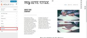
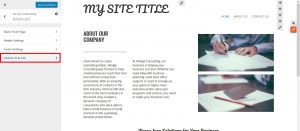
  Select Advanced
  Select Custom JS & CSS
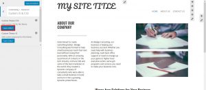
  Under Custom Theme CSS, Select Open Editor
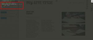
  Paste your media query in the editor. You will see your change apply instantly.
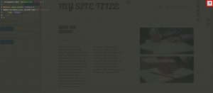
  Close the Editor by selecting the X in the top right hand corner
  Select Save and Publish
Congratulations! You now know how to apply media queries to elements of your BoldGrid Website.
SIGNUP FOR
BOLDGRID CENTRAL
200+ Design Templates + 1 Kick-ass SuperTheme
6 WordPress Plugins + 2 Essential Services
Everything you need to build and manage WordPress websites in one Central place.
